Overview
The dashboard lets you view and build reports to understand the impact of the campaigns on your customers. Interact with the data using interactive charts. Instantly spot trends and figure out the campaign performance. The reports can be scheduled to be received as an email or downloaded whenever needed. You can use these reports to analyze your campaign performance and customer engagement and guide product decisions.
Navigating to the Dashboard
Click on the Dashboard icon and expand the menu to view all the options.
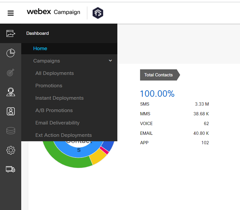
Dashboard Home Page (Top Card)
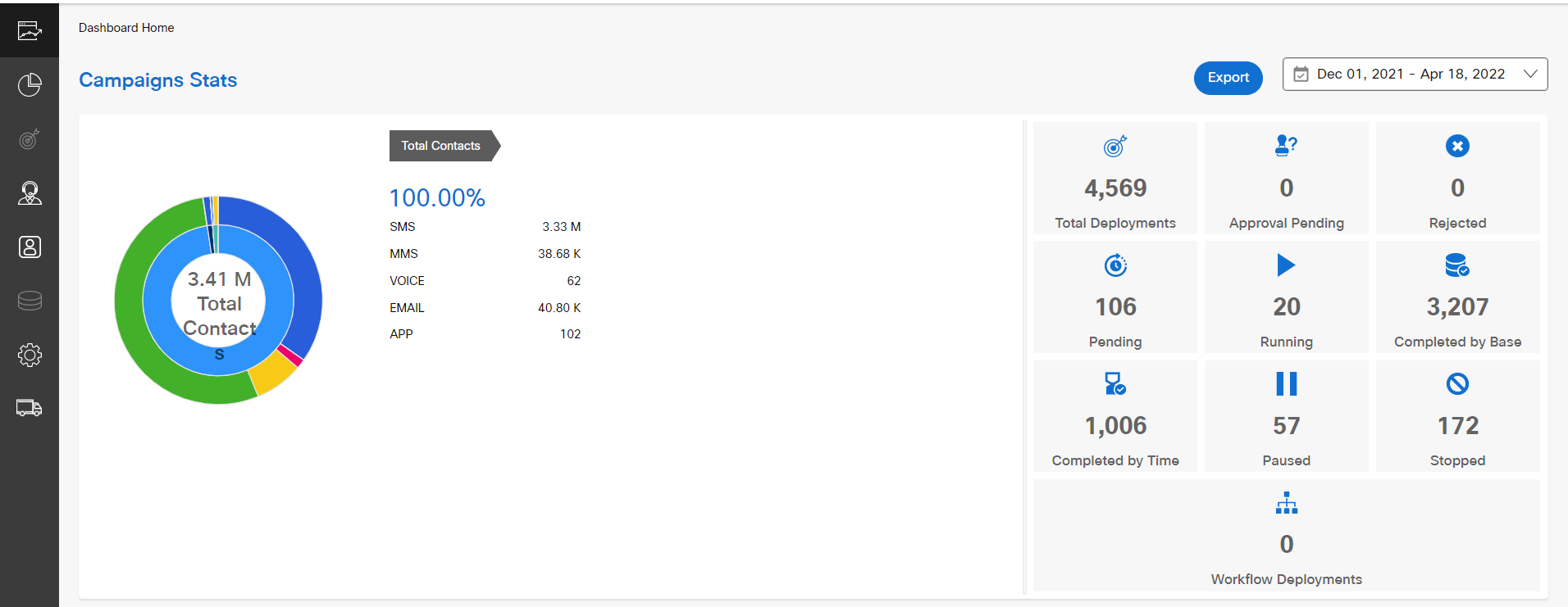
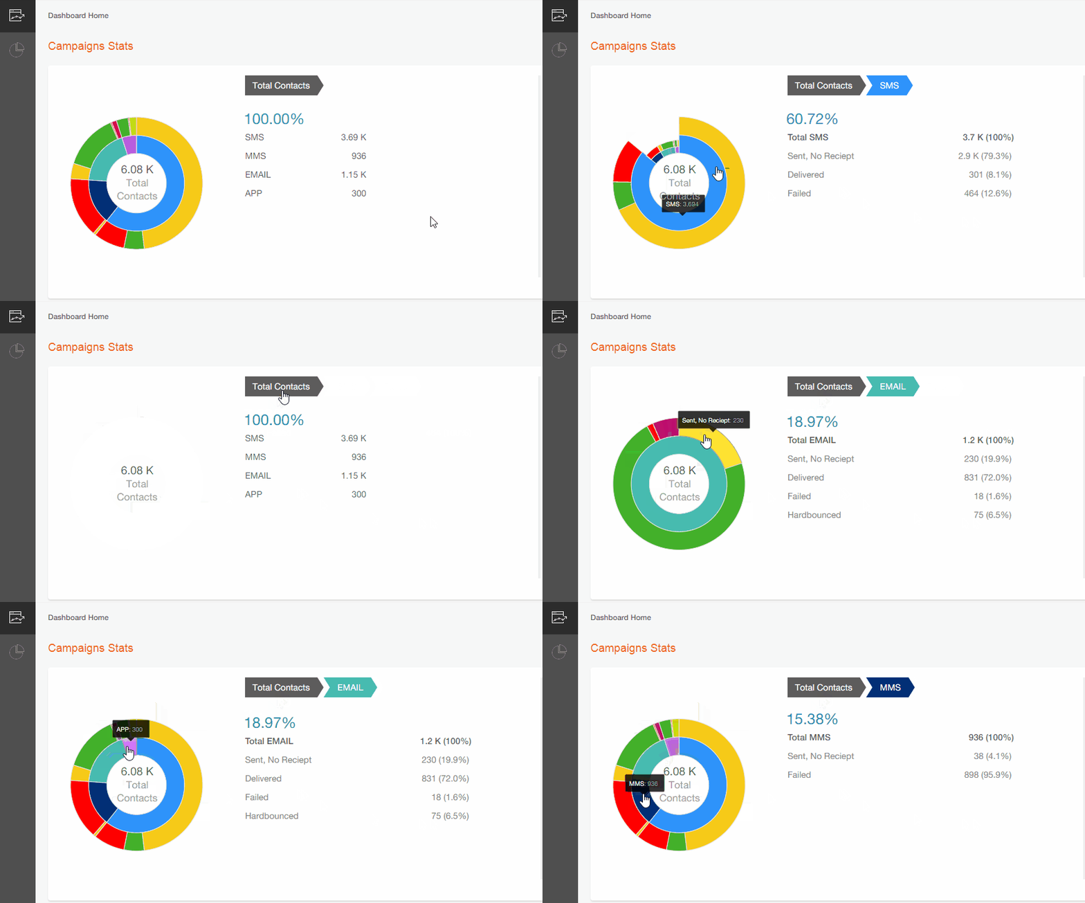
The campaign statistics display an interactive sunburst chart that shows a clear picture of all the channels, campaigns, and deployments available under a tenant for the selected period. You can drill down specific channel metrics by clicking on the graph. When the mouse is hovered on the graph, the tooltip will display the metrics of the graph.
A sample video of sunburst chart is shown below as to how a channel-specific metrics such as Delivered, Failed, Abandoned, and so on are rendered for the selected channels.
Dashboard Home Page (Middle Card)
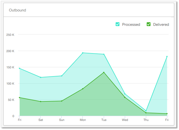
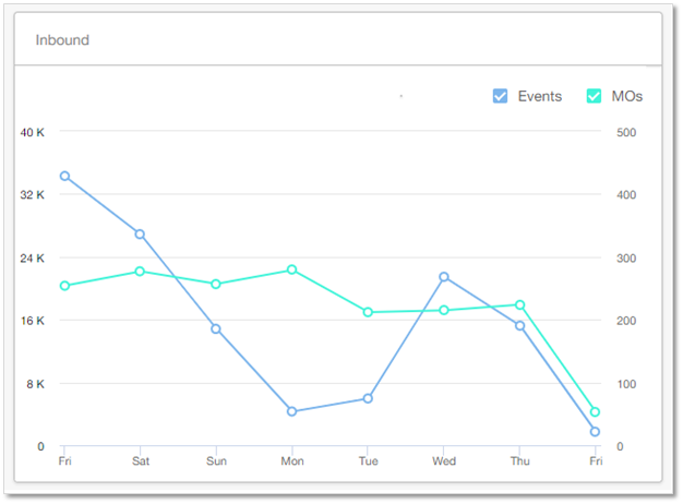
You can get a high-level view of some key ‘Outbound’ and ‘Inbound’ metrics across all your campaigns for the duration selected in the date filter at the top of the page.
An Outbound graph will display the difference between the processed vs delivered message count that was sent out by Webex Campaign. For example, a campaign is sent out to customers about an offer and inform them how the offer can be availed. It is possible that some messages may not be delivered due to network issue or DND etc. This graph shows the number of processed messages against the delivered. The term processed refers to an action that happens within Webex Campaign where the messages are bind as per the conditions to the selected target group before sending out for delivery.
An Inbound graph will display the messages count or events that were responded by the customers. For example, a campaign is sent out to customers about an offer and inform them how the offer can be availed. When an event is triggered based on the customer action (giving a missed call or sending SMS) to a campaign.
Dashboard Home Page (Bottom Card)
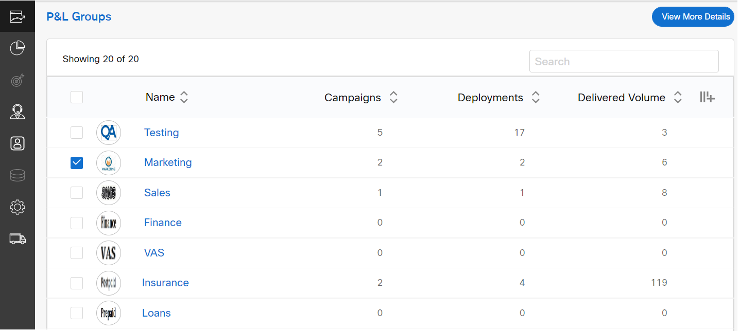
In this card, all the campaigns are grouped based on P&L groups. It shows the count of Campaigns, Deployments and Delivered Volume for each of your P&Ls. By default, it will display 10 P&L groups. To view more P&L groups, click View More that is displayed at the bottom of the screen.
Click on a P&L group, to view all the campaigns and deployments deployed under a P&L group. To view all the campaigns and deployments deployed under 2 or more P&L groups, select the checkbox of the required P&L groups and click View More Details.
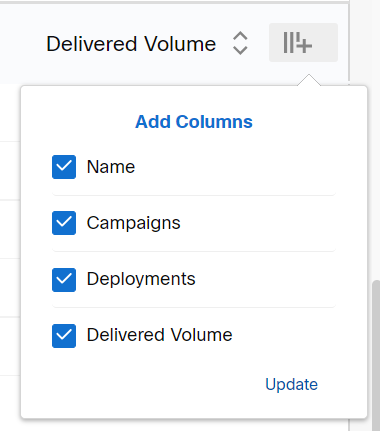
You can also hide the columns that are displayed on the screen. To do so, click on the icon as shown below and unselect the checkbox against a specific column. Click Update. The deselected columns will be hidden from the P&L list view.
Updated almost 2 years ago