

Applying Style Elements to Blocks
The Style Palette has two tabs. The properties in the Global tab are applicable to the entire page. For example, if you set the background color for the page, then it is applied to the entire page. Whereas the properties in the Building Block tab are applicable for the respective block. For example, if you set a background color for a Button, then it is applied only to the button.

Global Properties
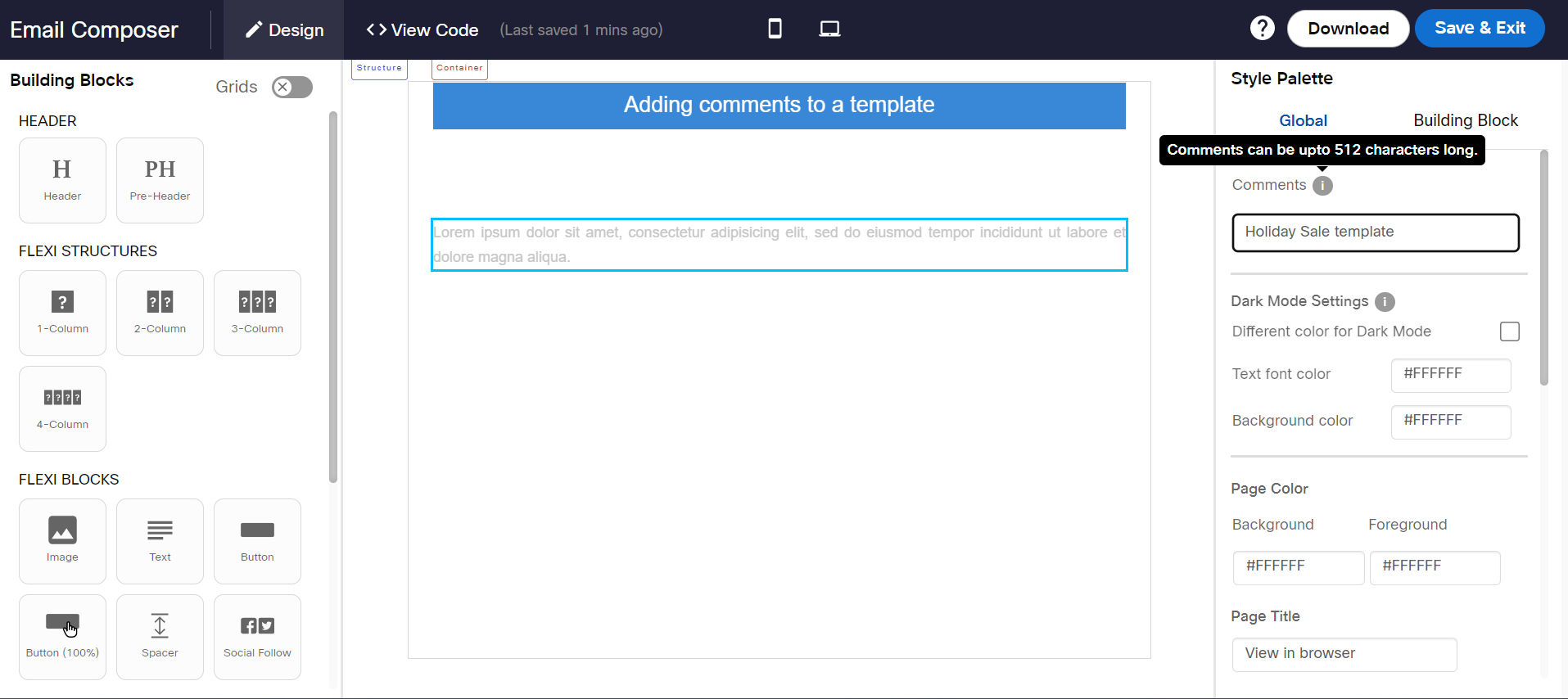
Comments
You can add small comments or notes within your email template. You can add comments for yourself or colleagues (up to a maximum of 512 characters), e.g., you may want to write a note within an email template such as standard font colors or text that you need to frequently copy and paste while working with email templates.
CSS in HTML element (beta)
Refer to this link.
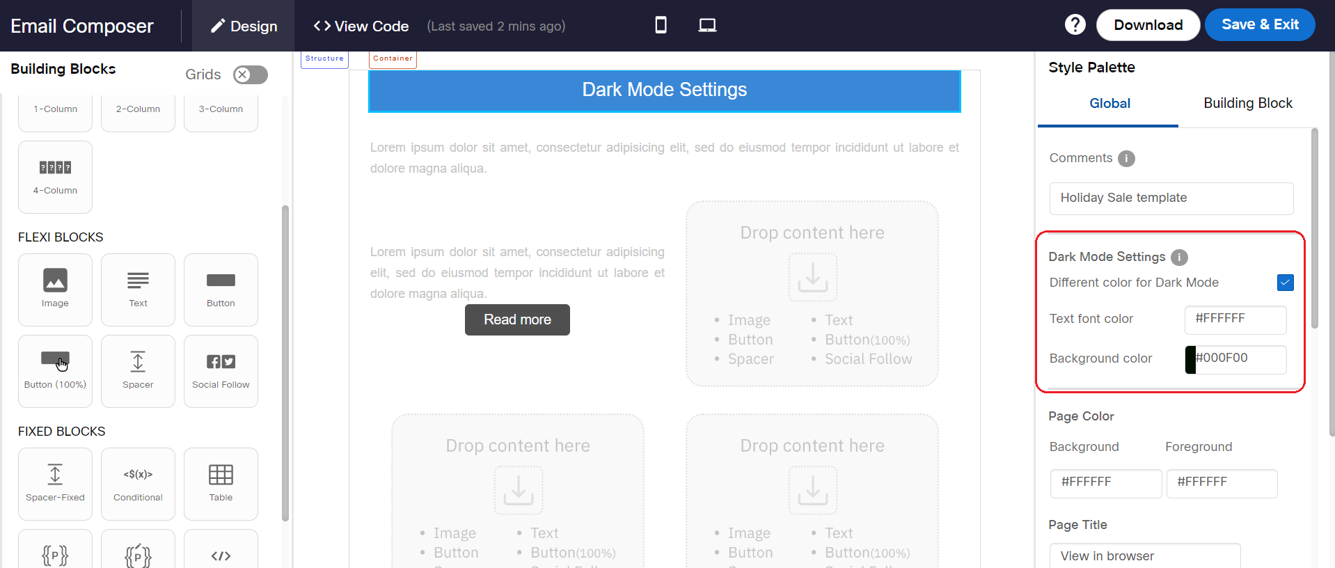
Dark Mode Settings
You can specify different colors for iOS and MacOS ‘Dark Mode’ for text within the Text Block and Button Block. This feature will be especially useful if you have a large customer base reading their emails within the iOS Mail or MacOS Mail apps.
This feature only works for Apple’s Mail app on iOS and MacOS; it does not work for ‘Dark Mode’ on Android or Windows devices; nor does it work on non-Apple email apps (e.g., Gmail / Outlook) on iOS devices.
You will need to first enable the ‘Dark Mode Settings’ on the ‘Global’ tab under the Style Palette and then you need to specify the text colors to be used within the Text Block and the Button Block when displaying the email content in dark mode in Apple Mail app on iOS & MacOS.
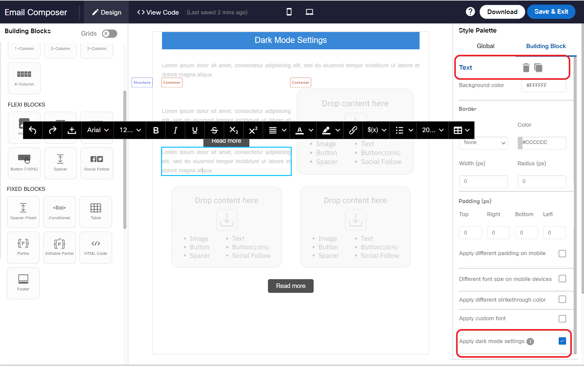
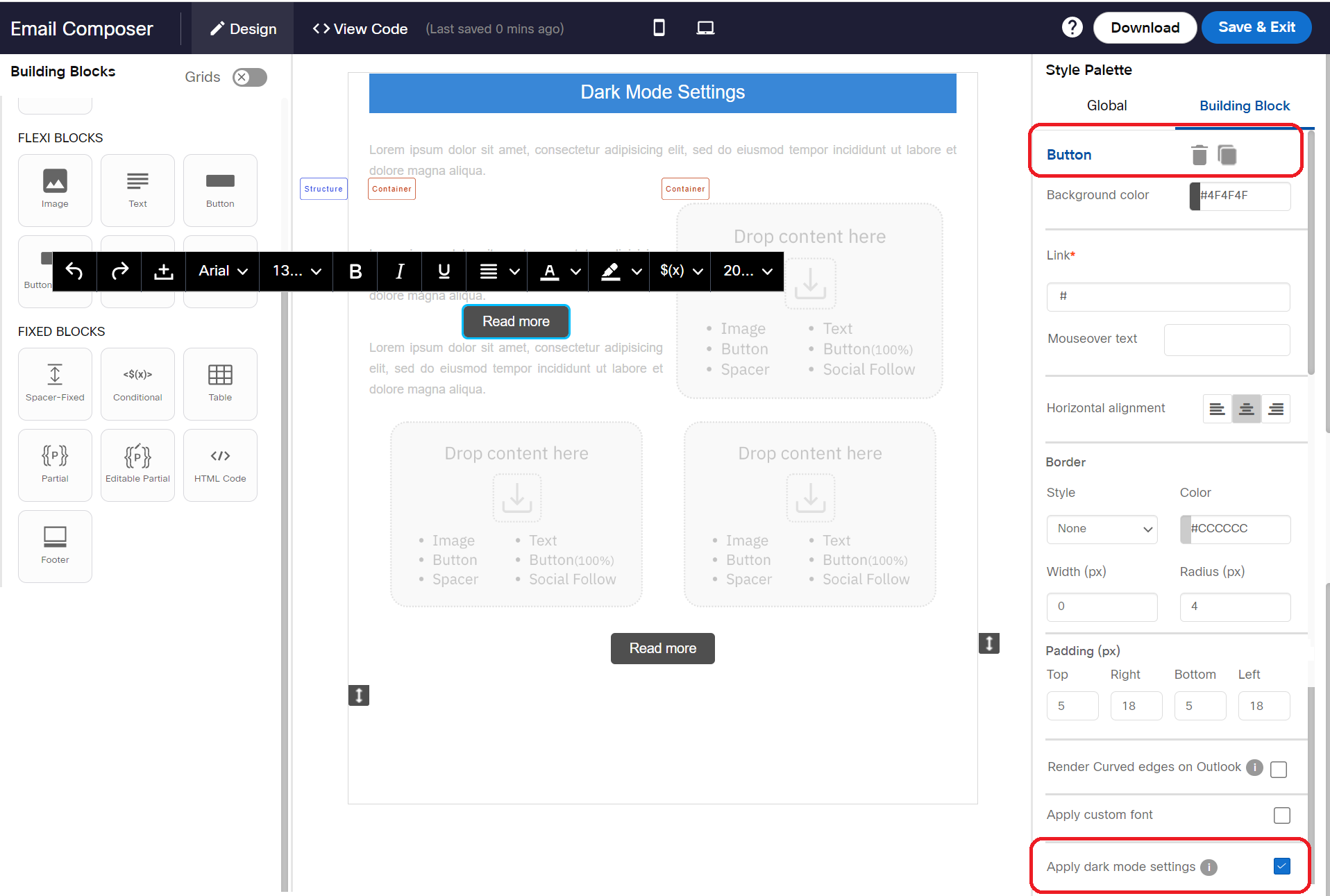
After the above ‘Global’ configuration, you will need to enable the setting for ‘Different text color for Dark Mode’ on the ‘Building Block’ tab for each Text Block and Button Block as appropriate.
Gmail Promotion Tab Annotations
Refer to this link.
Page Color
Background: Used to set the background color for the page. The page color may not work for all mobile devices. After you apply the page color, we recommend you to check the inbox preview for mobile devices before sending the campaign.
Foreground: Used to set the background color for all building blocks. When this option is set, the selected color will be applied to all the building blocks on the workspace.
Page Title
Used to set a title for the browser which is displayed on the browser tab when an email is viewed in the browser. The default text is “View in browser”. You can change this text as per your design template.
Building Block Properties
The options on the Style Palette change based on the selected block.
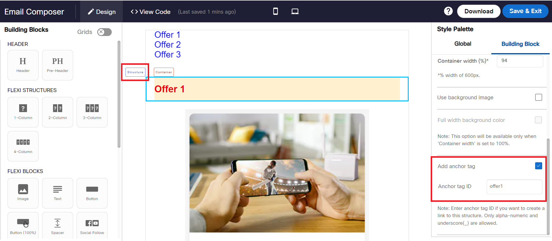
Add anchor tag
This feature allows you to add anchor tags to a structure. These tags are assigned to a text that can serve as clickable links, facilitating navigation within an email. This feature is useful for lengthy emails, such as newsletters, containing diverse content. It empowers your recipients to swiftly access the sections of highest interest amidst the various pieces of content.
To add anchor tag:
- Select the Structure to which you want to add the anchor tag.
- From the right menu, locate Add anchor tag and click the checkbox.
- Enter the Anchor tag ID.
You cannot assign same anchor tag to multiple structures. You can only use upto 32 characters for this field which can include a-z, A-Z, 0-9 and underscore(_) only.
- Select the text to which you want to assign an anchor tag and click on the link icon and configure the link that can serve as a clickable link, facilitating navigation within an email. The text can be anywhere in the content or at the top as shown in the above snapshot.
- On the link information screen, enter the anchor tag prefixed by # (the same anchor tags added to structures).
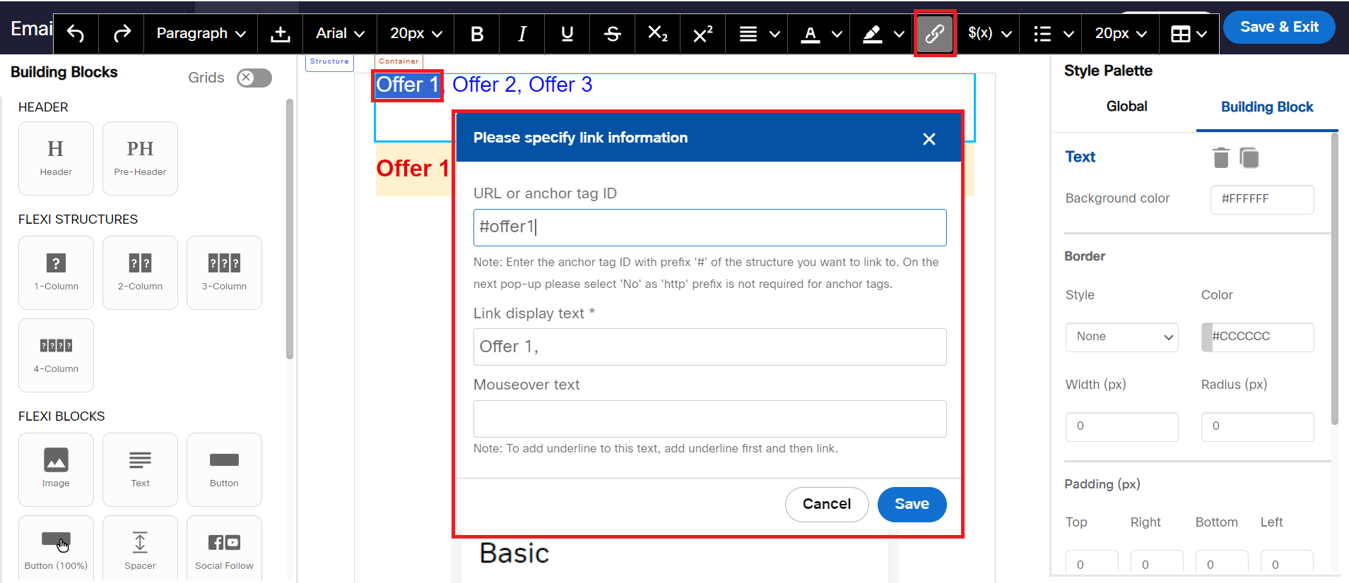
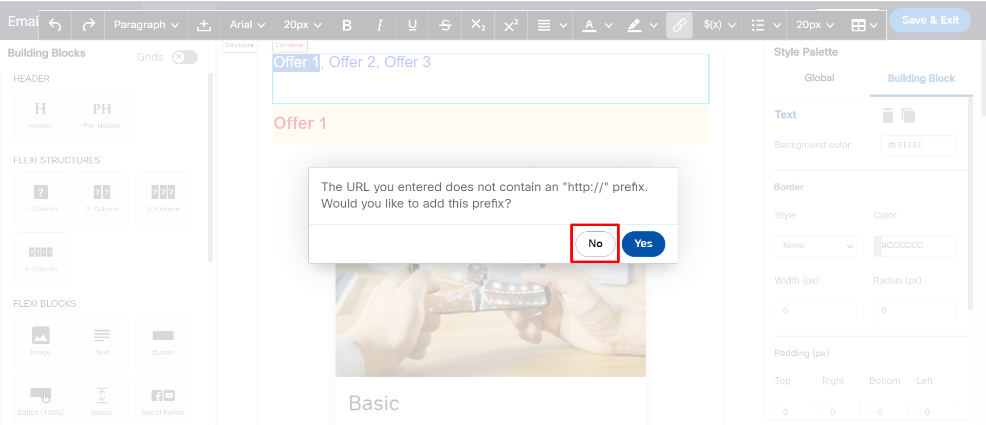
- Click on Save and then click No. We don't need to prefix http:// for anchor tags.
Usage notes:
- The maximum allowed length of the anchor tag ID is 32 characters.
- The only special character allowed within the anchor tag ID is ‘underscore’ (‘_’).
- If you try to assign an anchor tag ID to a structure that has already been assigned to another structure, the system will clear the text entered by you in the input field and display an alert message as follows: “ is already assigned to another structure. Please assign unique anchor tag IDs to each structure.”.
- If you duplicate a structure that has been assigned an anchor tag ID, then the duplicated structure will also have the same anchor tag ID. In this case, it is your responsibility to update it to ensure a different unique anchor tag ID is assigned to the duplicated structure.
- As of March 2024, only the following email apps/inbox providers support this ‘anchor tags’ feature:
a. iOS – Outlook app
b. iOS – iOS native Apple Mail app
c. MacOS – Outlook app
d. MacOS – Native Apple Mail app
e. Android - Outlook app
f. Web-based – Outlook Office 365 - As of March 2024, the following are some of the email apps/inbox providers that did not support this ‘anchor tags’ feature. Please keep this in mind while planning your email campaign. When the email recipient clicks on the anchor tags within these email clients, they are not redirected to the linked structure further down the email. We hope these email clients will begin to support this standard HTML feature in the future.
a. Windows – Outlook app
b. Web-based – Gmail
c. Android – Gmail app
Alt Text Style
Used to set the alternate text for an image. The alternate text is displayed only when the image is blocked by the email clients.
- Alt Text: Specifies the text to be displayed.
- Font Family: Specifies the font family of the text. The supported fonts are Ariel, Helvetica, and Times New Roman.
- Font Size: Specifies the font size of the text.
- Line Height: Specifies the line height of the text.
- Text color: Specifies the text color.
- Background Color: Specifies the background color for the block that is displayed only when the image is blocked by the email clients.
The background color property of the image is important if the image is not able to be rendered and that’s when the alt-text also becomes important.
Limitations of Alt Text
- Some email clients do not support alt text.
- Some email clients may ignore the text style for alt text and render's the default text style.
The following table shows the list of email clients currently support styled Alt Text. Of course, this may change in the future as email inbox providers are continually updating their products.

When Alt Text settings are set for the image, you can preview them using the Hide images option that appears for Mobile and Desktop previews.
To preview the Alt text settings:
- Click on the Desktop or Mobile preview.
- Click the View Alt Text checkbox that appears on the menu.

Below is an example of the Alt text settings configured for the images.

In Desktop preview images were hidden to show the Alt text.

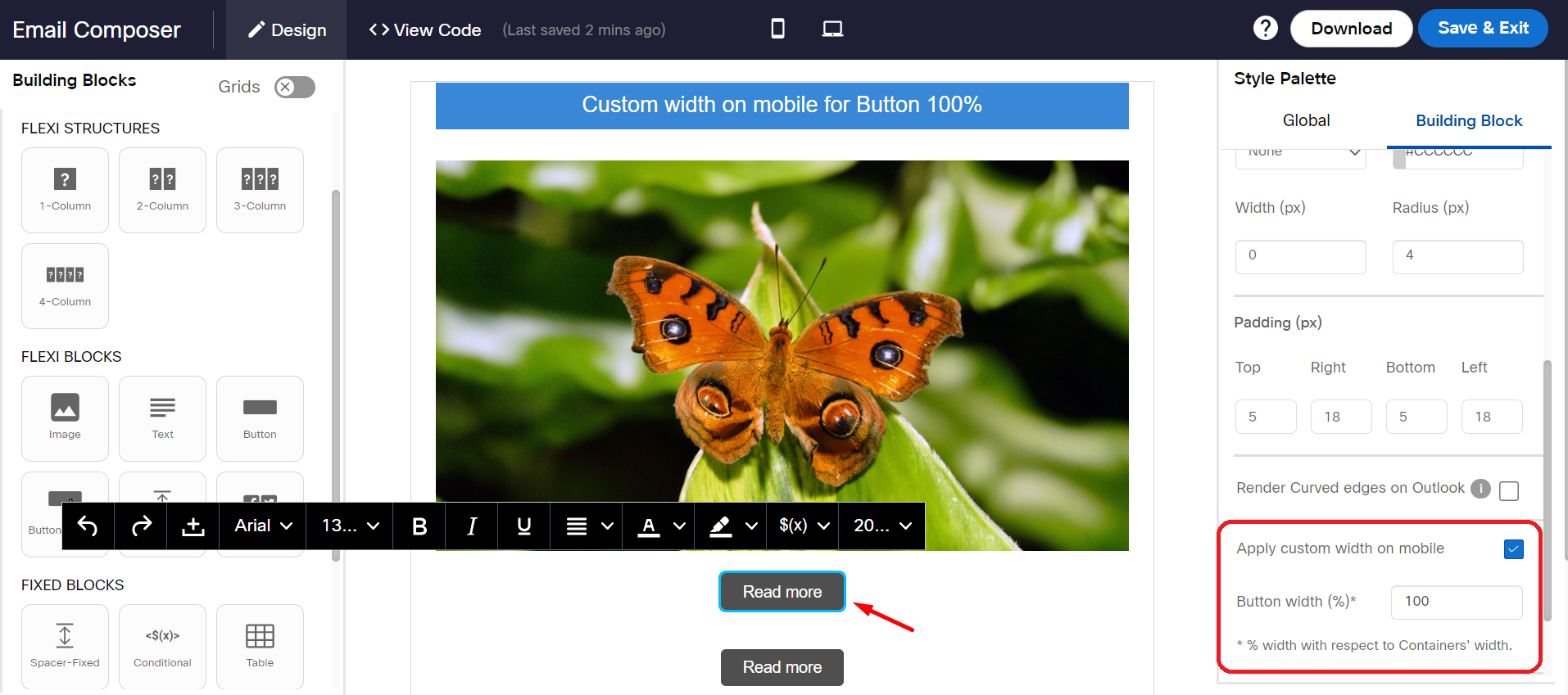
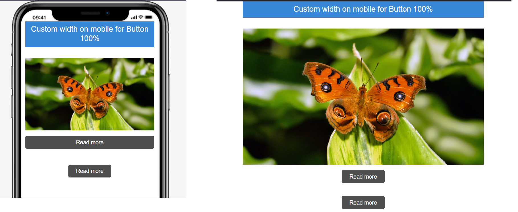
Apply Custom Width on Mobile
This property allows you to configure different width for buttons on mobile devices. You can specify the % of the button-width that should be used to render on mobile devices. This is the % width with respect to the Containers’ width.
Mobile & Desktop Preview:
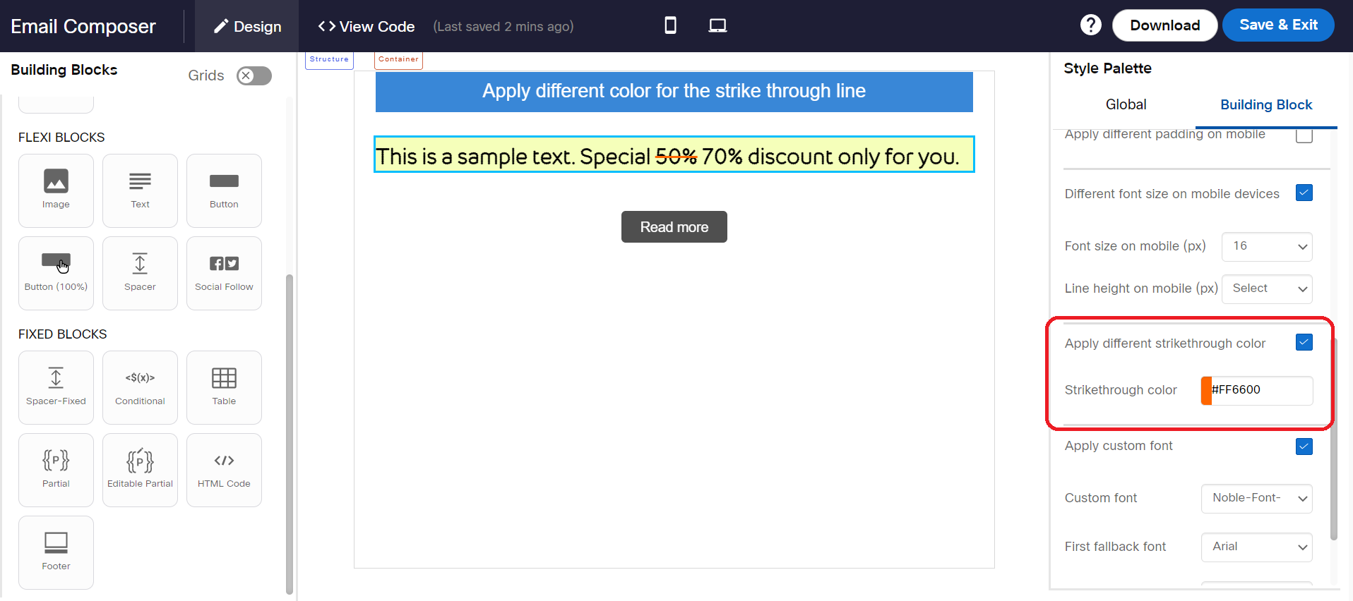
Apply different strikethrough color
When a text is applied with a strikethrough, then the color of the text is also applied for the strikethrough line. However, using this option you can apply different color for strikethrough line. This property is especially useful when you want to emphasize something. For example, the discounted price of an offer compared to the original higher price.
Apply different padding on mobile
This property allows you to apply different padding on mobile for the Text block. If you do not select this setting, then by default, both mobile and desktop email clients will have the same padding.

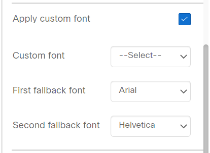
Apply Custom font
The Apply Custom font in Email Composer is a premium feature. It may not be available for all tenants. If you want to use these custom fonts, contact your account manager.
This property allows you to apply a different font for a textbox. Click anywhere inside a textbox and locate Apply Custom font property from the Style Palette.
Select the Custom font , First fallback font , and Second fallback font from the respective drop-down list boxes. If the Custom font is not displayed in the recipient devices, then the First fallback font will be displayed. If the First fallback font is not supported by the recipient devices, then the Second fallback font will be displayed. The supported fallback fonts are Ariel, Helvetica, Times New Roman, Lucida Sans Unicode, and Lucida Grande.
Currently, custom fonts can be added from the back-end. That means you should send a request for adding the required custom fonts to your account manager.
The following table shows which email clients support custom fonts at present. Of course, this may change in the future as email inbox providers are continually updating their products.

Apply Radius to
This property allows you to apply a radius to a spacer block. Using this property you can design a rounded corner look for your images using this property by adding 2 spacers immediately above and below the image. Apply the same background color as that of the image and specify a radius to individual corners of the ‘Spacer’ block. This setting will be visible within Style Palette when you click inside the ‘Spacer’ block.
Background color
Used to set the background color for the selected block. You can also use image as a background for table, 1-column, 2-column, and 3 Column structure blocks.
Block width (%)
This property allows you to set the width of the able block. The default width of the block is 94%. You can change the block width as per your design. However, the width must be in between 50% - 94%.
Border
The below properties are applicable for the table, Image & text, and image blocks. The border can be set individually to the top, bottom, left, and right sides. To set the style to all sides, select the checkbox and apply styles.
- Style: Used to set the style for the border. The options are Solid, Dashed and Dotted.
- Color: Used to set the border color for the border.
- Width (px): Used to set the border width for border.
- Radius (px): Used to set the corner radius for the table border. This property is applicable only when you apply background color for a single table cell. This is a known limitation.
You can apply the ‘Radius’ option only if you select a single table cell and if you apply some Background Color for that cell.
If you want to use the ‘Radius’ option for each individual cell, then the other 3 border options are not applicable (i.e. Border Style, Border Color and Border Width should not be used in conjunction with the Radius option.
Usage Notes::
- For Flexi Structures such as 1-Column, 2-Column, and 3-Column, you can set Color and Width (px) for the border.
- For 2-Column Container, you can set different Color and Width (px) for specific sides of the border.
- Emails may not render properly on the Outlook Desktop email client if this setting is used; however, they will render correctly (as designed) on the Outlook App on mobile devices (both Android and iOS).
- The default width is set to 0px, so by default, no border will be applied.
- This setting is also available for the Drag-&-Drop Partial Composer.
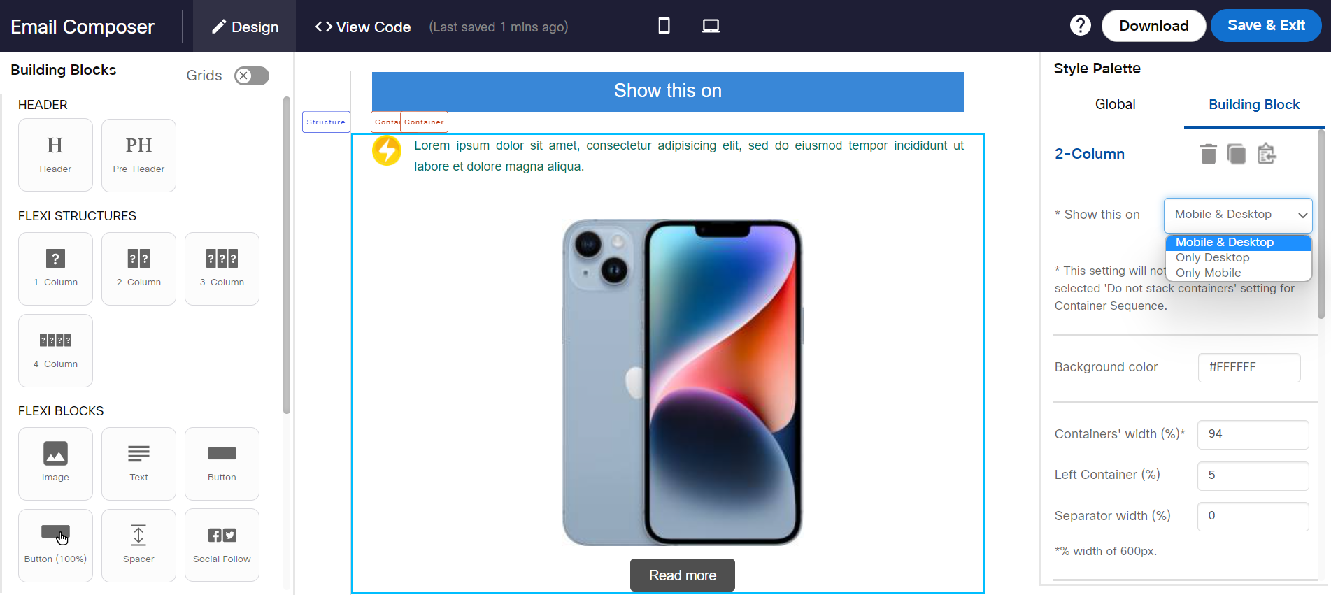
Containers' width (%)
This option is displayed when clicked on the Structure label of a Column Structure. It is used to set the width of the container. The default option is 94 %.
For 3-column and 4-Column, the width is equally divided amongst containers.

Different font size on mobile devices
By default, the desktop font size will be rendered for mobile devices. If you want to apply a different font size for mobile devices, then use Font size on mobile (px) option from the Style Palette.
To apply different font size on mobile devices:
- Select the Text block (the textbox border should show the teal color).
- From the Style Palette select Different font size on mobile devices checkbox.
- Select the desired font size from the "Font size on mobile (px)" option. The new font size will be applied to all the text present in Text block. You cannot apply a different font size for partial text using this option.
- Select the desired line height from the Line height on mobile (px) drop-down.

Desktop & Mobile Preview

Usage Notes:
- This option is currently only available for the ‘Text’ block.
- This option is not yet available for drag-&-drop Partial Composer.
- Line height will be 1.5 x the font size on mobile devices if this option is selected; e.g. if the font size for mobile devices is set to 20px, then a line height of 30px will be applied on mobile devices.
- Note that the Font size and the line height on Desktop devices will be applied as selected in the black floating toolbar.
Do not expand on mobile devices
This property is applicable for Image Flexi block. When this option is not enabled, the image that is smaller than the container width will be stretched to occupy the entire structure width in mobile devices.
This property is not applicable for images with size greater than mobile device width (between 320px to 480px) and also the width of the image is greater than a container width.
For example, if you select am image with size 100x100 px, on the mobile device the image will get stretched and occupies the entire container width.
When this property is set for images whose image size is less than the container width, the original dimension of the image is maintained.

This setting will be useful when you want to use the same small-dimension images on both Desktop and Mobile devices.

Full width background color
This property is applicable for 1-Column and 2-Column structures. It is displayed on selecting the Structure label of the blocks. It is used to extend the background color to outside the design area of the container only if the Container width (%) property is set as 100%.

Style Palette settings for Full width background color for 2-Column.

Usage Notes:
- Background color of the ‘Structure’ will be inherited by the ‘Container’ if it is not overridden by the user by selecting another background color at the ‘Container’ level. In this case, the background color of the ‘Structure’ will be applied outside of the design area as well.
- There will be no change in the rendering of the template on mobile devices even if you use this option.
- For 2-Column structure, select each Container of the structure and apply different background colors to notice the effect.
Desktop & Mobile Preview

Horizontal Alignment on Mobile
This option allows you to set a mobile device-specific alignment for all blocks in a container. The Horizontal alignment on Mobile option is displayed in Style Palette when a container is selected for Flexi blocks.
This property is not respected for image block when Do not expand on mobile devices property is enabled for Image block.
For 2-Column block, if the Structure's property While Rendering on Mobile is set as Do not stack containers, then mobile-specific alignment will not be rendered. It must be set to either Right container on top or Left container on top.


Below is a screenshot to show how the alignment looks when the structure is set as Left container on top and previewed both on desktop and mobile devices.

Below is a screenshot to show how the alignment looks when the Structure's property While Rendering On Mobile option is set as Do not stack containers and Horizontal Alignment for containers is set as Left and Right respectively and previewed both on desktop and mobile devices.

Horizontal alignment
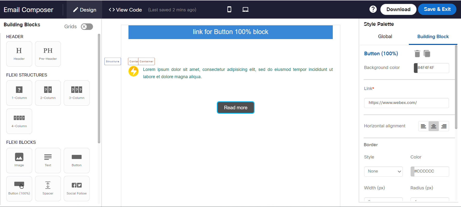
This option is used to set the alignment position for Button and Button (100%) blocks. You can change the alignment to left, center, or right as per your use case. The default alignment of the button is center.

Desktop and Mobile Preview

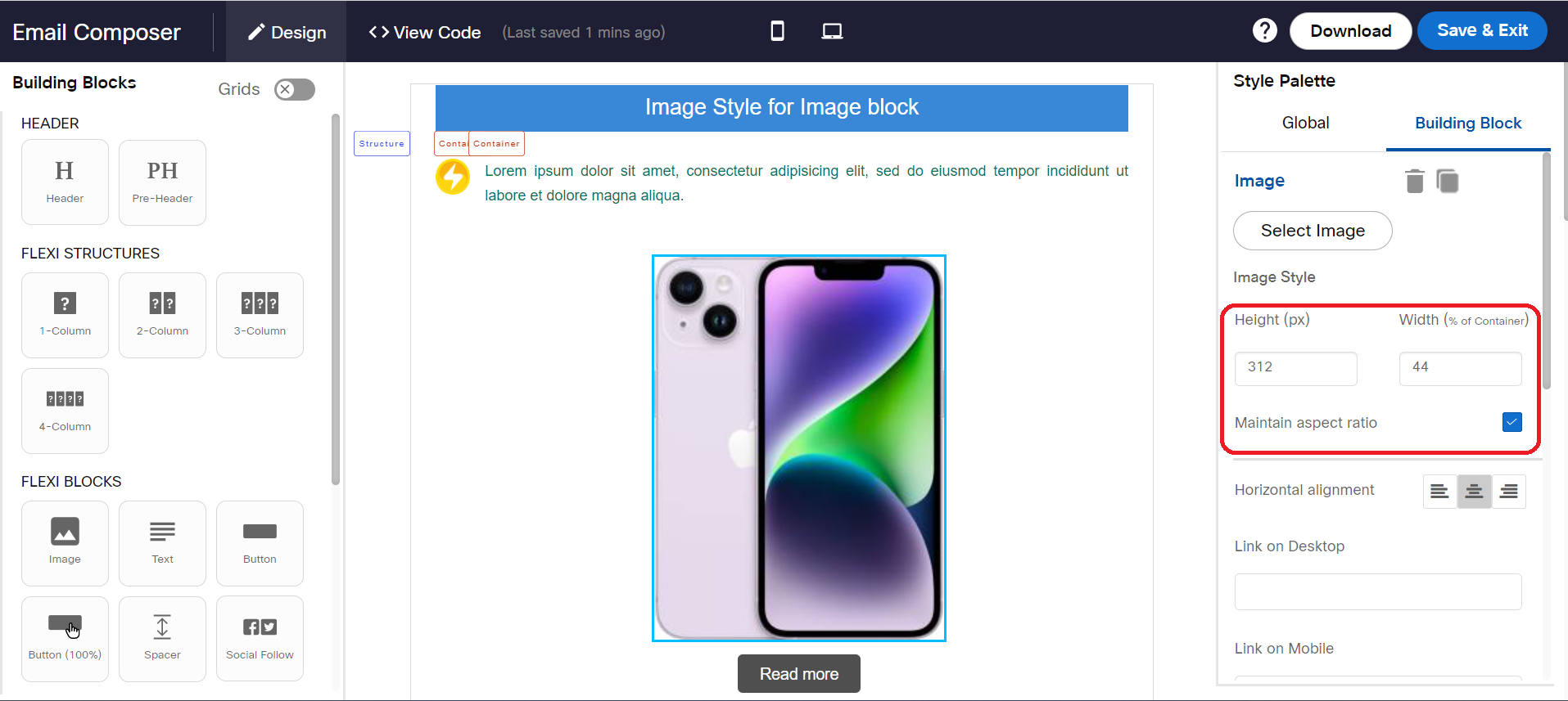
Image Style
The below properties are applicable for image blocks.
- Height (px): Used to set the default height of the selected image.
- Width (% of Container): Used to set the width of the selected image.
Link
This property allows you to add a URL for the button (100%) and button block.
Link on Desktop
This property allows you to add a link for the image block on Desktop.
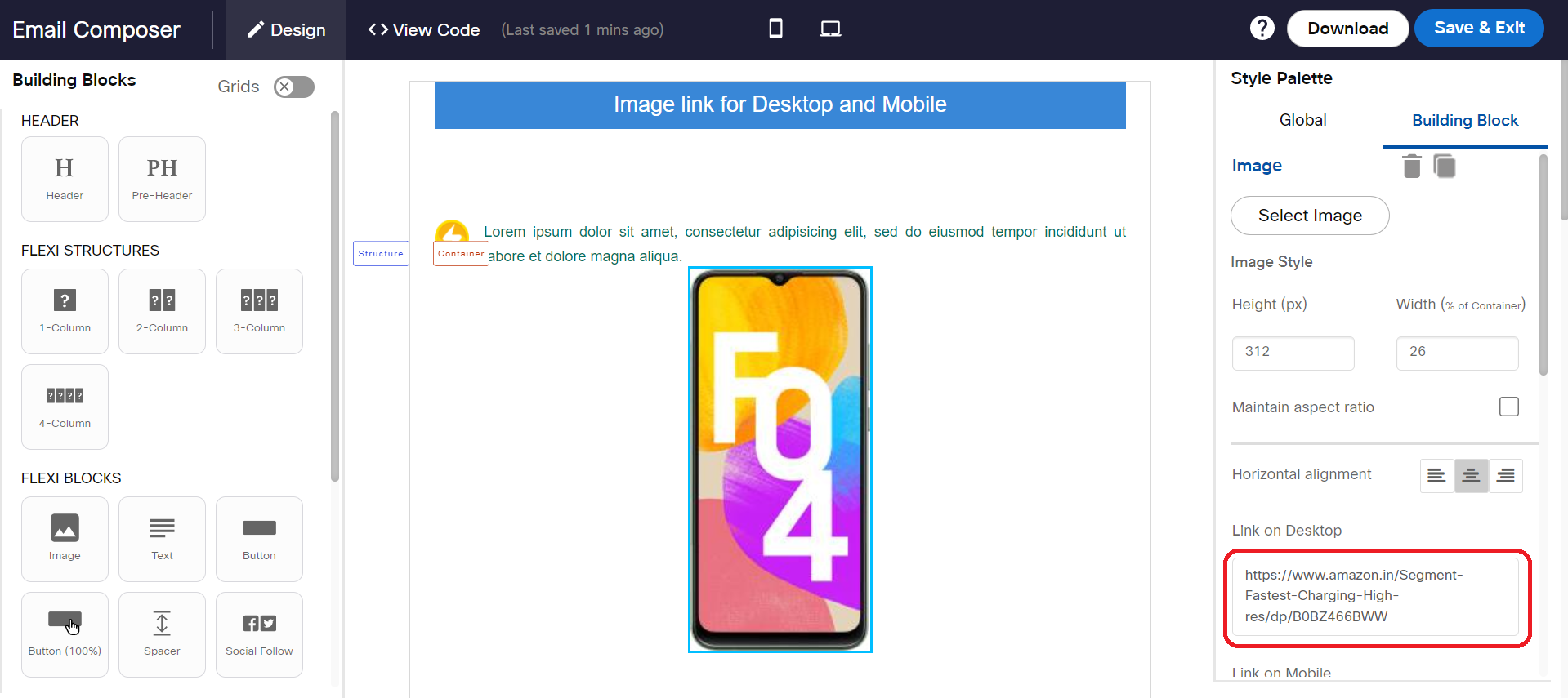
Link on Mobile
This property allows you to add a link for the image block on Mobile.

Left Container (%)
This property is displayed when clicked on the Structure label of a 2-Column block. This property is used to set the width of the left container. The minimum value you can set is 5%.

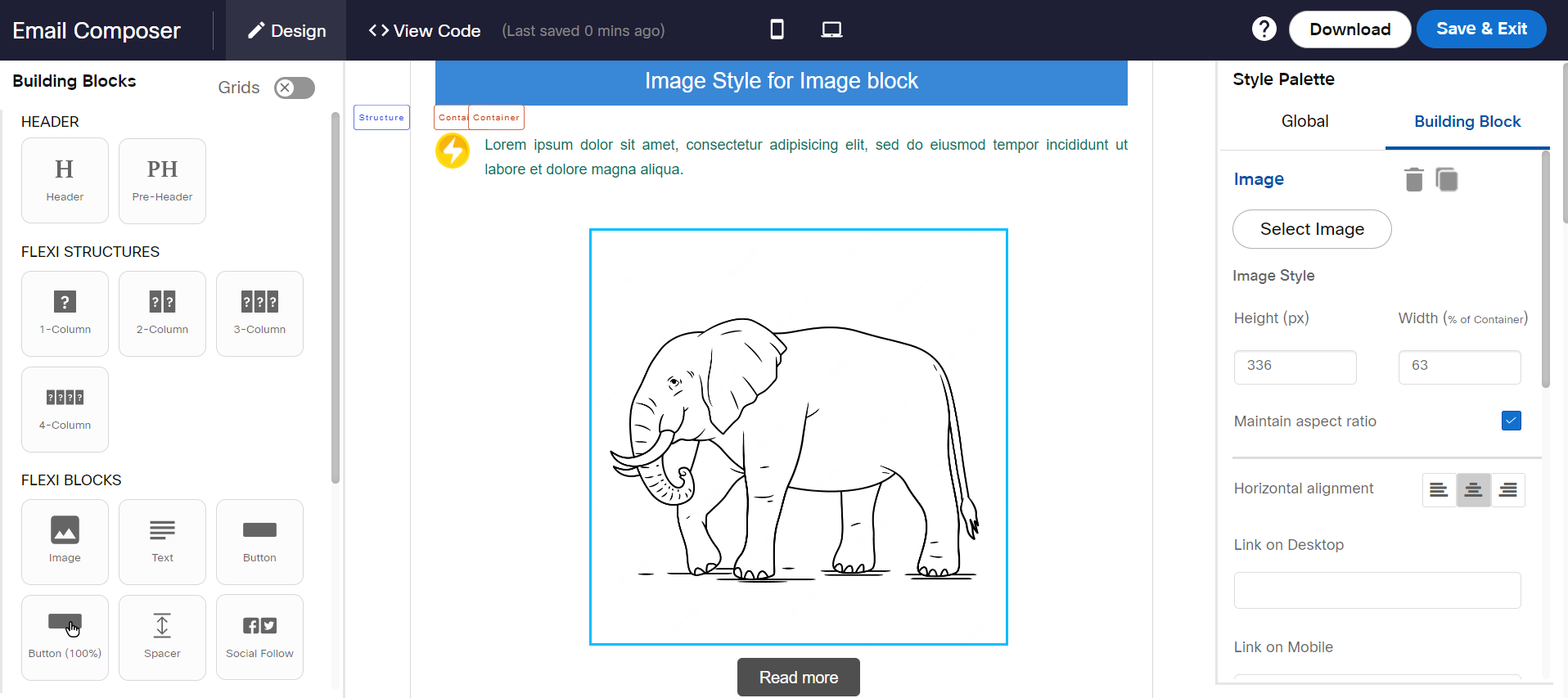
Maintain aspect ratio
This property allows you to resize the image by maintaining the ratio between the image Width and Height. For example, if the image size is 200 px and 140 px and if you change the height of the image to 100, then the height will be automatically changed to 70px. This will maintain the quality of the image. If the image size is changed without the aspect ratio, then the image may get distorted.
Image Height and Width changed without enabling the Maintain aspect ratio.
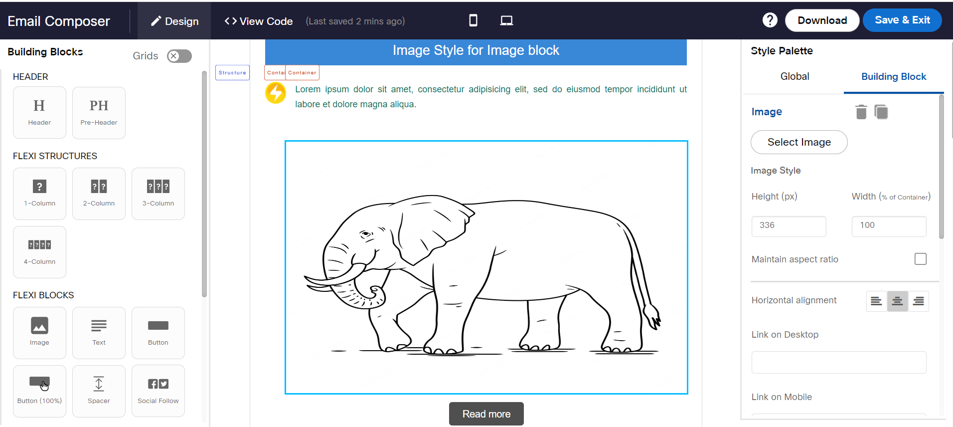
Image Height and Width changed by enabling the Maintain aspect ratio.
Mouseover text
This property allows you to add mouseover text for Button block.

Padding (px)
Used to set the padding for the selected blocks except for image blocks.
Render Curved edges on Outlook
This property allows you to set curved edges for Button and Button 100% blocks in Outlook Desktop apps.
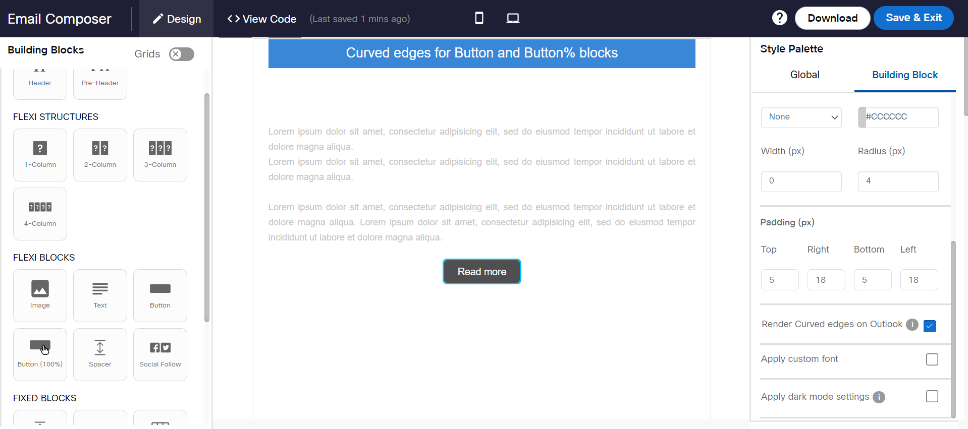
Usage Notes:
- If this setting is enabled, it will not be possible to track link clicks on this button which occurs on the Outlook Desktop app. This limitation is because we need to apply VML tags (instead of standard HTML tags) to render the curved edges of the button on the Outlook Desktop app.
- If you enable this setting for a ‘Button’ or ‘Button (100%)’, then please do not use a ‘Background Image’ for the Structure containing this button; otherwise there is a risk of the email being rendered in a distorted fashion.
Separator width (%):
This property allows you to set a width for the separator. The default value is 1%. You can change this to anything between 0 to 5.
For 3-Column and 4-column Structures, the Separators between two Containers will have the same width as per the input of this setting.
* Show this on
This property allows you to show or hide 1-Column, 2-Column, and 3-Column structures on Desktop or Mobile. By default, the structure is displayed on both Desktop and Mobile devices. You can use this property to show mobile-specific content for mobile users.
The blocks Button, Button 100%, and Social Follow added in 1CF structure do not respect Padding property when Show only on Mobile property is enabled. The Padding is applied for Android & iOS Outlook apps and will not be applied on Android & iOS Gmail Apps & Native App.
# Show this on
This option is used to design a fallback HTML block that will be displayed (as an alternative for an AMP interactive block) on devices that do not support AMP blocks yet. This option is displayed when you select the ‘Structure’ label for 1-Column, 2-Column, and 3-Column on the design area.
This property has the following three options:
- Only HTML: When this option is selected, this structure will be displayed in all HTML templates.
- Only AMP HTML: When this option is selected, the structure will be displayed in AMP HTML templates.
- HTML & AMP HTML: When this option is selected, the structure will be displayed in both HTML and AMP HTML templates.
AMP blocks content will be removed from the fallback HTML even if you select the option HTML & AMP HTML.
To explain this with an example, we have added 3 structures and configured as follows:
- 1st structure with AMP block and HTML text block with Show this on property set to HTML & AMP HTML.
- 2nd structure with a text block with Show this on set to Only AMP HTML.
- 3rd structure with a text block with Show this on set to Only HTML.

AMP HTML Preview: In this preview, 3rd structure which is set as Only HTML is hidden from display.

HTML Preview : In this preview, 1st structure AMP block and 2d structure that is set as Only AMP HTML are hidden from display.

Spacer height (px)
This property allows you to specify the height for the spacer. The default height is 24px. You can change the height as per your requirement.
Text Style Palette
Used to set the style elements such as text size, font, text alignment, table style and so on.
While Rendering On Mobile
Container Sequence
This option is used for 2-column structure to stack which container on top of the other on mobile devices. The options are:
- Left container on top The left container will be stacked on top of the right container.
- Right container on top: The right container will be stacked on top of the left container.
- Do not stack containers: Both the containers are shown side by side.
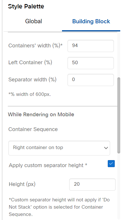
Apply custom separator height
This property allows you to specify a different height on mobile devices for the separator between the 2 Containers within a 2-Column Structure. This setting will be visible on the Style Palette when you click on the ‘Structure’ label for ‘2-Column’ block.

Desktop & Mobile Preview:

Containers' Outer Border
This is currently a Beta feature.
The ‘Containers’ outer border’ property allows you to add a common outside border to the 2 Containers within the ‘2-Column’ Structure. This setting will be visible within the Style Palette when you click on the ‘Container’ label within a ‘2 Column’ Structure.

Desktop & Mobile Preview

Updated 8 months ago