Flexi Structures
The Flexi Structures are the layout blocks (containers) with one or more columns that determine where you can add Flexi blocks. When a structure is duplicated, all the blocks within the structure will also get duplicated.
1-Column Structure
A 1-Column structure is a container that allows you to add multiple blocks in each column such as Image, Text, Button, Button - (100%), Social, and Spacer to design a template.
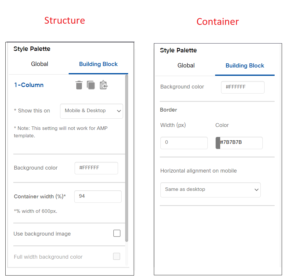
This block has labels 'Container' and 'Structure'. These labels are visible if you click anywhere inside 1-Column block. You should select these labels to apply a background color to Container/Structure from Style Palette.
You can also set the width of the container by using the ‘Container width (%)’ option which is available in Style Palette when you click on ‘Structure’ label.
- The minimum allowed value for this width is 70%.
- The maximum allowed value is 100%.
Usage Notes:
- The default width of the Container has been set to 100%.
- The value entered in the ‘Container width (%)’ option would be applicable to mobile devices as well.
- Drag and drop at least one block inside the Container before saving the template.
- You can drop multiple blocks inside the Container.
- The blocks must be dragged from the left side palette into the ‘1-Column’ Structure. i.e. You should not move a block designed outside the ‘1-Column’ Structure into its Container.
- You can drag and drop a ‘1-Column' block inside a Conditional block.
Properties
2-Column Structure
A 2-Column structure is a layout block with 2 containers that allows you to add multiple blocks in each container such as Image, Text, Button, Button (100%), Social, and Spacer to design a template. This block is used to create a custom design using a combination of Flexi blocks.
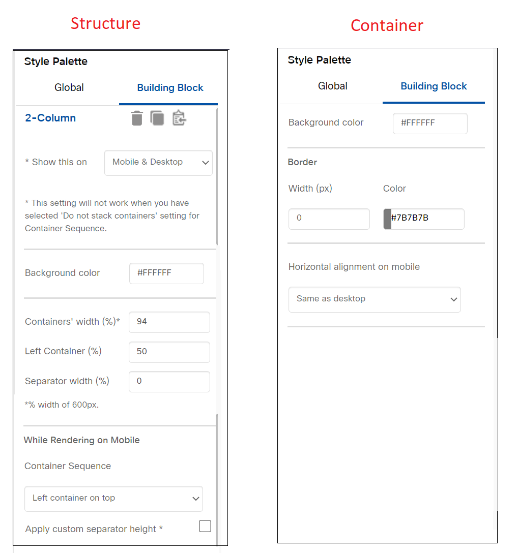
A 2-Column block has labels 'Container' and 'Structure'. These labels are visible if you click anywhere inside ‘2-Column’ block. You should select these labels to apply styles to Container/Structure from Style Palette. While rendering on mobile devices, by default the Left Container will be stacked on top of the Right container.

Usage Notes:
- The default width of the block is 100%. You can configure the combined width of the 2 Containers within the 'Structure'. This can be done under the Style Palette when you click on the 'Structure' label. For example, if you specify this value as 90%, then the combined width of both the Containers would be 90% of 600px i.e. 540px. The width can be set anything between 70 to 100%.

- You can also configure the % width of the Left Container (which will also then decide the % width of the Right Container). This can be done under the Style Palette when you click on the 'Structure' label. For example, if the combined width of the 2 Containers is 540px and the value for ‘Left Container (%)’ is 40, then Left Container width would be 40 % of 540px i.e. 216px and Right Container width would be 324px.
The minimum allowed value for the ‘Left Container (%)’ field is 10%. The maximum allowed value for the ‘Left Container (%)’ is 90%. In case the Image-Flexi block is used in a Container and if the ‘Left Container width (%)’ value is changed, then the height of the Container would be adjusted such that the image aspect ratio is maintained.

- The width of the ‘2-Column’ block on mobile devices will also be decided by the ‘Containers’ width (%)’ value e.g. If the Container’s Width value is set to 80%, then the 2-Column Block will also render with 80% width on a mobile device.

- Do not increase the left/right padding of a building block added in a container such that the width of the building block becomes more than the container width. In such cases, the container width would be adjusted to accommodate the padding values. However, this new width value will not be reflected in the UI for the ‘Left Container (%)’ value.
We strongly recommend that in this case, you adjust the padding value(s) so that the block can be accommodated inside the Container without changing the width of the Container; otherwise, the rendering of the email may be affected on some email clients.

- When a ‘2-Column’ block is used inside a Conditional block then ‘Structure’ label will be visible on the top left corner of the ‘2-Column’ block.

Below are a few samples created using this block:


Follow the below steps to use this block:
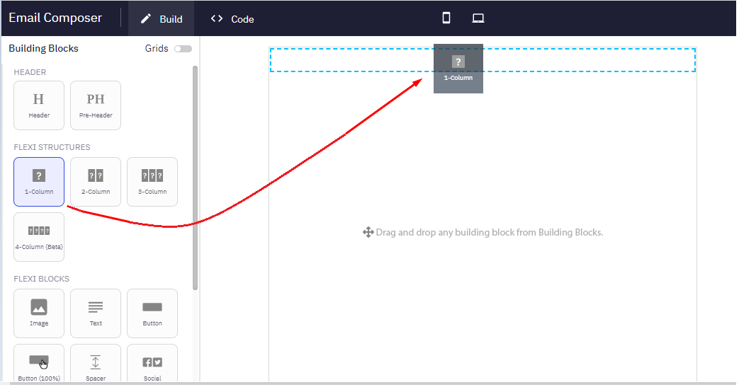
- Drag and drop a 2-Column Structure on the workspace.
- Drag and drop a combination of Image, Text, Button, Button - (100%), Social, and Spacer blocks on the 2-Column block as per your design.
- Apply the required styles to the blocks.
- (Optional) Set a width to separate the blocks. The default value is 0. You can set any value between 0 to 5.
- (Optional) Select the right container to be stacked on top of the right container on mobile devices. The default option is the left container stacked on top of the right container. You can also select an option not to stack the containers. Both containers will be shown side by side on a mobile device.
- Preview the template using inbox preview.
Properties
3-Column Structure
A 3-Column structure is a layout block with 3 containers that allows you to add multiple blocks in each container such as Image, Text, Button, Button - (100%), and Spacer.
This block has labels 'Container' and 'Structure'. These labels are visible if you click anywhere inside the ‘3-Column ’ Structure. You should select these labels to apply styles to the Container/Structure from Style Palette.

You can add background color for each column of the 3-Column structure. The separator width between each container is configurable. Click on the Structure label and apply the following properties from the Style Palette:
- Containers' width (%): The default width of the block is 100%. You can change this to between 80 to 100.
- Separator width (%): The default width of the separator is 1%. You can change this to anything between 0 to 5.
- Use background image: Select the checkbox to select and apply a background image for the structure.
In a mobile preview, the containers are stacked from left to right. That means, the Left Container is on top followed by the middle Container, and then the right Container at the bottom.
Click on the Container label and apply the following properties from the Style Palette:
- Background color: This will override the Background color applied at the Structure level.
- Border: You can add a border to the Container using this option.
- Horizontal alignment on mobile: You can add different alignments for mobile devices. Click here for more details on alignment.
Usage Notes
- The value entered in the ‘Container width (%)’ option would be applicable to mobile devices as well.
- Drag and drop at least one block inside the Container before saving the template.
- For the column separator, there is no option to set a background color. The Background color for the structure will be applied to the column separator by default.
Properties
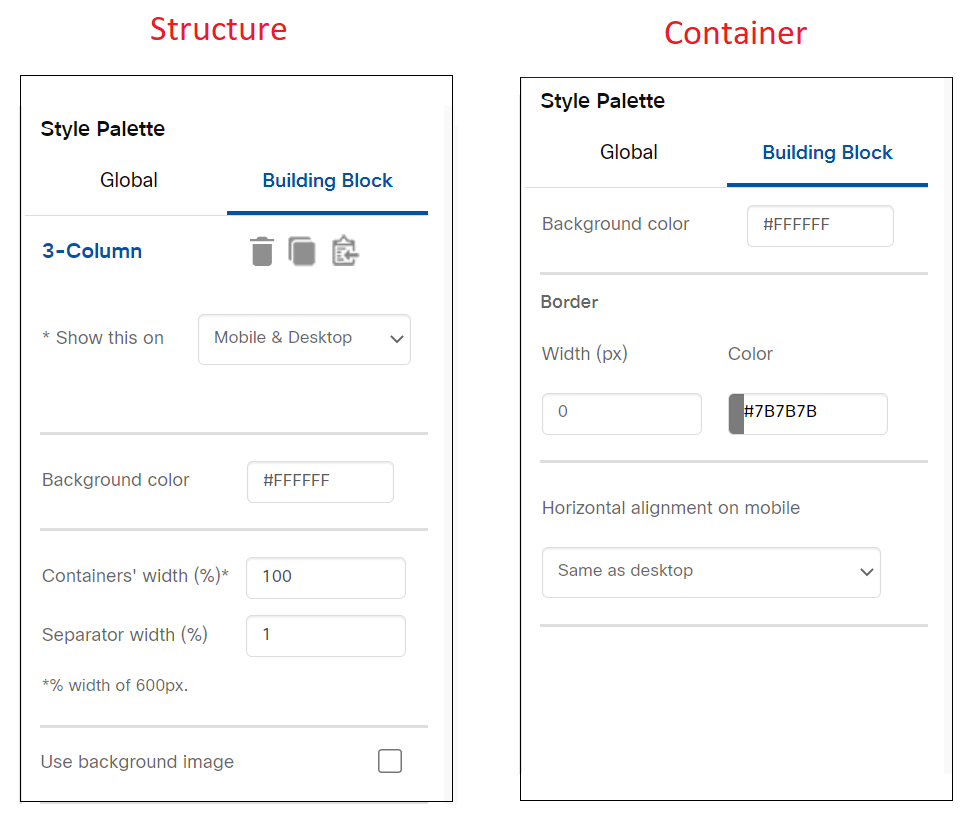
You can configure the following properties for a 3-Column Structure:
| Container Properties | Structure Properties |
|---|---|
| Background color | * Show this on |
| Border | # Show this on |
| Horizontal alignment on mobile | Background color |
| Containers' width (%) | |
| Separator width % | |
| While Rendering on Mobile * Use background image |
4 Column Structure
A 4-Column structure is a layout block with 4 containers that allows you to add multiple blocks in each container such as Image, Text, Button, Button (100%), and Spacer.
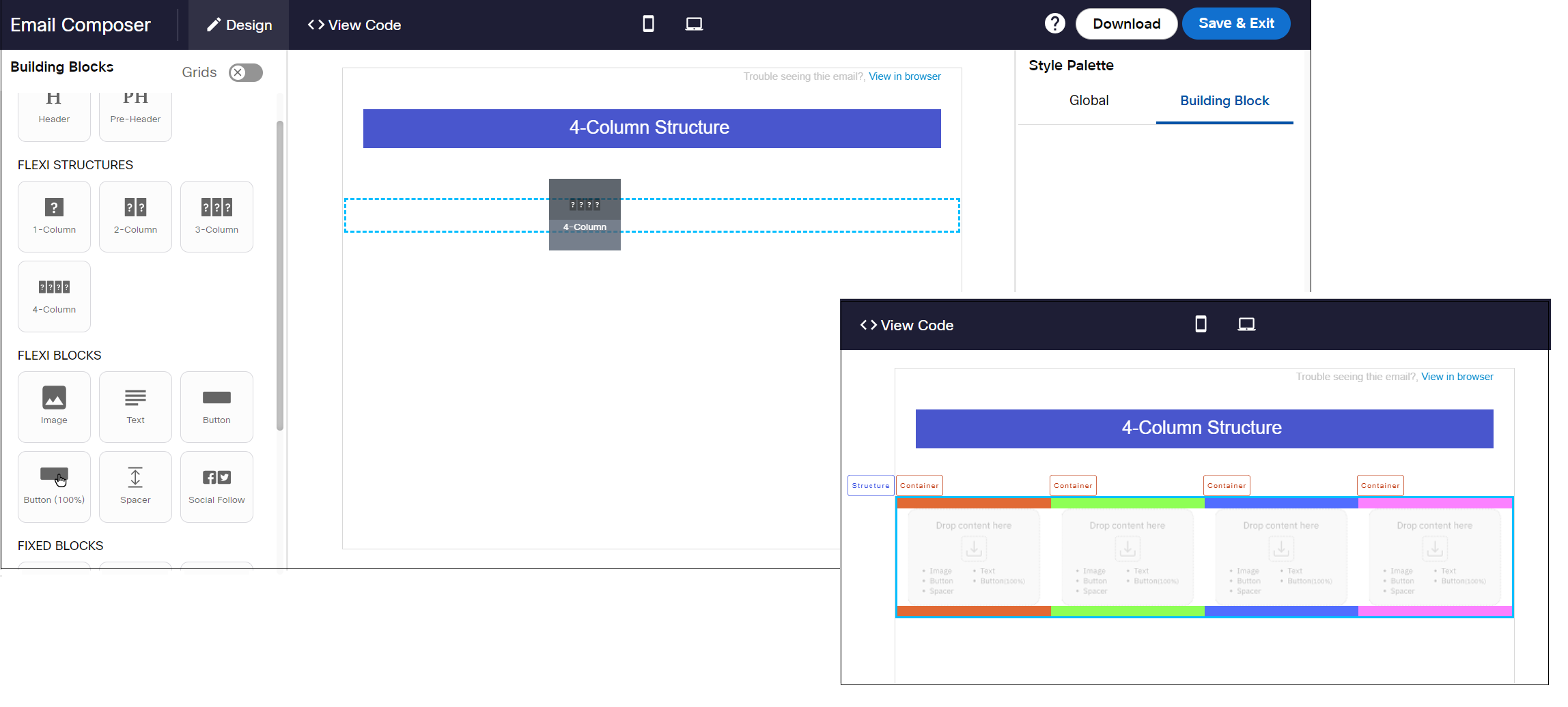
The behavior of this block is the same as 3-Column block, that is all the columns are stacked in mobile devices.
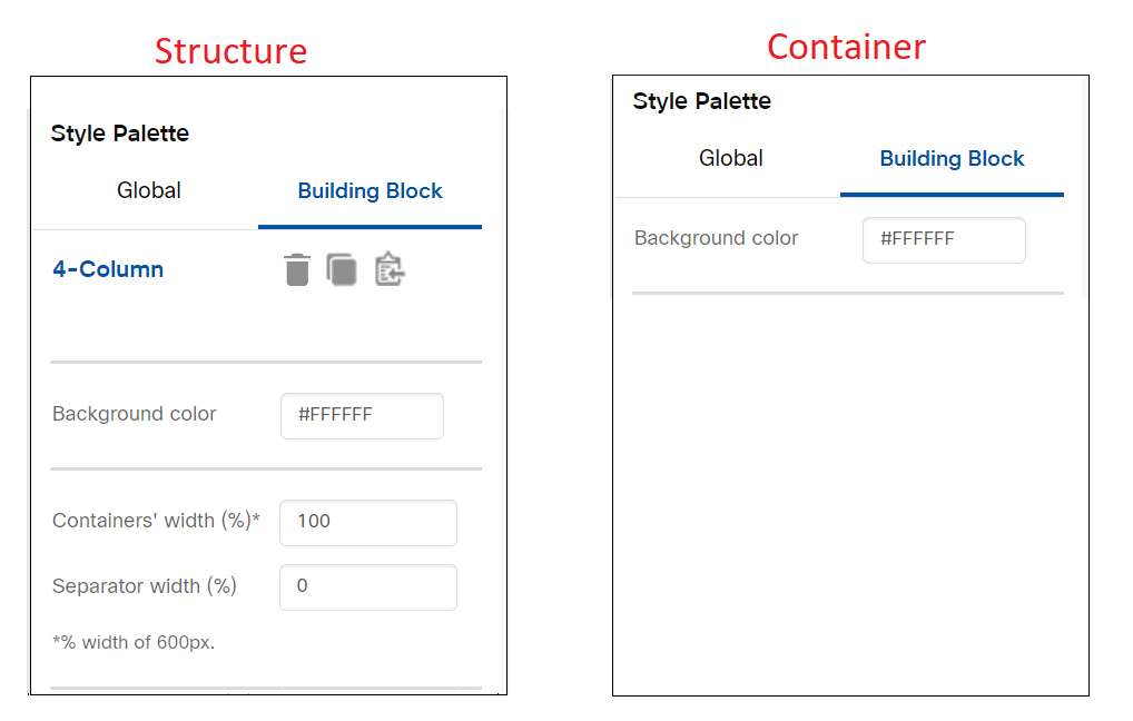
Properties
You can configure the following properties for a 4-Column structure:
| Container Properties | Structure Properties |
|---|---|
| Background color | # Show this on |
| Background color | |
| Containers' width (%) | |
| Separator width (%) |
Updated 5 months ago