

Flexi Blocks
The Flexi Blocks help you design the content of your landing page. Using these blocks you can add text, buttons, and images in Flexi Structure blocks. The Flexi blocks cannot be added directly on the Workspace. You have to add any of the Flexi Structure blocks to add the Flexi Block.
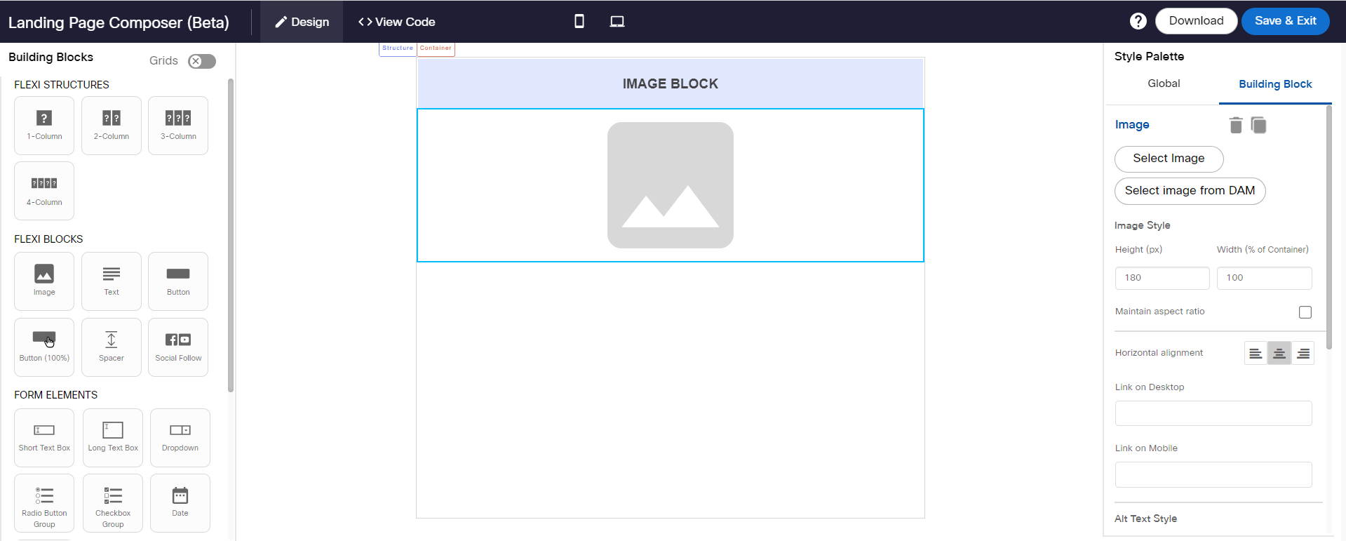
Image Block
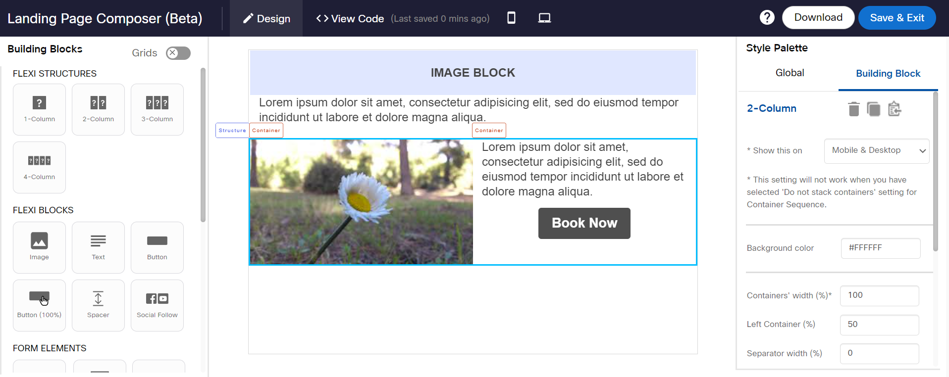
An Image block is used to add an image inside a Flexi structure. It occupies 100% width of the container. To change the background color for the block, click on Container label and set the desired Background color from the Style Palette. It cannot be drag and dropped outside the flex container. It occupies 100% width of the container.
The background color option will not be displayed without selecting the container label. The Background color option will only be displayed on selecting the container label.

Properties
Usage notes:
- All the asset types to be selected will be of ‘Image’ type and the formats supported for the image will be .jpg, .jpeg, .png, .gif, .bmp, and .svg.
- On the left panel, you will see the folder structure and will be able to expand/collapse specific folders. Canto folders and albums can be distinguished by their different icons on the left panel.
- On the right panel, you will be able to see thumbnails of the images – with the following additional info about each image also shown:
a. Image name
b. Asset type and file extension
c. Image size
d. Date uploaded
e. Date modified on
f. Approval status
g. Image width & height dimensions (in pixels) - You can search for the image by filename, description, comments, author, and tags. You can just enter the keywords and select the fields in which you would like to search for the entered keyword.
- You can optionally select the ‘Exact match’ checkbox.
- Desktop image will be used for mobile rendering if a separate image is not selected when displaying the email on a mobile device.
- Images for desktop and mobile must be selected from the same folder or from the results of the same search criteria.
Text Block
A Text block is used to add text inside a structure block. A Text block cannot be dragged and dropped outside the structure.
The default text settings are as follows:
| Text Setting | Default Value |
|---|---|
| Font Family | Arial |
| Text Color | # 333333 |
| Font Size | 12px |
| Line height | 20px |
The limitations of Text block:
- To change the bullet style, select the entire text, including the bullets and then change the style.
- Bullets within bullets are not supported (sub-bullets for bullet points).
- To apply Line Height, select the entire text and then apply the desired line height. You cannot apply different line heights for different parts of text in a single text block.
- To apply both Link and Underline to a text, select the text and apply an underline to it, and then apply the desired link. If you apply in reverse order it might not work properly in the Outlook Desktop app.
- When you apply text color through a color picker pop-up the recently used colors will be added automatically to the color palette. They are stored in the browser cache. Once the cache is cleared, the colors will also be cleared from the color picker.
- When you add custom color in the color palate grid, it will add up to 10 custom colors. While adding after 4-5 custom colors, then the ‘custom-color’ button changes its position.
Properties
Button Block
A Button block is used to add a button inside a Flexi container. A Button block cannot be drag and dropped outside the flex container. The Button alignment can be set using the Style Menu.
Properties
Button (100 %)
This block is the same as a Button Flexi block. The only difference is when a link is added for a Button Flexi, only the text part is clickable, whereas for Button Flexi (100%) entire button area is clickable.

To add a link, select the button and enter the URL in the style palette.
Usage Notes:
- While rendering in the Outlook Desktop client, if top or bottom padding is not applied then right and left padding will not render. If top/bottom is applied then Outlook will adjust right and left padding automatically.
Properties
Spacer Block
A Spacer block is used to add a space between the blocks in a Flexi structure. A Spacer block cannot be drag and dropped outside the flex structure.
Properties
Social Follow Block
Social Follow block allows you to configure your company's social media sites. For example, you can provide links to your Facebook page, Twitter handles, etc. A Social Follow block cannot be drag and dropped outside a Flexi Structures.
To add a Social block, follow these steps:
- Drag and drop a Social Follow block inside the 1-Column or 2-Column structure.
- Click on the Properties icon. The Social Follow Settings screen appears.
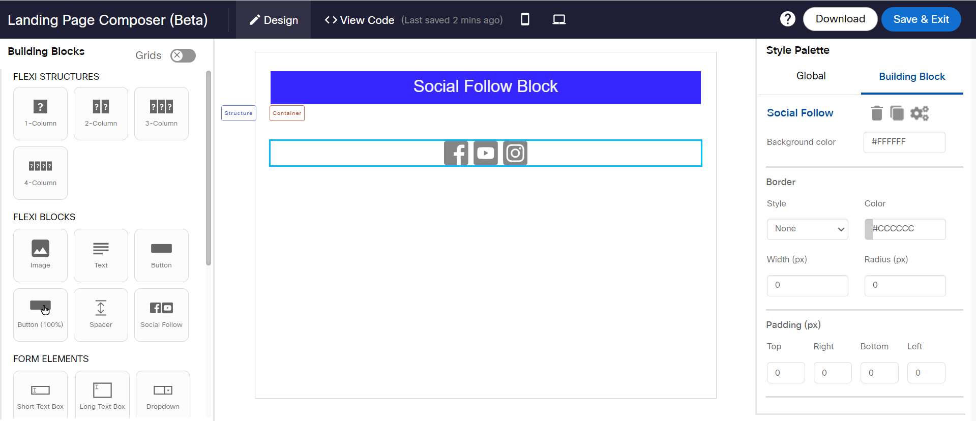
- Click on the icon and select an image for the respective Social Network. There is no size restriction for the images you select. The default height of the icon is 30px. If you select a large-size image, the height will be resized to 30px by maintaining the aspect ratio. You can change the height up to 80px. If you select an image for desktop, it will be automatically applied to mobile. You can also configure separate images for desktop and mobile devices.
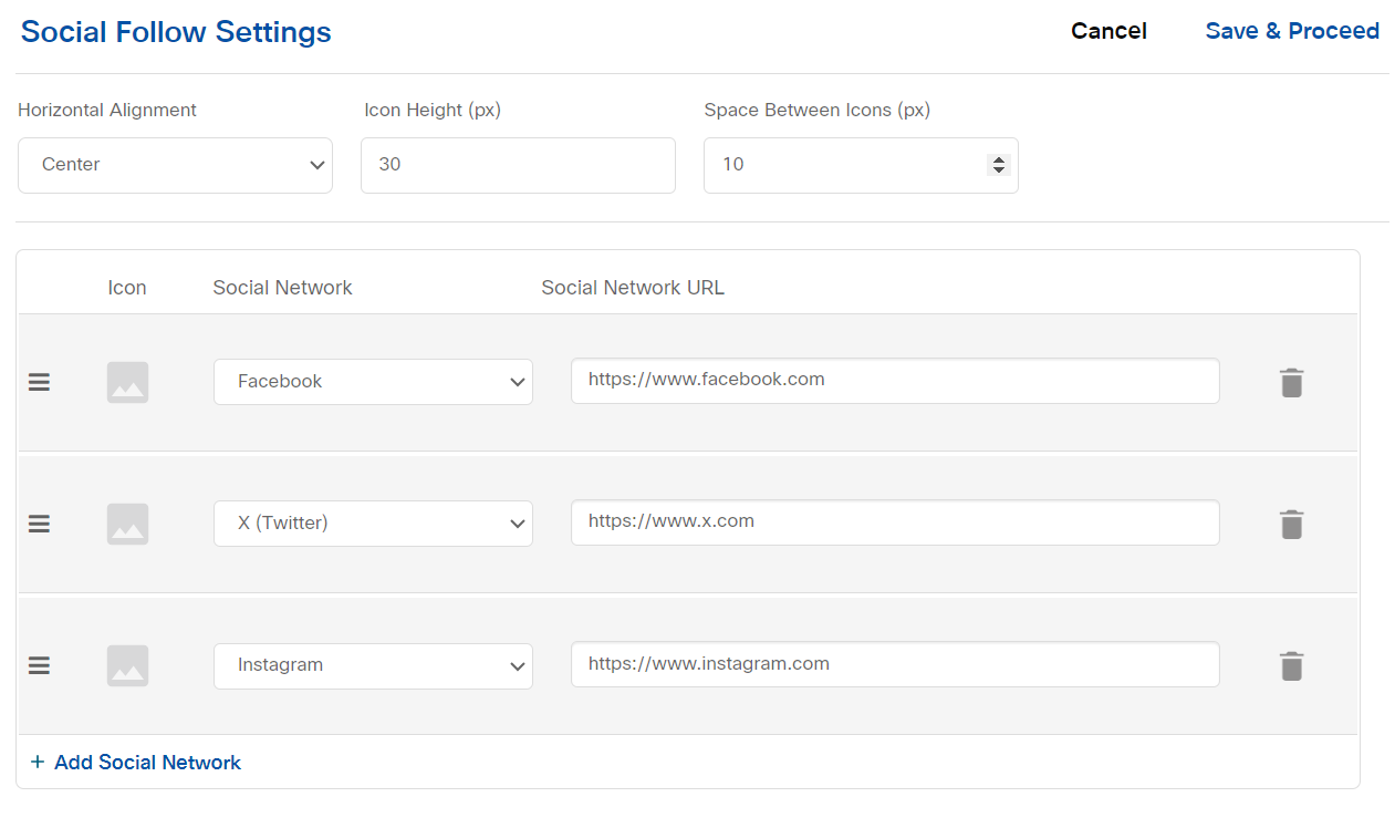
- Click + Add social network to add more Social Network links. You can change the order of the icons using 3 horizontal lines icon. You can specify the space between the icons. The maximum space between the icons is limited to 80px.
- Click Save & Close.
You can configure up to 5 social networks.
Usage Notes:
- This block cannot be added in a 3 column Flexi layout.
- Social network icons should be in a single line in desktop preview and mobile preview, otherwise, icons may render unevenly spaced in the final HTML.
- Icons used should have similar dimensions.
- Minimum value of ‘Icon Height’ is 15px.
- Maximum value of ‘Space between icons’ is 80px.
- The placeholder social follow icons only appear in design view but will not render in Desktop/Mobile preview or final HTML.
Properties
Updated over 1 year ago