

Applying Style Elements to Landing Page
The Style Palette has two tabs. The properties in the Global tab are applicable to the entire page. For example, if you set the background color for the page, then it is applied to the entire page. Whereas the properties in the Building Block tab are applicable for the respective block. For example, if you set a background color for a Button, then it is applied only to the button.

Global Properties
Color Scheme
Select a color schema applied to the landing page. These schemas are preset with page color, font color, foreground, background color, etc.
If none of the schemas is matching with your design color scheme, you can design your own color scheme.
Page Color
-
Background: Used to set the background color for the page. The page color may not work for all mobile devices. After you apply the page color, we recommend you check the inbox preview for mobile devices before sending the campaign.
-
Foreground: Used to set the background color for all building blocks. When this option is set, the selected color will be applied to all the building blocks on the Design Editor.
Page Width (px)
Used to set the page width. The default page width is 600 px.
Font Color
Used to set the default font color for all text blocks.
Page Title
Used to set a title for the browser which is displayed on the browser tab when an email is viewed in the browser. The default text is “View in browser”. You can change this text as per your design template.
Form Style
The below settings are applicable for all blocks in the Form:
- Label Alignment: Used to set the text alignment of the form. The options are Left and Top.
- Label Width(%): Used to set the width between the label text and the text box. This property is applicable when the Label Alignment is set as Left. The Label will always occupy 100% Container's width when Label Alignment is selected as Top.
- Input Box Width(%): Used to set the width of the input box. The default value is 100%.
- Box Alignment: Used to set the alignment of the input box. This property is applicable when the input box width is less than 90%.

Building Block Properties
The options on the Style Palette changes based on the selected block.
Alt Text Style
Used to set the alternate text for an image. The alternate text is displayed only when the image is blocked by the email clients.
- Alt Text: Specifies the text to be displayed.
- Font Family: Specifies the font family of the text. The supported fonts are Ariel, Helvetica, and Times New Roman.
- Font Size: Specifies the font size of the text.
- Line Height: Specifies the line height of the text.
- Text color: Specifies the text color.
- Background Color: Specifies the background color for the block that is displayed only when the image is blocked by the email clients.
Limitations of Alt Text
- Some email clients do not support alt text.
- Some email clients may ignore the text style for alt text and render's the default text style.
The following table shows the list of email clients currently support styled Alt Text. Of course, this may change in the future as email inbox providers are continually updating their products.

When Alt Text settings are set for the image, you can preview them using the Hide images option appears for Mobile and Desktop previews.
To preview the Alt text settings:
- Click on the Desktop or Mobile preview.
- Click the View Alt Text checkbox that appears on the menu.

Below is an example of the Alt text settings configured for the images.

In Desktop preview images were hidden to show the Alt text.

Apply Custom Width on Mobile
This property allows you to configure different width for Button 100% on mobile devices. You can specify the % of the button-width that should be used to render on mobile devices. This is the % width with respect to the Containers’ width.
Apply different padding on mobile
This property allows you to apply different padding on mobile for the Text block. If you do not select this setting, then by default, both mobile and desktop email clients will have the same padding.

Apply different strikethrough color
When a text is applied with a strikethrough, then the color of the text is also applied for the strikethrough line. However, using this option you can apply different color for strikethrough line.

Apply Custom font
The Apply Custom font is a premium feature. It may not be available for all tenants. If you want to use these custom fonts, contact your account manager.
This feature allows you to apply a different font for a textbox. Click anywhere inside a textbox and locate Apply custom font property from the Style Palette.
Select the Custom font , a First fallback font and a Second fallback font from the respective drop-down list boxes. The First fallback font will be displayed in case a Custom font is not supported by the recipient devices. If the First fallback font is not supported, then the Second fallback font will be displayed. The supported fallback fonts are Ariel, Helvetica, Lucida, and Times New Roman.

Currently, custom fonts can be added from the back-end. That means you should place a request for adding the required custom fonts to your account manager.
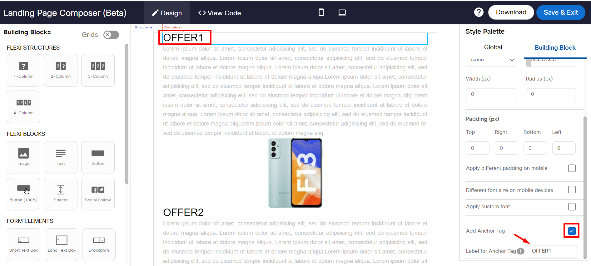
Add Anchor Tag
This option is used to create an anchor tag to a text. The anchor tag can be used to navigate to a header in the landing page based on the Target Group header value.
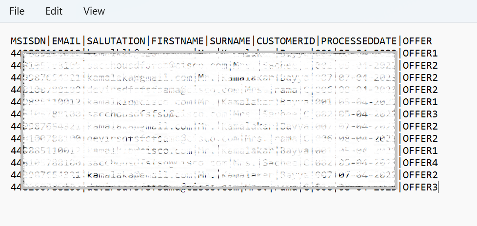
For example, if you have a landing page with different headers that represent offers such as OFFER1, OFFER2, OFFER3, OFFER4, etc. Your Target Group data should also have a header that should have the above-specified values.
You can send a link with a specific offer directly to a message recipient based on the header value of the Target Group, This will help you target the recipient with a suitable offer.
Below is a sample TG with some headers.
Select the text to which you want to apply an anchor tag. From the style palette, select the Add Anchor Tag checkbox and enter the tag for the selected text. The anchor tag value is case-sensitive.
Select the Global tab from the Style Palette and select the TG header that has the anchor tag values,

Click Save & Exit.
When you use the landing page link in your Email or SMS deployments, you will observe that the landing page URL is appended with the Target Group header that is selected in the landing page composer's Global tab. When the message recipient receives the message, the header will be replaced with the value that is present in the target group for the respective recipient.
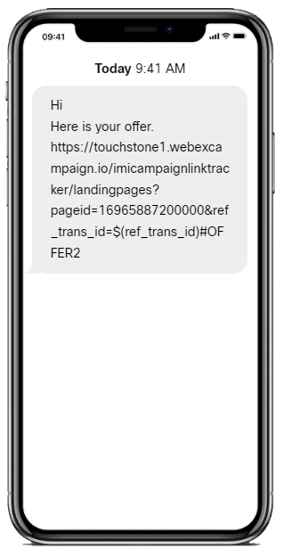
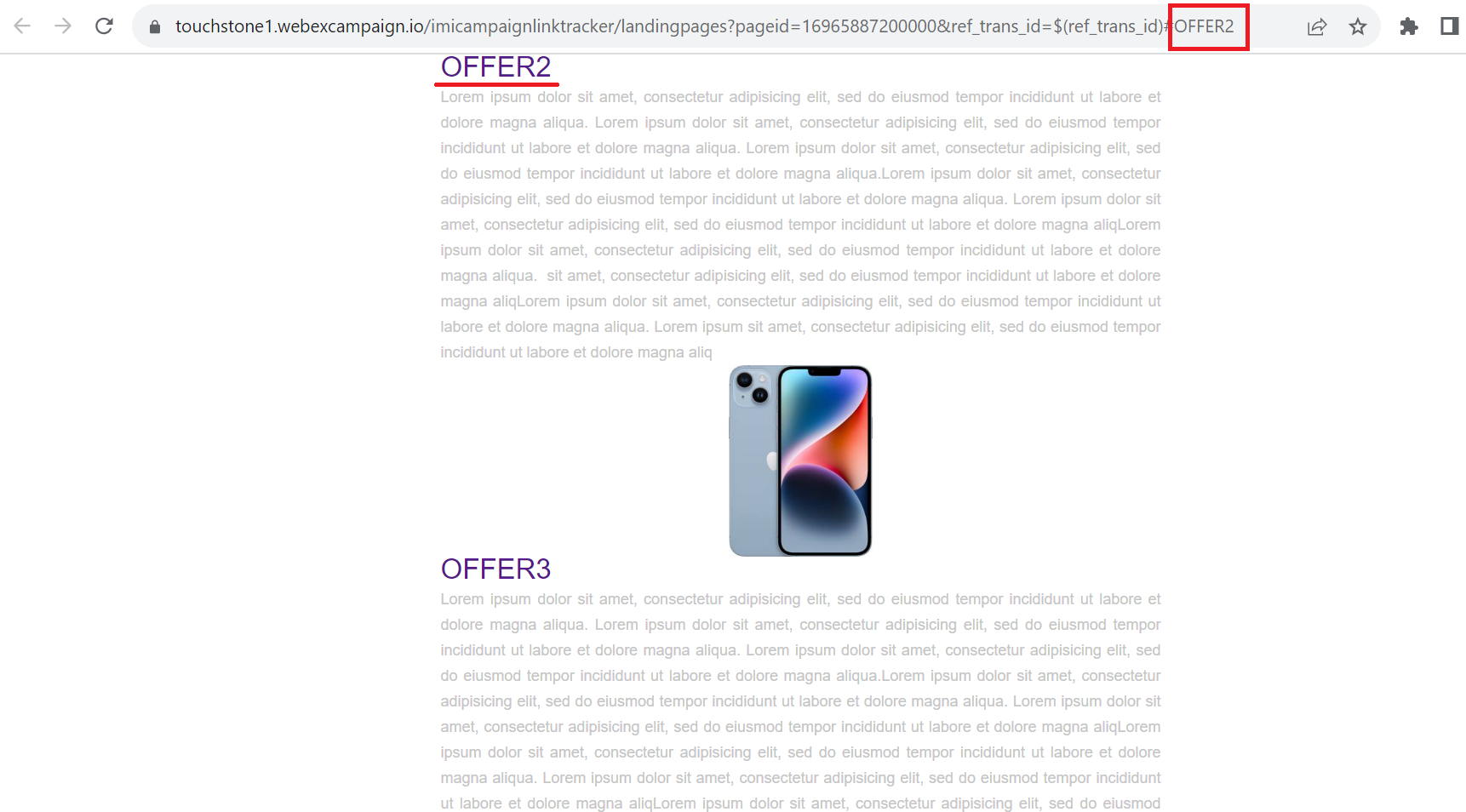
When the message recipients click on the link, they will be displayed with the anchor tag value that is present in the TG header.
Background color
Used to set the background color for the selected block.
Block width (%)
This property allows you to set the width of the table block. The default width of the block is 94%. You can change the block width as per your design. However, the width must be between 50% - 94%.
Border
The below properties are applicable for the table, Image & text, and image blocks. The border can be set individually to the top, bottom, left, and right sides. To set the style to all sides, select the checkbox and apply styles.
- Style: Used to set the style for the border. The options are Solid, Dashed, and Dotted.
- Color: Used to set the border color for the border.
- Width (px): Used to set the border width for border.
- Radius (px): Used to set the corner radius for the table border. This property is applicable only when you apply background color for a single table cell. This is a known limitation.
You can apply the ‘Radius’ option only if you select a single table cell and if you apply some Background Color for that cell.
If you want to use the ‘Radius’ option for each individual cell, then the other 3 border options are not applicable (i.e. Border Style, Border Color and Border Width should not be used in conjunction with the Radius option.
Usage Notes::
- For Flexi blocks, this feature is currently in ‘beta’ as we expect to introduce some enhancements in upcoming releases.
- For Flexi Structures such as 1-Column, 2-Column, and 3-Column, you can set Color and Width (px) for the border.
- Emails may not render properly on the Outlook Desktop email client if this setting is used; however, they will render correctly (as designed) on the Outlook App on mobile devices (both Android and iOS).
- The default width is set to 0px, so by default, no border will be applied.
Containers' width (%)
This option is displayed when clicked on the Structure label of a Column Structure. It is used to set the width of the container. The default option is 94 %.

Different font size on mobile devices
By default, the desktop font size will be rendered for mobile devices. If you want to apply a different font size for mobile devices, then use the Font size on mobile (px) option from the Style Palette.
To apply different font sizes on mobile devices:
- Select the Text block (the textbox border should show the teal color).
- From the Style Palette select the Different font size on mobile devices checkbox.
- Select the desired font size from the "Font size on mobile (px)" option. The new font size will be applied to all the text present in a Text block. You cannot apply a different font size for partial text using this option.
- Select the desired line height from the Line height on mobile (px) drop-down.

Desktop & Mobile Preview

Usage Notes:
- This option is currently only available for the ‘Text’ block.
- Line height will be 1.5 x the font size on mobile devices if this option is selected; e.g. if the font size for mobile devices is set to 20px, then a line height of 30px will be applied on mobile devices.
- Note that the Font size and the line height on Desktop devices will be applied as selected in the black floating toolbar.
Full width background color
This property is applicable for 1-Column and 2-Column structures. It is displayed on selecting the Structure label of the blocks. It is used to extend the background color to outside the design area of the container only if the Container width (%) property is set as 100%.

Style Palette settings for Full width background color for 2-Column.

Usage Notes:
- Background color of the ‘Structure’ will be inherited by the ‘Container’ if it is not overridden by the user by selecting another background color at the ‘Container’ level. In this case, the background color of the ‘Structure’ will be applied outside of the design area as well.
- There will be no change in the rendering of the template on mobile devices even if you use this option.
- For 2-Column structure, select each Container of the structure and apply different background colors to notice the effect.
Desktop & Mobile Preview

Horizontal Alignment on Mobile
This option allows you to set a mobile device-specific alignment for all blocks in a container. The Horizontal alignment on Mobile option is displayed in Style Palette when a container is selected for Flexi blocks.
For 2-Column block, if the Structure's property While Rendering on Mobile is set as Do not stack containers, then mobile-specific alignment will not be rendered. It must be set to either Right container on top or Left container on top.


Below is a screenshot to show how the alignment looks when the structure is set as Left container on top and previewed both on desktop and mobile devices.

Below is a screenshot to show how the alignment looks when the Structure's property While Rendering On Mobile option is set as Do not stack containers and Horizontal Alignment for containers is set as Left and Right respectively and previewed both on desktop and mobile devices.

Horizontal alignment
This option is used to set the alignment position for Button and Button (100%) blocks. You can change the alignment to left, center, or right as per your use case. The default alignment of the button is center.

Desktop and Mobile Preview

Image Style
The below properties are applicable for image blocks.
- Height (px): Used to set the default height of the selected image.
- Width (% of Container): Used to set the width of the selected image.
Link
This property allows you to add a link for the button (100%) block.
Link on Desktop
This property allows you to add a link for the image block on Desktop.
Link on Mobile
This property allows you to add a link for the image block on Desktop
Left Container (%)
This property is displayed when clicked on the Structure label of a 2-Column block. This property is used to set the width of the left container.
Maintain aspect ratio
This property allows you to resize the image by maintaining the ratio between the image Width and Height. For example, if the image size is 200 px and 140 px and if you change the height of the image to 100, then the height will be automatically changed to 70px. This will maintain the quality of the image. If the image size is changed without the aspect ratio, then the image may get distorted.
Image Height and Width changed without enabling the Maintain aspect ratio.

Image Height and Width changed by enabling the Maintain aspect ratio.

Mouseover text
This property allows you to add mouseover text for Button block.

Padding (px)
Used to set the padding for the selected blocks except for image blocks.
Separator width (%):
This property allows you to set a width for the separator. The default value is 1%. You can change this to anything between 0 to 5.
For 3-Column and 4-column Structures, the Separators between two Containers will have the same width as per the input of this setting.
*Show this on
This property allows you to show or hide 1-Column, 2-Column, and 3-Column structures on Desktop or Mobile. By default, the structure is displayed on both Desktop and Mobile devices. You can use this property to show mobile-specific content for mobile users.
The blocks Button, Button 100%, and Social Follow added in 1-Column structure do not respect Padding property when Show only on Mobile property is enabled. The Padding is applied for Android & iOS Outlook apps and will not be applied on Android & iOS Gmail Apps & Native App.

Spacer height (px)
This property allows you to specify the height of the spacer. The default height is 24px. You can change the height as per your requirement.
Styling options
This property allows you to apply style to the submit button text such as bold, italic, or underline.

Text Style Palette
Used to set the style elements such as text size, font, text alignment, table style, and so on.
On Mobile
This option is used to stack which container on top of the other on mobile devices. The options are:
- Left container on top The left container will be stacked on top of the right container.
- Right container on top: The right container will be stacked on top of the left container.
- Do not stack containers: Both the containers are shown side by side.

Using Background Image
This property allows you to insert an image as a background for the following building blocks.
- Table
- 1-Column
- 2-Column
- 3-Column
Background images may not render properly (or not at all) in all the email clients. Hence test thoroughly using our Inbox Preview and also by sending to test contacts. For devices /email clients which do not render background images correctly, you should apply an appropriate ‘background color’ such that the overlaying text is properly legible on that background color.
Currently, it is not possible to render a different background image for mobile devices.
Image size: Used to set the size of the image. The options are:
o Auto: Select this option to display the image in its original size.
o Contain: Select this option to resize the image to make sure the image is fully visible.
o Cover: Select this option to resize the image to cover the entire container, even if it has to
stretch the image or cut a little bit off one of the edges.
o Custom: Select this option to set the width and height of the image in percent of the block.

Vertical alignment: Used to position the image vertically.
o Top: Select this option to position the image at the top of the block.
o Center: Select this option to position the image at the center of the block.
o Bottom: Select this option to position the image at the bottom of the block.
Horizontal alignment: Used to position the image horizontally.
o Left: Select this option to position the image at the left of the block.
o Center: Select this option to position the image at the center of the block.
o Right: Select this option to position the image at the right of the block.
Repeat Image: Used to repeat the image.
o No: Select this option to not to repeat the image. The image is shown only once.
o Horizontally: Select this option to repeat the image horizontally.
o Vertically: Select this option to repeat the image vertically.
o Both: Select this option to repeat the image both horizontally and vertically.

The following table shows whether the Background Image feature is supported in various popular email clients:

Updated over 1 year ago