

Fixed Blocks
The Fixed Blocks help you design the content outside the Flexi Structure blocks. That means you need not add a Flexi Structure to use these blocks. These blocks can be added directly on the Workspace.
Spacer Block
This block is used to add a space between two Structure blocks. When a spacer is used the blocks are separated by 24px. This is the default value. You can change the spacer height as per your need.
Properties
Conditional Block
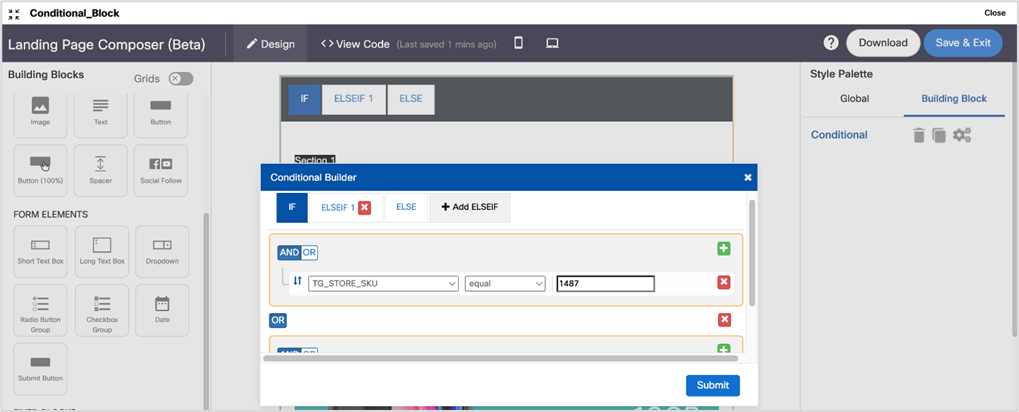
You can add conditions to show specific content that satisfies the condition. Add a conditional block using drag and drop, from the left side menu only. When you add a block in the Conditional block, it should be dropped inside the solid orange border. You cannot move a block into a Conditional block on the workspace. If you are unable to add or delete images within the block, then you have to add any other building block (dummy block) on the Conditional block. This will refresh the Conditional block which will display the blue selector links. You can delete the newly added building block.
You can add the ‘OR’ operation between 2 sets of conditions. You can create expressions such as (Condition1 AND Condition2) OR (Condition3 AND Condition4) within a single ELSEIF Condition.
You can only add one such ‘OR’ condition within an ELSEIF condition.
A conditional block may not work if it is created using other methods.

Usage notes:
- To be able to use the ‘Conditional’ block, you must have associated the landing page with either a target group or an event, so that either a TG header or an event parameter can then be used in the ‘if-else-elseif’ conditions.
- Drag and drop the ‘Conditional’ block from the ‘Fixed blocks’ collection in the left panel onto the central design canvas.
- Click on the ‘settings’ (gear) icon in the right panel.
- Select the ‘TG header’ or ‘event parameter’ from the first dropdown on the ‘IF’ tab.
- Select the conditional operator from the second dropdown, e.g. ‘equal’, ‘not equal’ etc.
- Enter the comparison value in the text entry field.
- You may optionally combine this first condition with additional conditions using AND/OR operators.
Usage Recommendations and limitations:
- You can add up to 15 ELSEIF conditions in a Conditional building block. Overall 120 ELSEIF conditions can be added to a template. For example, you can add 8 Conditional blocks with 15 conditions in each or 10 Conditional blocks with 12 conditions in each.
- You cannot add a conditional block inside another conditional block.
- You should add all conditions before clicking Submit. Alerts or errors are not displayed for ELSEIF conditions that are not configured after adding them. You have to verify each ELSEIF condition for missing configuration.
- While creating a template, if a Target Group (Personalization Reference) is selected with certain headers and a conditional block is configured with the selected Target Group Headers, if you decide to change the Target Group, make sure the new Target Group also contains the same Headers as previous Target Group else the conditional block will not work as expected.
- If the template size is big, then the scroll button on the preview page becomes unresponsive. For example, for a template with 326 (Text and Button) blocks and with 77 conditions the template size is 991kb. It also takes up to 30 seconds to switch between the Design view and the HTML view. The time taken to switch between the Design view and the HTML view depends on the text blocks in a template. For example,
- A template with 80 Conditions, 50 Text & button blocks, and 30 Image blocks will take 3 seconds.
- A template with 80 Conditions, 20 Text blocks, and 60 Image blocks will take 1 second.
- A template with 70 conditions may take up to 10 seconds to save the template.
- A template with 80 Conditions, 50 Text & button blocks, and 30 Image blocks may take 5 seconds to open the template for editing.
- We have observed that the browser crashes when duplicating a block with 80 conditions and maximum content in each condition (2000+kb) and it also takes up to 15sec to duplicate the block.
- We have observed a slight delay in the drag & drop of new blocks and moving of the blocks(Size more than 500kb)
- Asset preview scrolling is a bit slow for the 80 conditions and maximum content combination(2000k+ kb)
- When a Conditional Block is copied, all the conditions configured for the original block will also be copied.
Adding a conditional block inside another conditional block is not supported.
Table Block
A Table block allows you to add a table. When you select the table block, a toolbar is displayed. Using the table icon on the toolbar, you can add the number of rows and columns and apply styles for the table. You can also add a table in other building blocks such as Text blocks and Image & Text blocks.

You can merge or split cells as required using the table properties. By default, the table borders are hidden. You have to set the table border as required in table properties. The table block will not render properly if the table properties are set incorrectly. It is your responsibility to verify the table properties and how it is rendered on the device.

Assigning Border Styles to Table Block:
You can assign styles such as border style, color, and width to blocks and individual cells of the table. You can apply styles to a particular side as well.
To apply border style to a particular side:
- Select the block or a table cell.
- Select the checkbox of the required style.
- Apply the desired style.
The style will be applied to the selected side.
To apply border style to all sides, select Apply to all sides checkbox and apply the desired style.
The individual border style options are only available for Table (textual) block.

Limitations of the Table block:
- Do not copy and paste the content from a browser into the table cell as it may not render properly.
- To apply a style to a cell, make sure the cell is selected. A selected cell border will be displayed in cyan color.
- After the styles are applied to multiple cells, if you select those cells again, then the right side Style Palette will not display the applied style values. The applied style values will be displayed only if you select a single cell at a time.
- Please use the mouse/touchpad to select multiple cells within the table. The use of keyboard arrow keys is not within the Table block of the email Composer.
- If you want to use the 'Radius' option for each individual cell, then the other 3 border options are not applicable (i.e. Border Style, Border Color, and Border Width should not be used in conjunction with the Radius option).
Properties
Footer Building Block
This block is used to add a footer. The unsubscribe link in the footer does not add the customers to DND list or unsubscribe list. You have to provide a URL to a landing page that handles unsubscribe functionality which is not part of the Webex Campaign.'