Form Elements
The form elements are used to design a form in which the end users can fill in the details requested in the Landing Page. Following are the blocks for Form:
Date
A date element allows a user to enter a date such as “Date of Birth” in the landing pages.
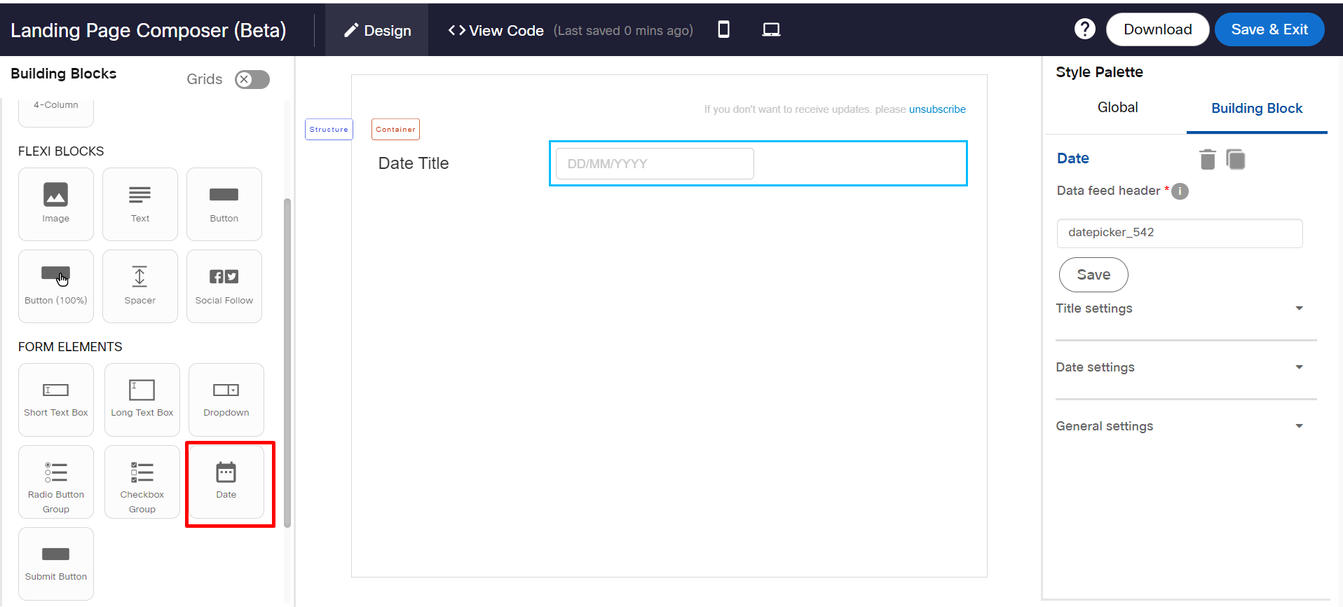
Follow these steps to add a Date element on the form:
- From the Building Blocks palette, drag and drop a 1-Column or 2-Column Structure.
- Drag and drop a Date element in the structure.
- Select the Date element. The Date settings appear in the Style Palette.
- (Optional) Enter a header name and click Save, to define the header name for the data collected for fields via Landing Pages.
Following are the properties of Date:
Apply custom font
This feature allows you to apply a different font for the text of a form element. Click anywhere inside a text of a form element and locate Apply custom font property from the Style Palette.
Click here for more information.
Title Settings
You can add and change the style of the title text. The options are:
- Title: This property allows you to enter text for the title.
- Text color: This property allows you to change the title text color.
- Font Size: This property allows you to change the font size.
- Font family: This property allows you to change the font family.
- Horizontal alignment: This property allows you to set the horizontal alignment.
- Styling options: This property allows you to apply style for text such as underline, Bold, or Italic.
Date Settings
Date format: Select the date format. The options are MM/DD/YYYY, DD/MM/YYYY, and MMM-DD-YYYY.
Required Field
Select the check box to make this field mandatory.
Dropdown
A dropdown element allows a user to select an option from the given choices. You can add up to 10 options in a dropdown.
Only 3 dropdown elements can be added in a form.
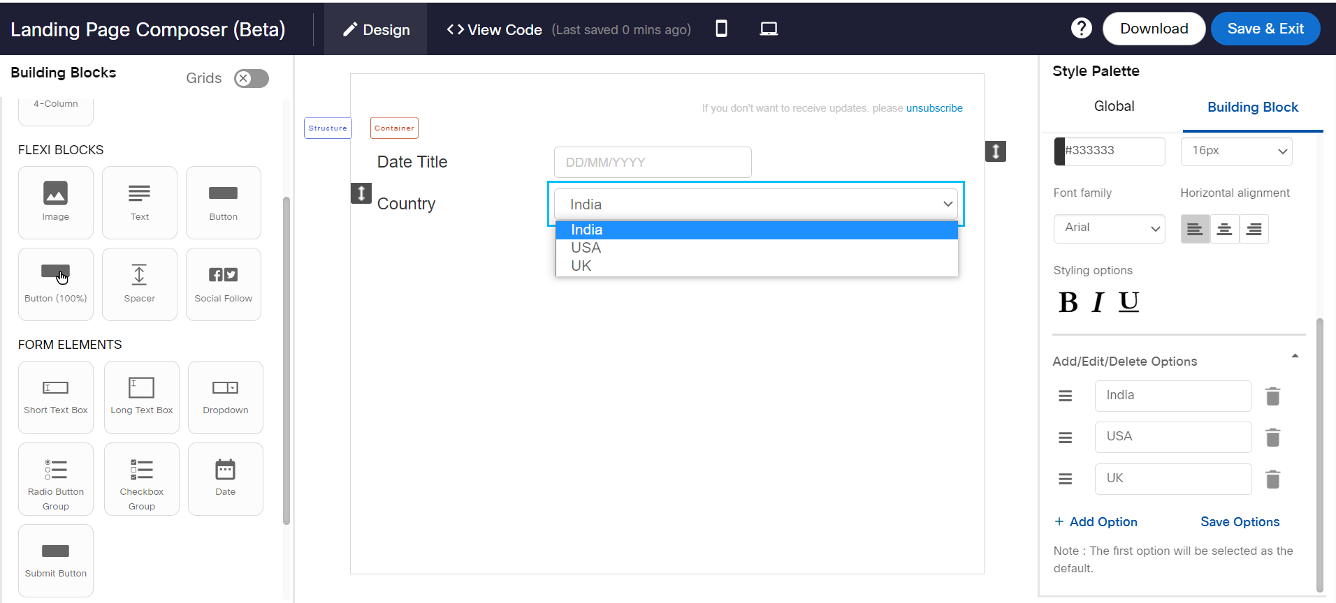
Follow these steps to add a dropdown in the form:
- From the Building Blocks palette, drag and drop a 1-Column or 2-Column Structure.
- Drag and drop a Dropdown element in the structure.
- Select the dropdown block and click Settings from the Style Palette. The Dropdown settings appear. By default 2 options will be displayed.
- To add more options, click +Add Option enter the text. You can add up to a maximum of 10 options.
- Click Save Options.
- (Optional) Click the Delete icon to delete an option.
- (Optional) To change the order of the option, drag the icon and drop it at the required position.
- (Optional) Enter a header name and click Save, to define the header name for the data collected for fields via Landing Pages.
Apply custom font
This feature allows you to apply a different font for the text of a form element. Click anywhere inside a text of a form element and locate Apply custom font property from the Style Palette.
Click here for more information.
Title Settings
You can add and change the style of the title text. The options are:
- Title: This property allows you to enter text for the title.
- Text color: This property allows you to change the title text color.
- Font Size: This property allows you to change the font size.
- Font family: This property allows you to change the font family.
- Horizontal alignment: This property allows you to set the horizontal alignment.
- Styling options: This property allows you to apply style for text such as underline, Bold, or Italic.
Add/Edit/Delete Options for a Dropdown
To add options in the Dropdown:
- Select the Dropdown element and expand Add/Edit/Delete Options in the style palette.
- Enter the desired text for the options.
- To add more options, click +Add Option and enter the text. The topmost option will be the default selected option.
- To change the order of the options, select the required option icon and drop it above or below the other options.
- Click Save Options.
- (Optional)To remove an option, click on the Remove icon of the required option.
Long Text Box
A Long Text Box allows a user to add long text up to 500 characters. Only 3 Long Text Box elements can be added in a form.
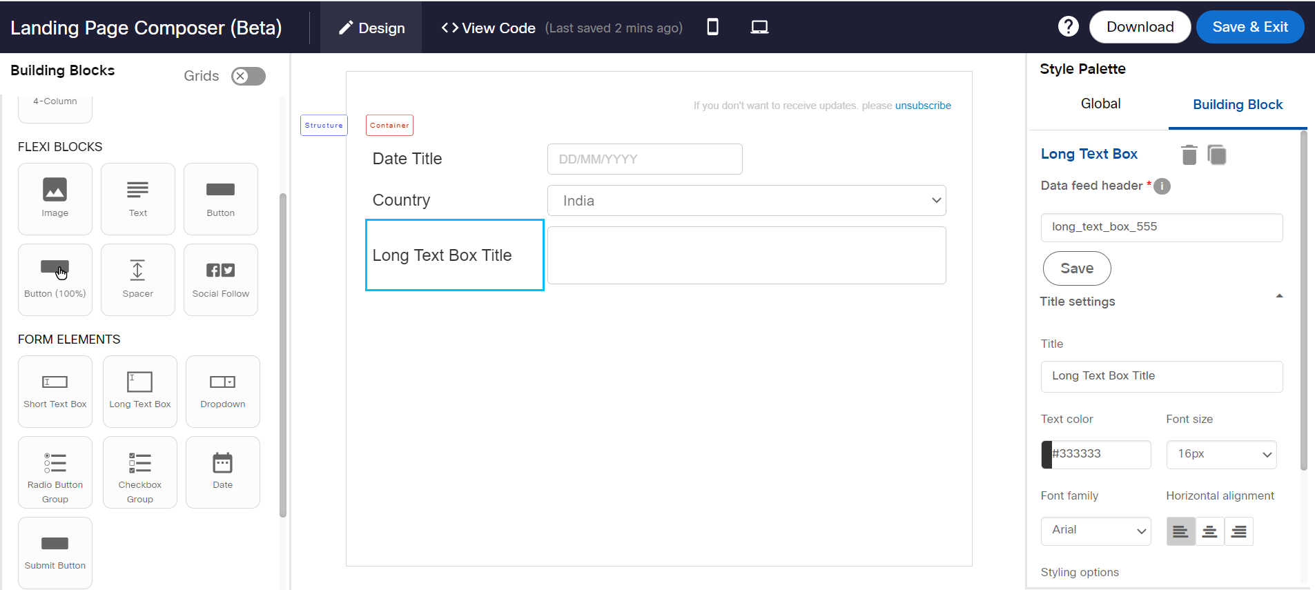
Follow these steps to add a Long Text Box in the form:
- From the Building Blocks palette, drag and drop a 1-Column or 2-Column Structure.
- Drag and drop a Long Text Box element in the structure.
- Select the Long Text Box element. The Long Text Box settings appear in the Style Palette.
- (Optional) Enter a header name and click Save, to define the header name for the data collected for fields via Landing Pages.
Following are the properties of Long Text Box:
Apply custom font
This feature allows you to apply a different font for the text. Click anywhere inside a text and locate Apply custom font property from the Style Palette.
Select the Custom font , a First fallback font and a Second fallback font from the respective drop-down list boxes. The First fallback font will be displayed in case a Custom font is not supported by the recipient devices. If the First fallback font is not supported, then the Second fallback font will be displayed.
The supported fallback fonts are Ariel, Helvetica, Lucida, and Times New Roman.
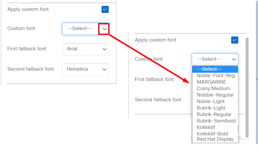
Currently, custom fonts can be added from the back-end. That means you should place a request for adding the required custom fonts to your account manager.
Title settings
You can add and change the style of the title text. The options are:
- Title: This property allows you to enter text for the title.
- Text color: This property allows you to change the title text color.
- Font Size: This property allows you to change the font size.
- Font family: This property allows you to change the font family.
- Horizontal alignment: This property allows you to set the horizontal alignment.
- Styling options: This property allows you to apply style for text such as underline, Bold, or Italic.
Placeholder text
Enter a short text for users to describe what to enter in the field. A maximum of 50 characters are allowed for placeholder text.
Required field
Select the check box to make this field mandatory.
Short Text Box
A Short Text Box allows a user to add short text up to 50 characters. Only 5 Short Text Box elements can be added in a form.
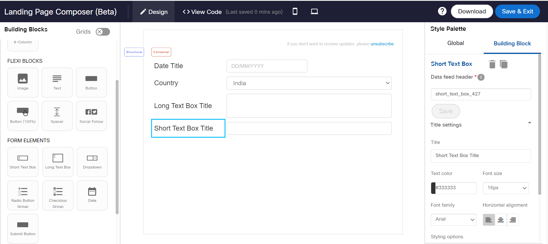
Follow these steps to add a Short Text Box in the form:
- From the Building Blocks palette, drag and drop a 1-Column or 2-Column Structure.
- Drag and drop a Short Text Box element in the structure.
- Select the Short Text Box element. The Short Text Box settings appear in the Style Palette.
- (Optional) Enter a header name and click Save, to define the header name for the data collected for fields via Landing Pages.
Following are the properties of Short Text Box:
Apply custom font
This feature allows you to apply a different font for the text of a form element. Click anywhere inside a text of a form element and locate Apply custom font property from the Style Palette.
Click here for more information.
Title Settings
You can add and change the style of the title text. The options are:
- Title: This property allows you to enter text for the title.
- Text color: This property allows you to change the title text color.
- Font Size: This property allows you to change the font size.
- Font family: This property allows you to change the font family.
- Horizontal alignment: This property allows you to set the horizontal alignment.
- Styling options: This property allows you to apply style for text such as underline, Bold, or Italic.
Placeholder Text
Enter a short text for users to describe what to enter in the field. A maximum of 50 characters are allowed for placeholder text.
Required Field
Select the check box to make this field mandatory.
Field Type
Select an option to restrict users to enter a certain type of text. For example, if you want to allow a numeric value for Age, then select the Numeric option. The application will automatically validate and shows an error if the text entered is not a number.
The Field Type restriction can be tested on a hosted landing page in Preview mode.
Submit Button
A Submit Button is used to submit a form. Only 1 Submit button is allowed in a form.

Follow these steps to edit the default label of the button:
- From the Building Blocks palette, drag and drop a Structure.
- Drag and drop the Submit button element in a Structure.
- Select the button and click Settings from the style palette. The Submit Button Settings screen appears.
- Enter a text for the submit button.
- Select an option to redirect your visitors to a landing page or show a successful completion page.
- Click Save & Proceed.
Properties
Following are the properties of Submit Button:
- Text color: This property allows you to change the button text color.
- Font size: This property allows you to change the button font size.
- Font family: This property allows you to change the button font family.
Radio Button Group
A Radio Button Group is used to add single-choice options in a form. You can add up to 5 options for each element. You can add up to 3 radio button groups in a form.
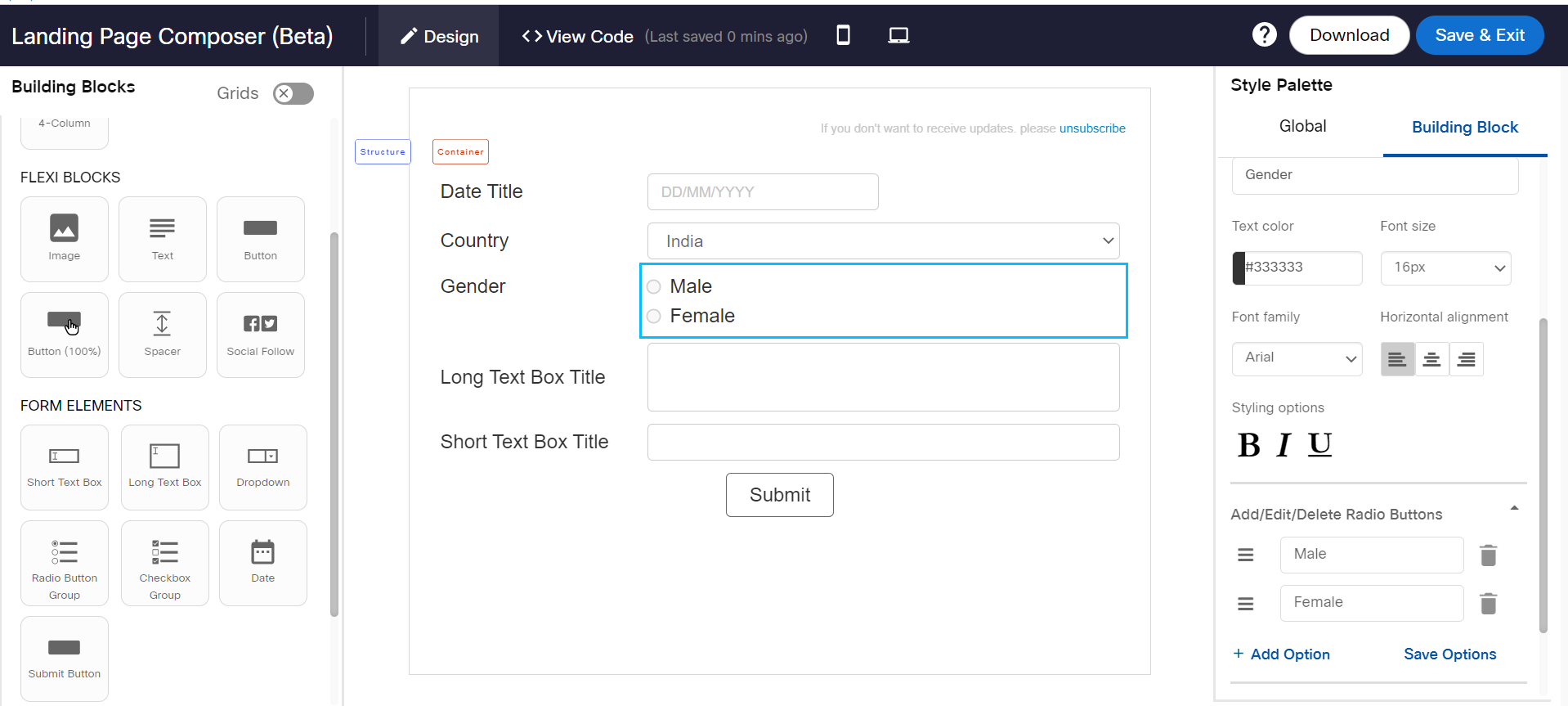
Follow these steps to add a radio button in the form:
- From the Building Blocks palette, drag and drop a 1-Column or 2-Column Structure.
- Drag and drop a Radio Button Group element in the structure.
- Select the Radio Button Group and click Settings from the Style Palette. The Radio Button Group settings appear. By default, 2 options will be displayed.
- To add more options, click +Add Option and enter the text. You can add up to a maximum of 5 options.
- Click Save Options.
- (Optional) Click the Delete icon to delete an option.
- (Optional) To change the order of the option, drag the icon and drop it at the required position.
- (Optional) Enter a header name and click Save, to define the header name for the data collected for fields via Landing Pages.
Follow these steps to add and edit the features of the Radio Button group:
Apply custom font
This feature allows you to apply a different font for the text of a form element. Click anywhere inside a text of a form element and locate Apply custom font property from the Style Palette.
Click here for more information.
Title Settings
You can add and change the style of the title text. The options are:
- Title: This property allows you to enter text for the title.
- Text color: This property allows you to change the title text color.
- Font size: This property allows you to change the font size.
- Font family: This property allows you to change the font family.
- Horizontal alignment: This property allows you to set the horizontal alignment.
- Styling options: This property allows you to apply style for text such as underline, Bold, or Italic.
Add/Edit/Delete Radio Buttons
To add options in the Radio Button:
- Select the radio button and expand Add/Edit/Delete Radio Buttons in the style palette.
- Enter the desired text for the options.
- To add more options, click +Add Option and enter the text.
- To change the order of the options, select the required option icon and drop it above or below the other options.
- Click Save Options.
- To remove an option, click on the Remove icon of the required option.
Radio Button Settings
You can change the text style of the radio buttons. The options are:
- Text color: This property allows you to change the radio button's text color.
- Font size: This property allows you to change the radio button's font size.
- Font family: This property allows you to change the radio button's font family.
- Styling options: This property allows you to apply style for the radio button's text such as underline, Bold, or Italic.
General Settings
- Hide Title: This property allows you to hide the radio button's title.
- Show radio buttons side by side: This property allows you to display the radio buttons horizontally.
Check Box Group
A Check Box Group is used to add single or multi-choice options in a form. You can add up to 5 options for each element. You can add up to 4 check box groups in a form.
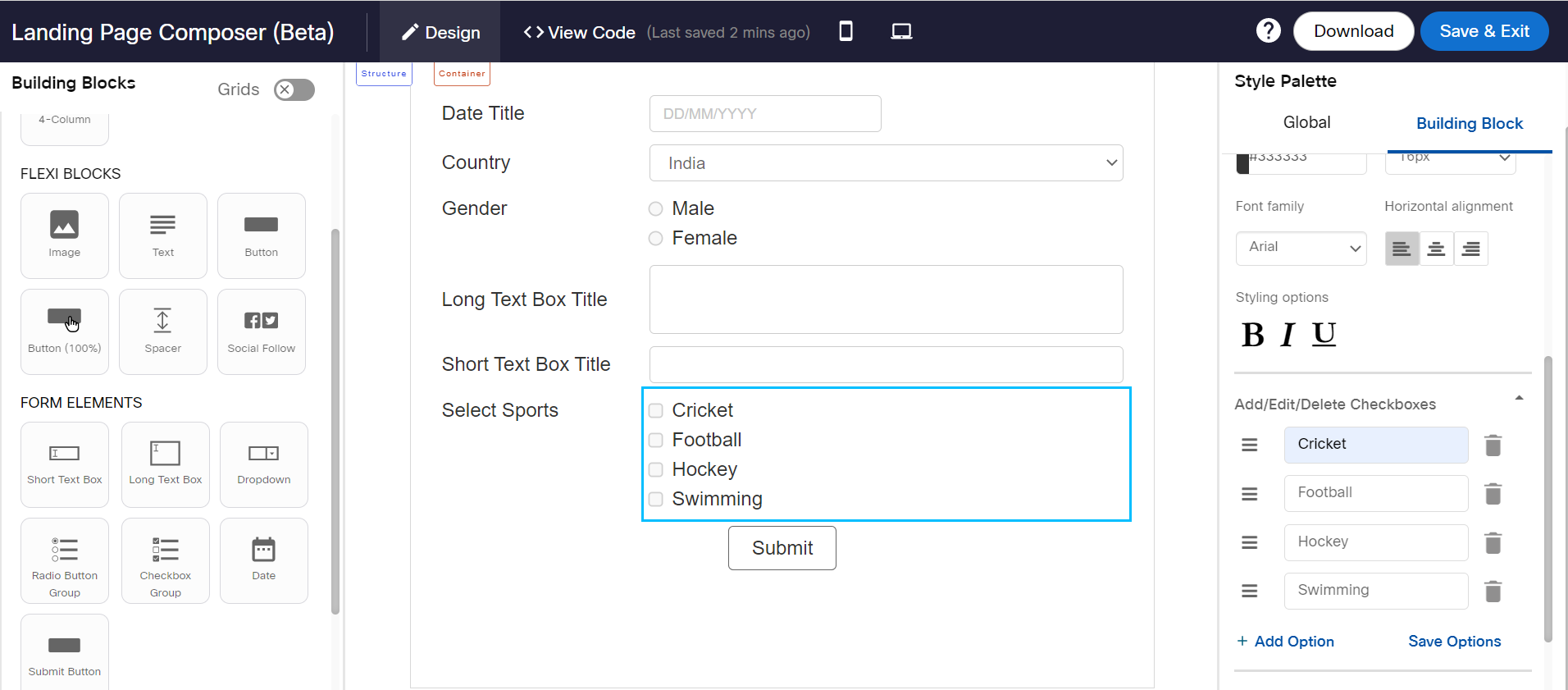
You can enter a header name and click Save, to define the header name for the data collected for fields via Landing Pages.
You can add and edit the features of the Check Box group:
Apply custom font
This feature allows you to apply a different font for the text of a form element. Click anywhere inside a text of a form element and locate Apply custom font property from the Style Palette.
Click here for more information.
Title Settings
You can add and change the style of the title text. The options are:
- Title: This property allows you to enter text for the title.
- Text color: This property allows you to change the title text color.
- Font size: This property allows you to change the font size.
- Font family: This property allows you to change the font family.
- Horizontal alignment: This property allows you to set the horizontal alignment.
- Styling options: This property allows you to apply style for text such as underline, Bold, or Italic.
Add/Edit/Delete Checkboxes
To add, edit, and delete the checkboxes:
- Select the radio button and expand Add/Edit/Delete Checkboxes in the style palette.
- Enter the desired text for the options.
- To add more options, click +Add Option and enter the text.
- To change the order of the options, select the required option icon and drop it above or below the other options.
- Click Save Options.
- To remove an option, click on the Remove icon of the required option.
Checkbox Settings
You can change the text style of the checkbox. The options are:
- Text color: This property allows you to change the checkbox text color.
- Font size: This property allows you to change the checkbox font size.
- Font family: This property allows you to change the checkbox font family.
- Styling options: This property allows you to apply style for checkbox text such as underline, Bold, or Italic.
General Settings
- Mandatory Field: When this property is selected, the option will become mandatory before submitting the form. That means the form cannot be submitted without selecting the checkbox.
- Hide Title: This property allows you to hide the radio button's title.
- Show radio buttons side by side: This property allows you to display the radio buttons horizontally.
Updated about 1 year ago