AMP Blocks
The AMP Blocks include the following blocks:
- Carousel
- Carousel with Text
- Accordion
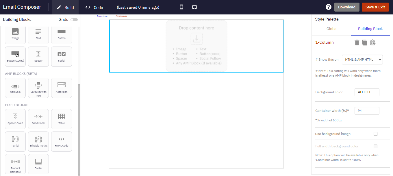
AMP blocks can be only added in 1-Column-Flexi structure.
Carousel
This block allows you to add up to 5 images that get navigated within the email.
Follow these steps to add an AMP Carousel block:
- From the Flexi Structures, add a 1-Column-block on the design canvas.
- From the AMP Blocks (Beta), add Carousel block in 1-Column structure.
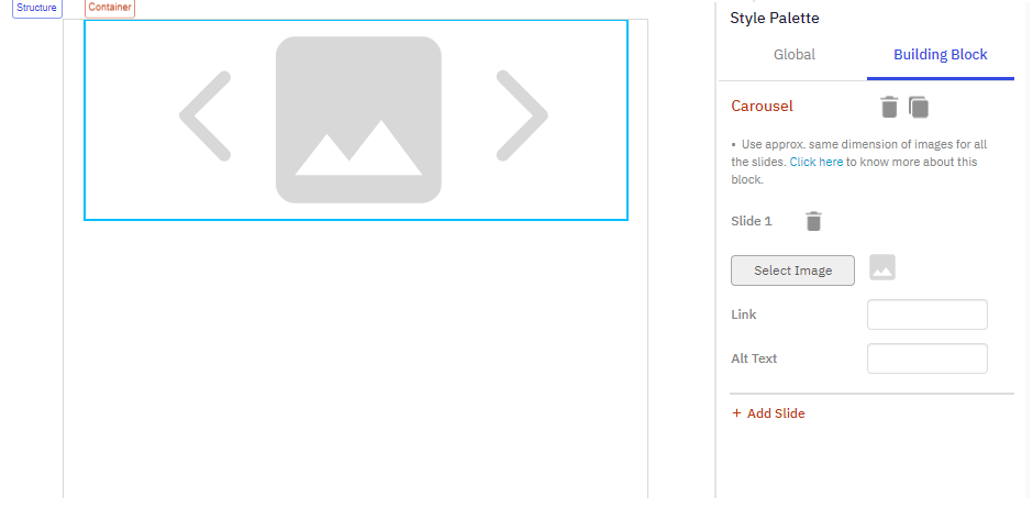
- Select the Carousel block. The Style Palette will display the options of Carousel block.
- Select Image: Select an image for the 1st slide.
- Link: (Optional) Enter a link to navigate the user when the image is clicked.
- Alt Text: (Optional) Enter an Alternate text.
- + Add Slide: Click + Add Slide to add more slides and configure them as mentioned above. You can add up to 5 slides.
Usage Notes:
- The overall height of an AMP Carousel will be equal to the maximum height of the images added in its Slides, e.g. if a Carousel has 3 Slides with the respective image heights of 300px (Slide #1), 500px (Slide #2) and 400px (Slide#3), then the Carousel’s height will be 500px. A gap will be visible below the images on Slide#1 and Slide#3.
- The rendered height of the Carousel in mobile devices will be the same as that on desktop devices.
- How the width of the images within a Carousel impacts the rendering on different device form factors:
* For both Desktop and Mobile devices, if the image width is less than 317px, then the Image is rendered with its original width.
* For both Desktop and Mobile devices, if the Image width is more than 317px, then the Image is stretched to occupy the full width of the Container.
Carousel with Text
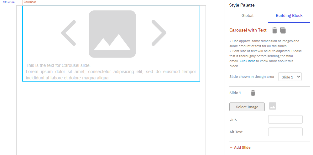
This block is similar to Carousel block with an option to add text below the image. That means you can add an image and also a text that navigates along with the image.
Follow these steps to add an AMP Carousel with Text block:
- From the Flexi Structures, add a 1-Column-Flexi block on the design canvas.
- From the AMP Blocks (Beta), add Carousel with Text block in 1-Column-Flexi structure.
- Select the Carousel with Text block. The Style Palette will display the options of Carousel block.
- Select Image: Select an image for the 1st slide.
- Link: (Optional) Enter a link to navigate the user when the image is clicked.
- Alt Text: (Optional) Enter an Alternate text.
- + Add Slide: Click + Add Slide to add more slides and configure them as mentioned above. You can add up to 5 slides.
Use the same (approximate) dimension of images and the same amount of text for all the slides.
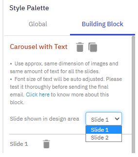
- To edit the text for the slides, you have to select each slide from the Slide shown in design area and then edit the text. For example, to edit the text of Slide 2, from the Style Palette, select Slide 2 from the Slide shown in design area. Slide 2 will be displayed on the canvas. Click in the text area of the block to edit the text.
- You can change the background color of the text from the Style Palette. The Background color option will be displayed on selecting the text.
Font size of the text will be auto-adjusted. Please test it thoroughly before sending the final email.
Accordion
This block allows you to add expandable sections. It allows you to add a lot of content that can be minimized in the email. You can configure whether the block should be expanded or collapsed when the block is rendered. You can add up to 5 accordions. All the titles of different sections of an accordion can have the same properties. If a section is deleted then the next section will become that section i.e. if section 2 is deleted then section 3 will become section 2.
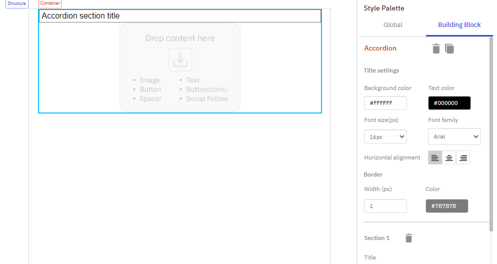
Follow these steps to add an Accordion block:
- From the Flexi Structures, add a 1-Column-Flexi block on the design canvas.
- From the AMP Blocks (Beta), add an Accordion block in 1-Colum-Flexi structure.
- As you notice, it is a container and you can add other Flexi blocks in it. Add the required Flexi blocks in the accordion section. To add more accordions, from the Style Palette, click + Add Section. Add the required Flexi blocks in the accordion section 2. You can add up to 5 slides.
- To change the accordion title, locate the Title from the Style Palette and add your title.
Following are the properties you can configure for this block:
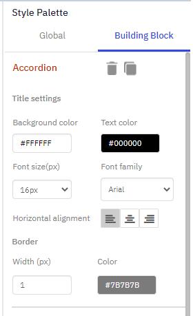
Title settings: You can add up to 75 characters as the title text.
- Background color: Set the background color for the accordion. The selected color will be applied to all other slides as well.
- Text color: Set the text color for the accordion. The selected color will be applied to the text of all other slides as well.
- Font size(px): Use this property to set the font size for the accordion.
- Font family: Use this property to set the font family for the accordion.
- Horizontal alignment: Use this property to set the accordion title alignment.
Border:
- Width (px): Use this property to set the accordion border.
- Color: Use this property to set the accordion border color.
Updated 5 months ago