Email Composer mini-release 2019 May 8th
Here’s the list of enhancements in this release:
1. Foreground Images : Style options for Alt-Text
We have continued ongoing enhancements for this feature which was introduced as ‘Beta’ in the previous release 3 weeks ago. With the below enhancement and a couple of other minor fixes for Outlook rendering included in this release, this feature can now be considered to be out of the ‘Beta’ status.
Alt-Text for an image will now render in the specified colour even if the image has a link associated with it. Previously the text colour of Alt-Text was getting overridden with the browser’s default colour (blue) if a link was added to the image.
2. Ongoing Enhancements to 2-Column-Flexi Block (Beta):
Although this feature still remains in ‘Beta’, we have made many enhancements in this release as follows. We expect this feature to ‘graduate’ out of the ‘Beta’ status in the next release in about 3 weeks.
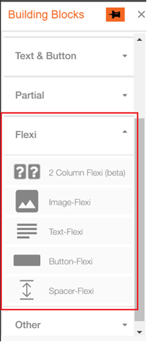
- We have introduced a new accordion section for ‘Flexi’ blocks in the ‘Building Blocks Palette’ on the left side. This is where we will introduce more Flexi-blocks in the future such as ‘3-Column- Flexi’ and ‘4-Column-Flexi’.
- We have also introduced the following four new building blocks – specially designed to be used within the 2-Column-Flexi block:
o Flexi-Image
o Flexi-Text
o Flexi-Button
o Flexi-Spacer
Only these building blocks can now be dragged-and-dropped inside the Containers of the 2-Column-Flexi Building block.
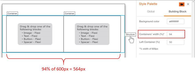
- We have also introduced ‘Container’ and ‘Structure’ labels for ‘2 Column Flexi’ Building block. These labels will be visible if you click anywhere inside the ‘2-Column-Flexi’ Building block. You can now select these labels to apply Background Colour to either a ‘Container’ or the whole ‘Structure’ from the Style palette.
- You can now configure the combined width of the 2 Containers within the 'Structure'. This can be done under the Style Palette when you click on the 'Structure' label. e.g. if you specify this value as 80%, then the combined width of both Containers would be 94% of 600px i.e. 564px.
o The minimum allowed value for this width is 70% .
o The maximum allowed value is 100% (which will give you the ‘full-bleed’ look).
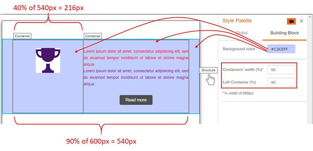
- You can also configure the % width of the Left Container (which will also then decide the % width of the Right Container). This can be done under the Style Palette when you click on the 'Structure' label. e.g. if the combined width of the 2 Containers is 540px and the value for ‘Left Container (%)’ is 40, then Left Container width would be 40 % of 540px i.e. 216px and Right Container width would be 324px.
o The minimum allowed value for the ‘Left Container (%)’ field is 10%.
o The maximum allowed value for the ‘Left Container (%)’ is 90%.
o In case the Image-Flexi block is used in a Container and if the ‘Left Container width (%)’ value is changed, then the height of the Container would be adjusted such that the image aspect ratio is maintained
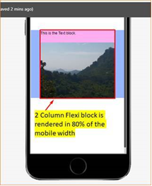
- The width of the ‘2-Column Flexi’ block on mobile devices will also be decided by the ‘Containers’ width (%)’ value e.g. If the Container’s Width value is set to 80%, then the 2-Column Flexi Block will also render with 80% width on a mobile device.
- In this release, while rendering on mobile devices, the Left Container (i.e. all the blocks within the Left Container) will be stacked on top of the Right Container (i.e. all the blocks within the Right Container). In the next release, we will introduce the ability for the user to decide whether the Left or Right Container should stack on top.
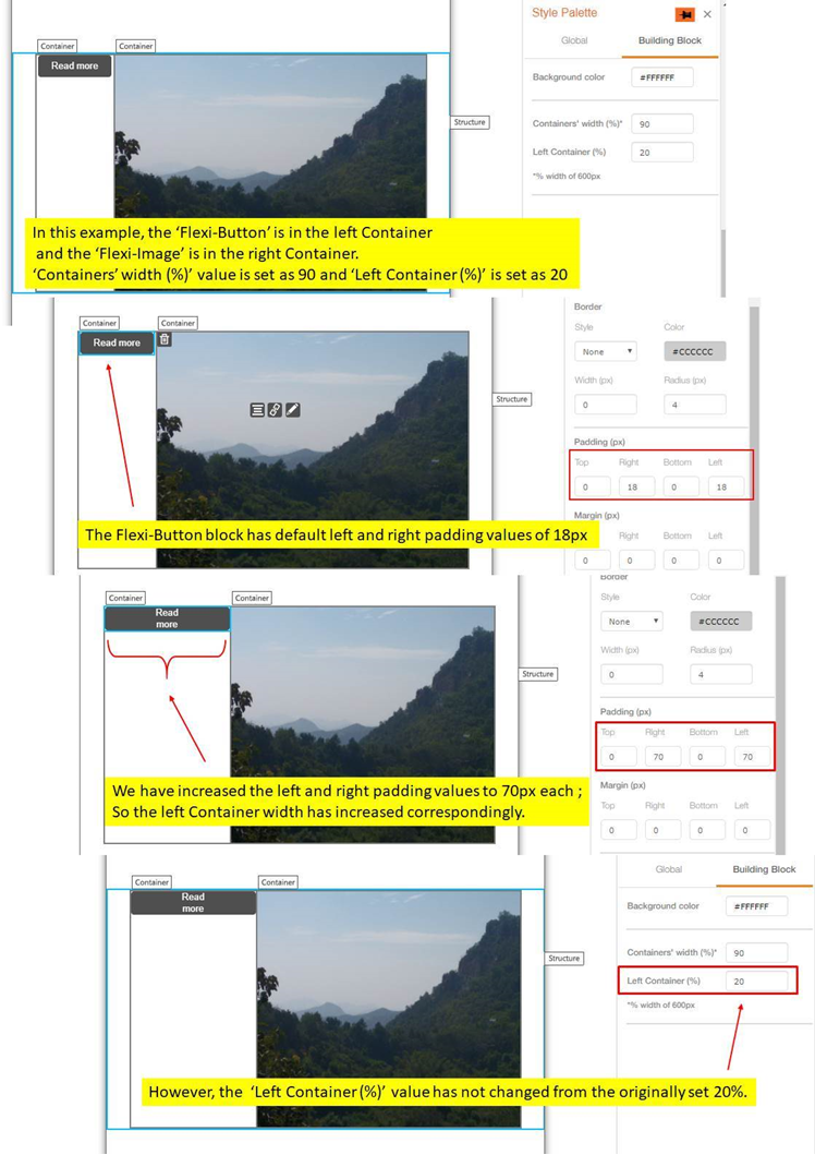
- If you increase the left / right padding for a block inside a Container such that the width of block becomes more than the Container width, then the width of the Container will be adjusted to accommodate the padding values. However, this new width value will not be reflected in the UI for the ‘Left Container (%)’ value. We strongly recommend that in this case you adjust the padding value(s) so that the block can be accommodated inside the Container without changing the width of the Container; otherwise the rendering of the email may be affected on some email clients.
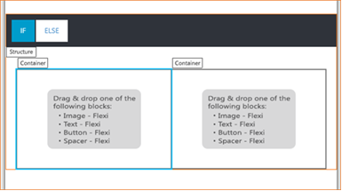
- When the ‘2 Column Flexi’ Block is used inside a Conditional Block, the ‘Structure’ label will be visible on the top left corner of the ‘2 Column Flexi’ block.
3. Button Building block : UX changes
- The default alignment of Button block has been changed to ‘Center’ (previously used to be ‘Left’).
- The default background colour of the Button has been changed to grey (previously used to be blue) .

Above changes will not affect any Button blocks used in existing templates or existing email deployments.