Email Composer mini-release 2019 January 7th
Here’s the list of enhancements in this release:
1. Clearly separated buttons for design and preview tasks:
Based on user feedback, we have now introduced a separate button for ‘Desktop Preview’. So there are now clearly separated buttons as follows:
a. Two Buttons for Preview tasks ( for indicative previews of email rendering previews in mobile and desktop email clients respectively ). While previewing, the email design cannot be edited.
b. Three Buttons for Design tasks (for viewing in HTML code ; for designing the email with Drag-&-Drop Building Blocks and for switching on / off the Grid view)

2. Reorganization of Building Blocks:
Based on user feedback, we have reorganized some of the Building Blocks as shown in this screenshot.
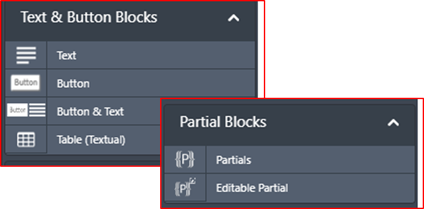
3. Ability to specify a ‘default background colour’ for all Building Blocks within an email template:
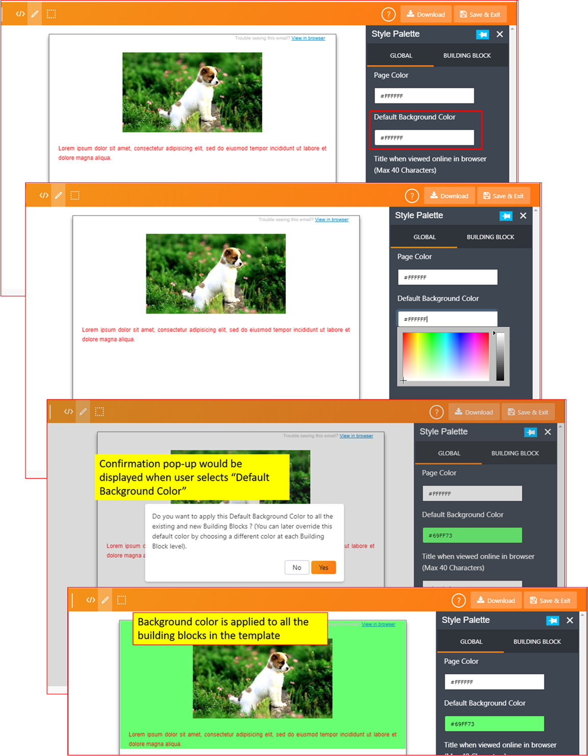
A new option called ‘Default Background Color’ has been added under the ‘Style Palette Global’ Tab. This default background colour will be applied to all the blocks already present in the email template as well as to any blocks which will be added after applying this background color. You can override this background colour for a specific building block (under the ‘Style Palette Building Block’ tab) .
Note: The colour specified in the ‘Default Background Color’ will not be applied to ‘Partials’.
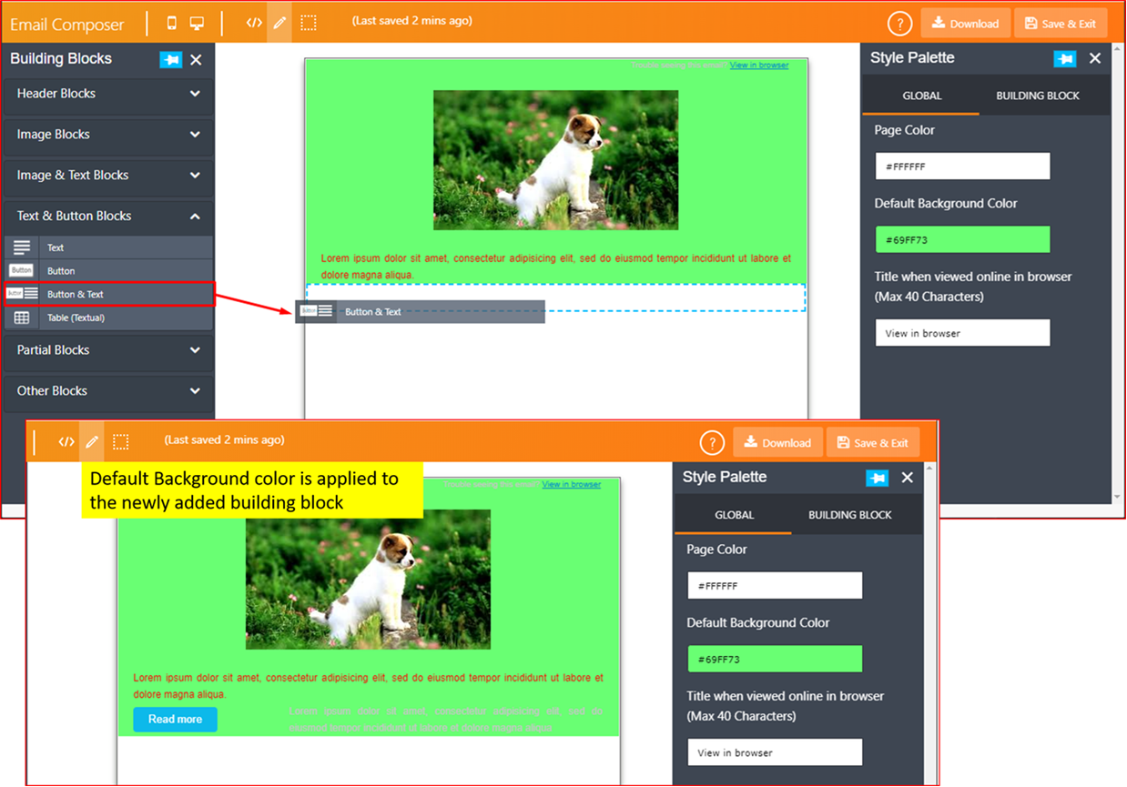
When a new Building Block is added after changing the ‘Default Background Color’:
4. Ability to specify the ‘Title Tag’ value (IMI-INC9579564 / IMI-PRB0042551):
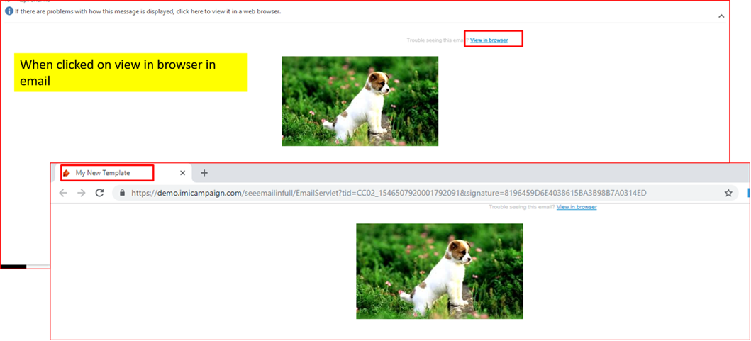
You can now specify the ‘Title Tag’ value under the ‘Style Palette Global’ tab. This value will be shown in the browser tab when an email-recipient clicks on the ‘View in browser’ link and opens the email within their browser. If you do not specify any value here, then the default text value ‘View in browser’ will be displayed.
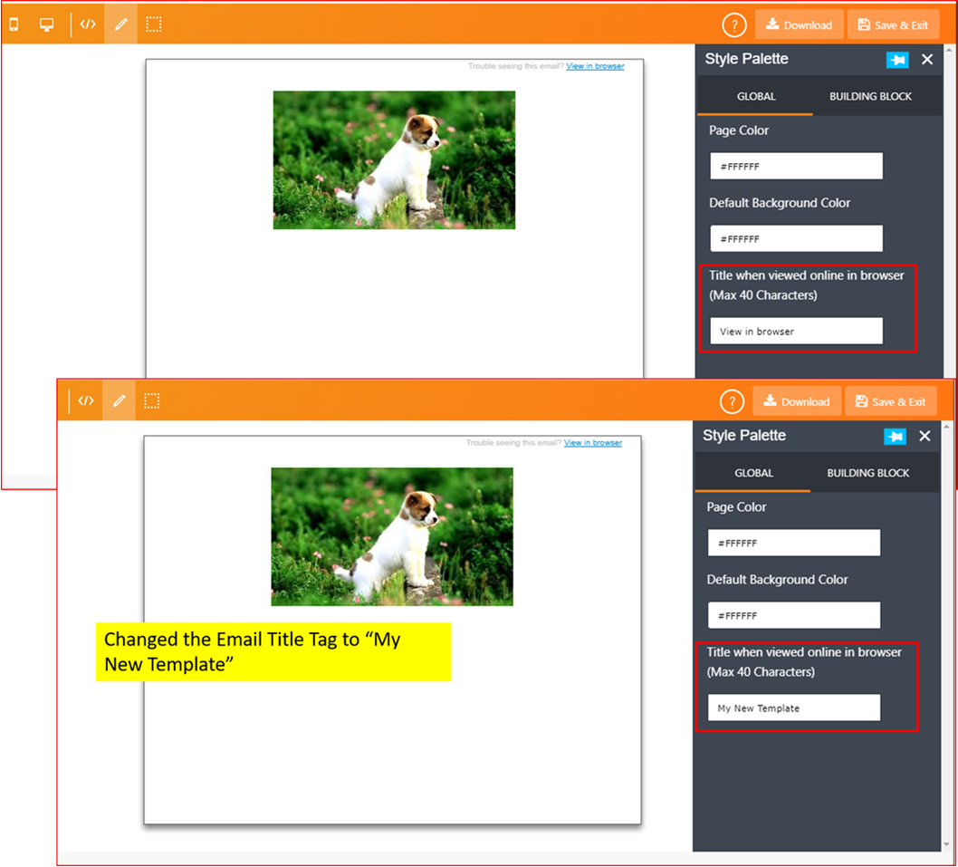
When the email recipient clicks on ‘View in browser’ link, the email content is displayed in a new browser tab and the specified value of the Title Tag is used.
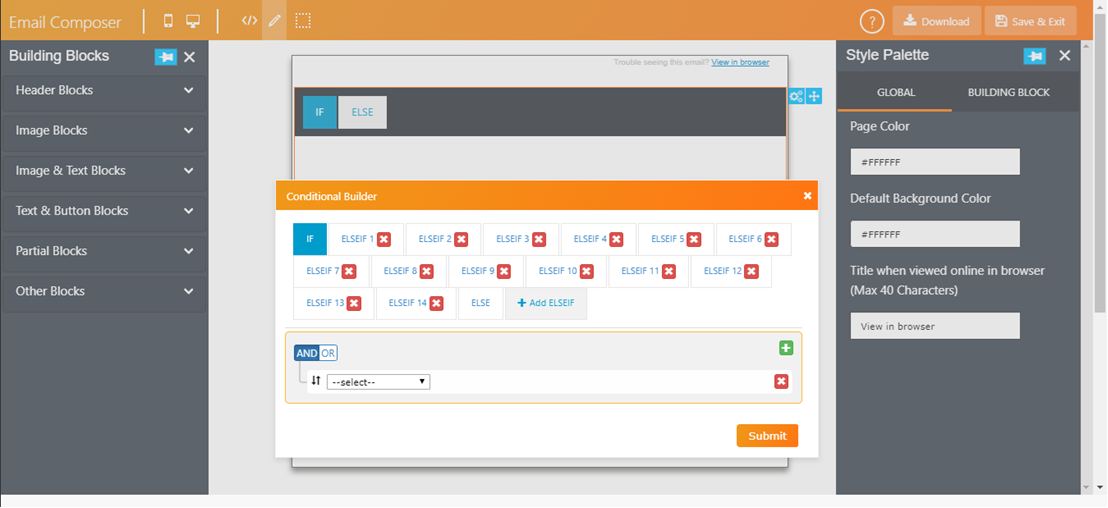
5. Ability to specify upto 15 conditions within the Conditional Building Block
Based on user feedback, we have increased the number of conditions within a Conditional Block to 15 (i.e. one IF condition + 14 ELSEIF conditions).
Previously, 9 ELSEIF conditions were allowed.
Cumulatively, a maximum of 60 conditions can be added within a single email template. e.g. you can add 4 conditional blocks with 15 conditions each or 12 conditional blocks with 5 conditions each etc.
The more conditional content you have within your email template, the more time will be required to save and open the email template. So this maximum limit of 60 has been applied taking into account a typical user’s PC and browser set up; so that the overall performance of the Email Composer is not affected adversely.
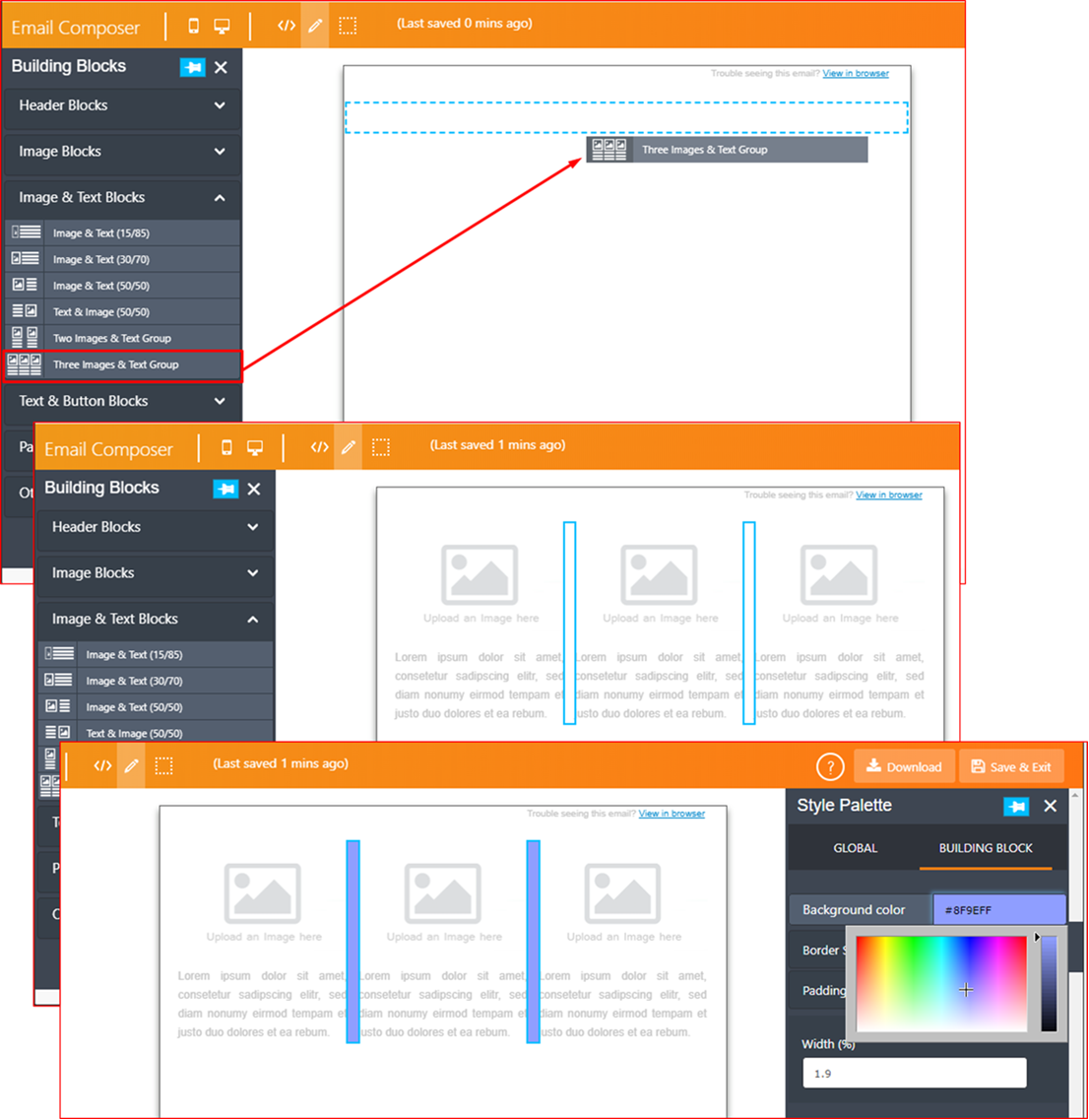
6. ‘Three Images and Text Group’ Building Block : configurable width for separator bars:
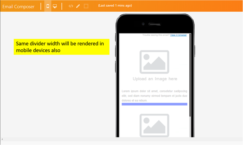
We have added an option called ‘Width (%)’ under ‘Style Palette Building Block’ tab. The same width % value will be used for rendering in mobile email clients.
The same % width is used when rendered in mobile email clients:
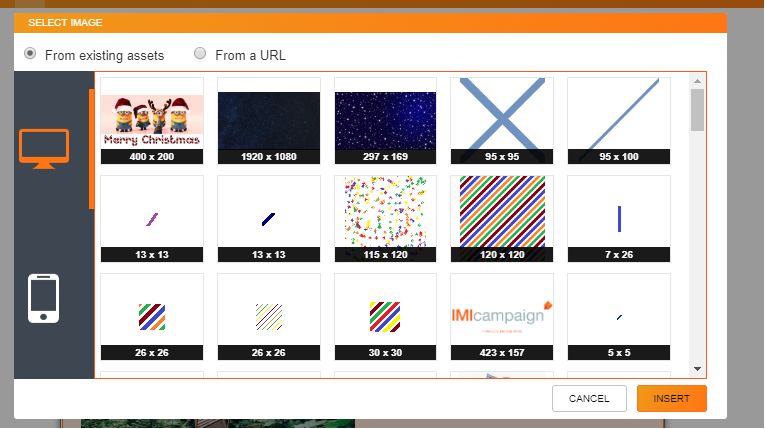
7. ‘Select Image’ pop-up UX improvements:
a. Now 15 images are displayed (instead of 8) – thus requiring less scrolling to find the image you want
b. Clearer wording with radio buttons to select the image ‘From existing assets’ or ‘From a URL’
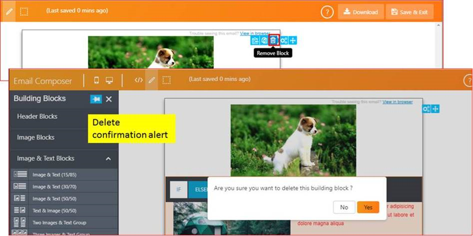
8. Confirmation alert pop-up when deleting a Block:
You will be shown a pop-up alert to confirm that you do indeed want to delete a Block from the email template.
9. Ability to specify higher values for Padding, Margin , Border and Spacer-height :
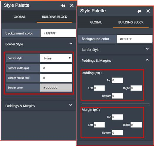
We have improved how you can specify the values for these parameters under ‘Style Palette Building Block’ tab for most of the Building Blocks (where applicable).
The range of allowed values are as follows:
i. Padding (px): Between 0 and 600px
ii. Margin (px): Between 0 and 600px
iii. Border width (px): Between 0 and 20px
iv. Border radius (px): Between 0 and 50px
v. Spacer height (px): Between 1 and 600px
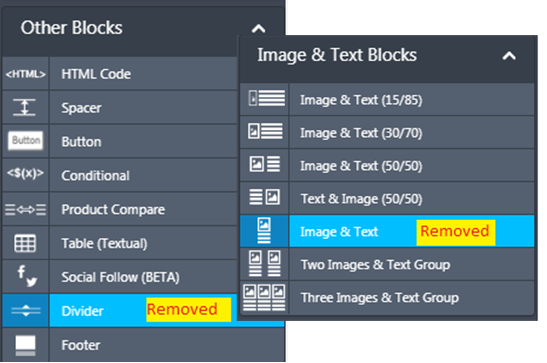
10. Removed ‘Image & Text’ and ‘Divider’ Building Blocks :
We have removed these two Blocks because the HTML layouts delivered by these could be achieved by using or combining other existing Blocks.
a. ‘Image & Text’ Block can be designed by adjacently-placed (one above the other) separate ‘Image’ and ‘Text’ Blocks.
b. Instead of the ‘Divider’ Block, the ‘Spacer’ Block can be used.
Note that if you have already used these 2 deprecated Blocks in one of your email templates, and used that email template within an email campaign deployment, then they will continue to work without any problems.
11. Bug fixes:
- When using the HTML block, the mobile preview was being cut off on the right side under certain conditions. We have added a horizontal scrollbar to show full mobile preview for such wide-layout HTML blocks.
- Fixed a bug which was causing the email template not to be saved properly if the user clicked on the ‘Save’ button whilst having HTML-Source-code pane open (IMI-PRB0042489).
- Fixed a bug which was causing the ‘Button’ Block border radius not to be rendered properly in the ‘Drag-&-Drop-Design’ mode. (It was already being rendered correctly in the actual emails, and when viewed in the browser )
Of course, in addition to the above enhancements and new features, we have delivered a number of minor bug fixes / validations to make the Email Composer more robust overall.