Email Composer mini-release 2019 April 15th
Here’s the list of enhancements in this release.
1. Text Editor Black Toolbar : Now font size of up to 40px is allowed
Previously the max font for the Text Size as well as Line Height was 36px. Now you can use up to 40px for both.
2. ‘Table (Textual)’ Building Block : Apply different Border Style to each side of a table cell
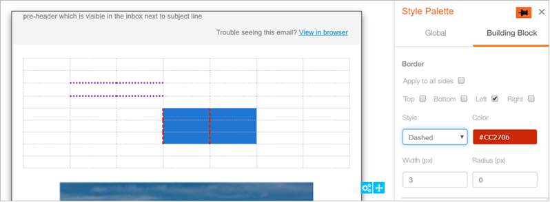
Now you will be able to select one or more cells within a table and apply the border style and colour individually to each side of the cell(s); e.g. in the screenshot below, the user has selected specific 6 cells within the table and applied a combination of Style, Colour and Width to only the Left side of these 6 cells (Red + Dashed + 3px). Another example from the screenshot shows that 4 different cells have been applied the following style options for their Bottom side (Purple + Dotted + 3px).
A step-by-step mini-tutorial has been included later in this Release Note for you to practice the use of this feature.
Usage Notes:
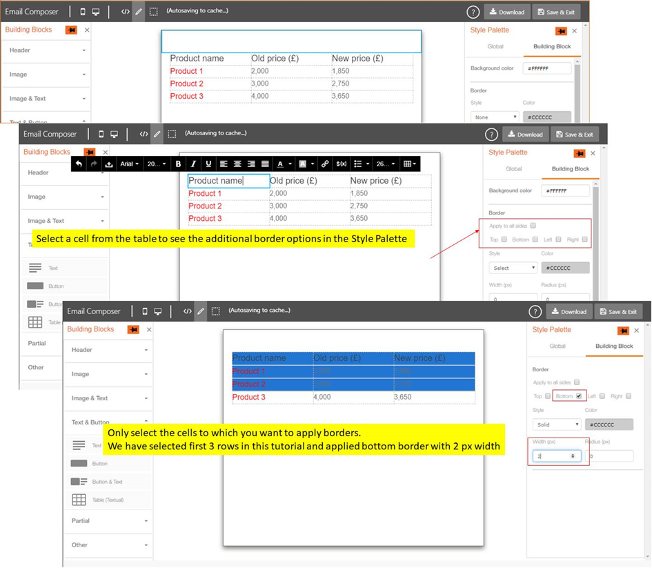
- You must initially select only one cell within the table ; then these individual border style options will become visible in the Style palette on the right side.
- Only after these options have become visible, you should use your mouse / touchpad to select other cells within the table (if you want to apply the same border style to multiple cells).
- Please only use the mouse / touchpad to select multiple cells within the table. The use of keyboard arrow keys is not supported within the Table building block of the Email Composer.
- After the Style options are applied to multiple cells, if you select those same cells again, then the right side Style Palette will not display the selected options. These Style option values will be visible only if you select a single cell at a time.
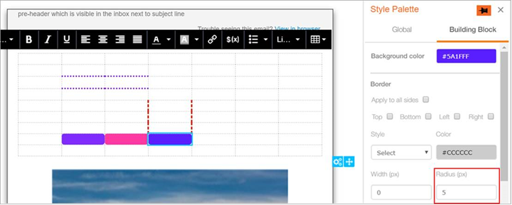
- The ‘Radius’ option on the right style palette is not meaningful if multiple cells are selected. (Please see the screenshot below).
- You can apply the ‘Radius’ option only if :
o you select a single table cell and
o if you apply some Background Colour for that cell - If you want to use the ‘Radius’ option for each individual cell, then the other 3 border options are not applicable (i.e. Border Style, Border Colour and Border Width should not be used in conjunction with the Radius option)
3. Foreground Images : Style options for Alt-Text (Beta)
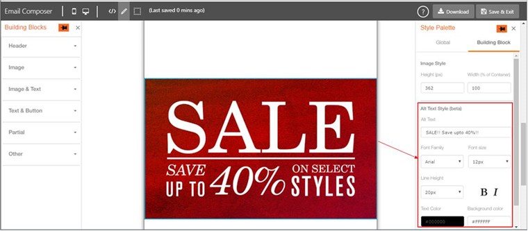
You can now use the following Style options for the Alt-Text for an image. These options become visible in the ‘Building Block’ tab under ‘Style Palette’ when you select an image.
- Font Family (Arial / Helvetica / Times New Roman)
- Font Size
- Line Height
- Bold
- Italic
- Text Colour
- Background Colour
Usage Notes:
- This feature is currently in ‘beta’ as we expect to introduce some enhancements in the next couple of releases.
- If you apply a URL link to the image, then the Alt-text will take the default colour for a linked text for that email client. For most email clients, this colour is blue. So in effect, the specified colour of the Alt-text will work only if you don’t have a URL link for the image.
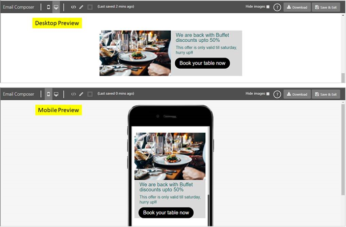
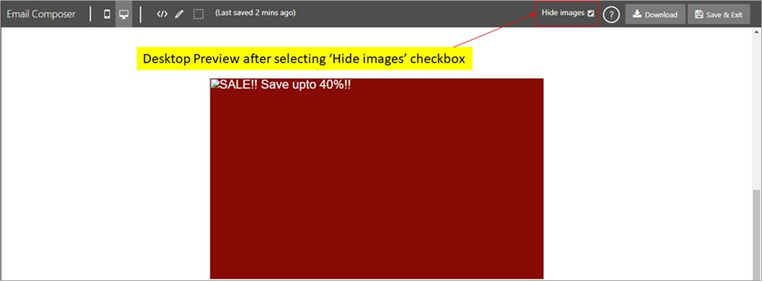
- You can use a new feature called ‘Hide images’ in Desktop Preview and Mobile Preview which can be used to preview the Alt-Text.
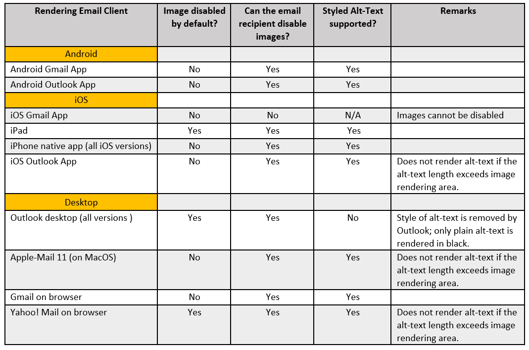
- The following table shows which email clients currently support styled Alt-Text. Of course, this may change in the future as email inbox providers are continually updating their products.
4. Introducing a new ‘Flexible’ Building Block : ‘2-Column Flexi’ (Beta)
This new type of Building Block is available under the ‘Other’ accordion. It is ‘flexible’ in the sense that it allows you to mix-and-match the overall look by dragging and dropping one or more of the following blocks inside this ‘Flexi’ block : Image , Text , Button, and Spacer.
Two step-by-step mini-tutorials have been included later in this Release Note for you to practice the use of this feature.

Usage Notes :
- This feature is currently in ‘beta’ as we expect to introduce some enhancements in the next couple of releases.
- We will be using the new terminology of a ‘Structure’ and ‘Containers’ with respect to this ‘Flexi’ block.
- The outer overall space indicated by the green outline in the above screenshot is the ‘Structure’. What is ‘fixed’ about this Structure is that it has 2 columns.
- This Structure has 2 ‘Containers’ indicated by the red outline.
- The combined width of the 2 Containers is 94% of the overall width of the Structure.
- Please drag and drop at least one block inside each Container before saving the template.
- Only the following blocks are allowed to be dropped inside a Container : Image, Text, Button and Spacer.
- You can drop multiple blocks inside each Container.
- These must be dragged from the left side palette. i.e. You may not move a block designed outside the ‘2 Column Flexi’ Structure into one of its Containers.
- You may drag and drop a ‘2 Column Flexi' block inside a Conditional block.
- If you select the whole 'Structure', then the only Style option available for this Building Block is 'Background Colour'.

- At the overall ‘Structure’ level, it is possible to ‘Move’ , ‘Delete’ , ‘Copy’ and ‘Copy-code-to-clipboard’ the Structure within the overall Email Message Template.

- It is possible to delete building blocks that have been dropped inside a Container. The 'Delete' icon can be seen on the top-left corner of the block when you hover the mouse over it.

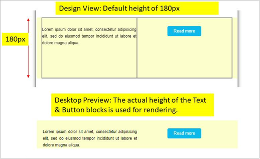
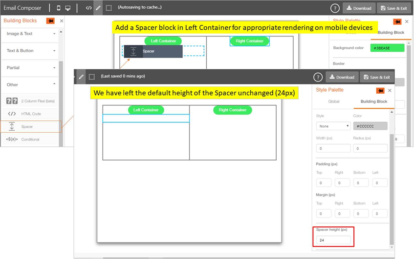
- The default height of Containers is 180px in Design View. However, while rendering the email , what matters is the actual total height of individual blocks within the Left & Right Containers (whichever is the taller).
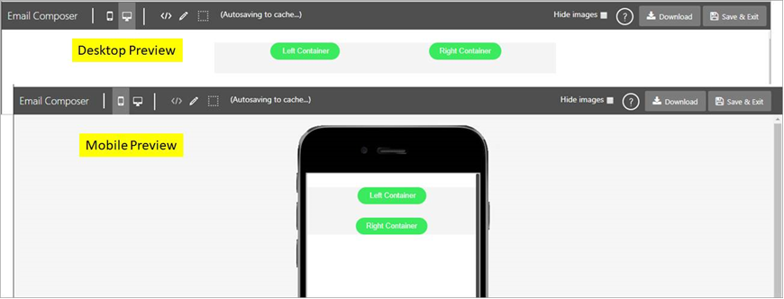
- In this release, while rendering on mobile devices, the Left Container (i.e. all the blocks within the Left Container) will be stacked on top of the Right Container (i.e. all the blocks within the Right Container). In the next release, we will introduce the ability for the user to decide whether the Left or Right Container should stack on top.
STEP-BY-STEP MINI-TUTORIAL 1 : ‘TABLE (TEXTUAL)’ : APPLYING DIFFERENT BORDER STYLES TO INDIVIDUAL CELLS IN A TABLE
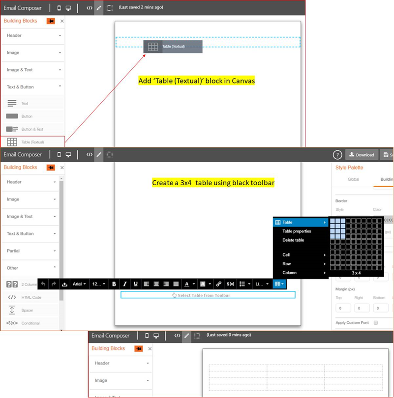
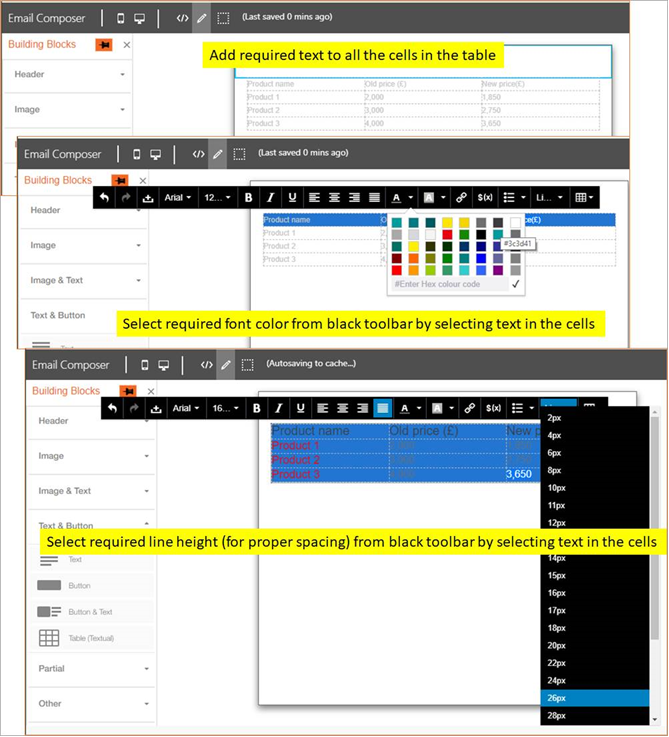
- Step 1: Add a ‘Table (Textual)’ block in the canvas (Design View) and create a 3x4 table using the black text-toolbar.
- Step 2: Add any desired text to the cells; then set Font Size, Font Colour, Line Height etc from the black text-toolbar.
- Step 3: Select any single cell in the table to see options in Style Palette to apply individual side borders; then select multiple cells to which you want to apply border styling. Please use only your mouse or touchpad (keyboard arrow keys are not supported).
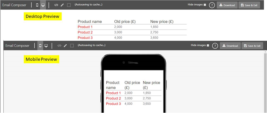
- Step 4: Preview the designed table in Desktop Preview and Mobile Preview panes.
STEP-BY-STEP MINI-TUTORIAL 2 : ‘2-COLUMN-FLEXI’ BLOCK : CREATE TWO BUTTONS SIDE-BY-SIDE
- Step 1: Drag and drop a ‘2 Column Flexi’ block in the canvas.

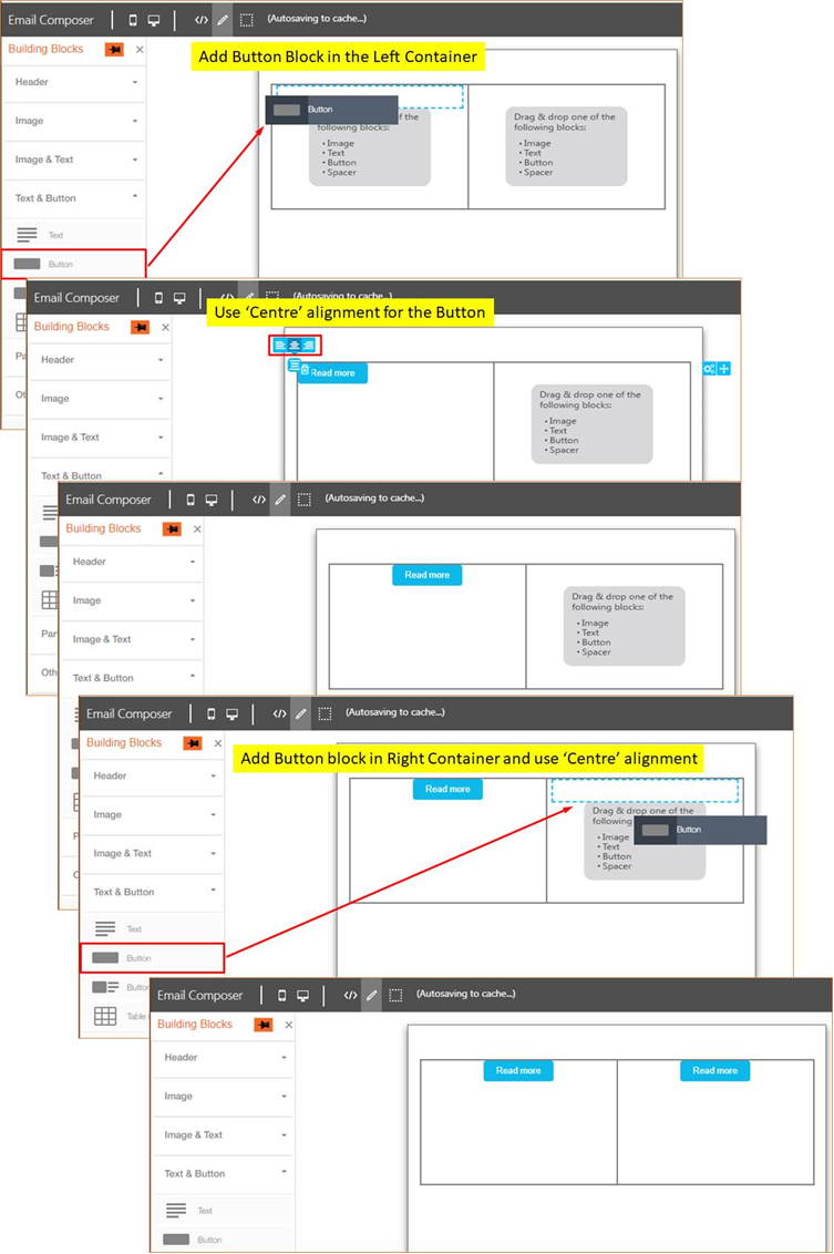
- Step 2: Add a Button block in the Left Container as well as in the Right Container. Configure the horizontal alignment of the Buttons as needed. We have used the 'Centre' alignment in this example.
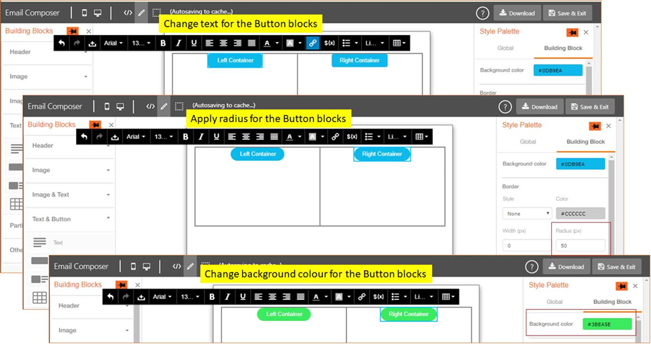
- Step 3: Change text, background colour and radius for Button blocks as needed.
- Step 4: Add a Spacer in Left Container to render an appropriate amount of space between the 2 Buttons when rendering on mobile devices.
- Step 5: Add the Background Colour for the overall ‘Structure’.

- Step 6: Preview the designed ‘Structure’ in Desktop Preview and Mobile Preview panes.
STEP-BY-STEP MINI-TUTORIAL 3 : ‘2-COLUMN-FLEXI’ : LEFT CONTAINER = IMAGE ; RIGHT CONTAINER = TEXT + BUTTON
- Step 1: Drag and drop a ‘2 Column Flexi’ block in the canvas.

-
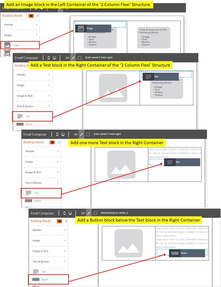
Step 2: Add an Image block in the Left Container. Add 2 Text blocks and a Button block in the Right Container.
-
Step 3: Select the image you want from within the Image-Selector pop-up. Add appropriate text to the Text blocks and to the Button block.
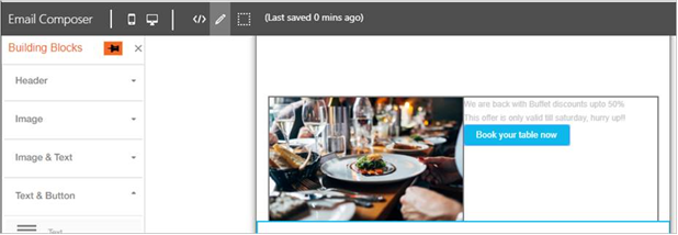
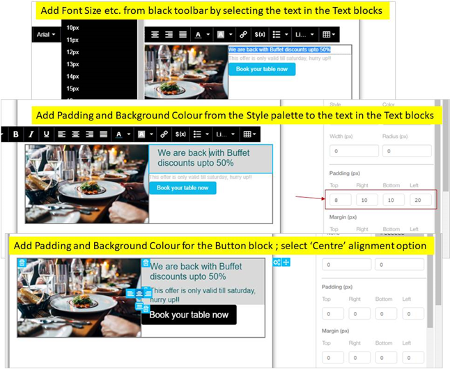
- Step 4: Add Background Colour, Font Size, Font Colour and other Styling options to the text in the Text and Button blocks.
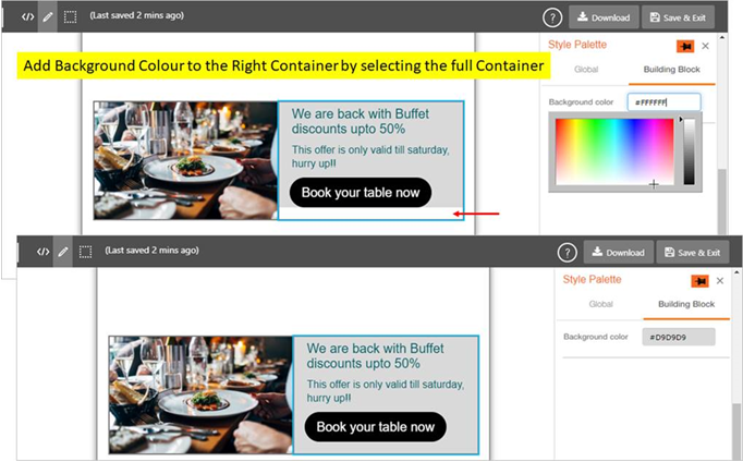
- Step 5: Add Background Colour to the Right Container.
- Step 6: Preview the designed ‘Structure’ in Desktop Preview and Mobile Preview panes.
