Email Composer mini-release 2018 December 3rd
Here’s the list of enhancements in this release:
1. Add a Background Image (BETA) :
A new option called “Use background image” has been added in Style Palette for the following Building Blocks:
- Text
- Table (Textual)
- Button
- Button & Text
This is being in introduced as a ‘beta feature’ . We will deliver some additional enhancements in upcoming releases. Your feedback is welcome on this feature; however, please do not raise an incident with Operations for this; instead please send me an email directly with your feedback.
Usage Notes:
- Background images do not render properly (or not at all) in all the email clients. So please test thoroughly using our Litmus Inbox Preview and also by sending to test contacts.
- For devices / email clients which do not render background images correctly, you should select an appropriate ‘background colour’ such that the overlaying text is properly legible on that that background colour
- Currently it is not possible to render a different background image for mobile devices. So even if you have selected a different background image for mobile devices, the image selected for Desktop will be the one rendered on all email clients.
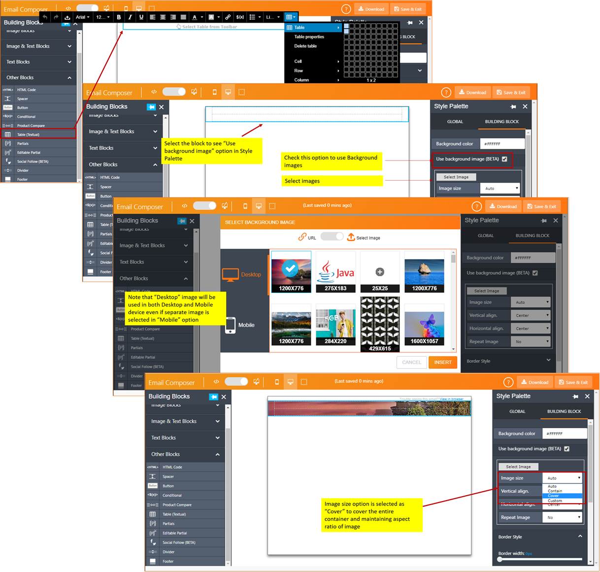
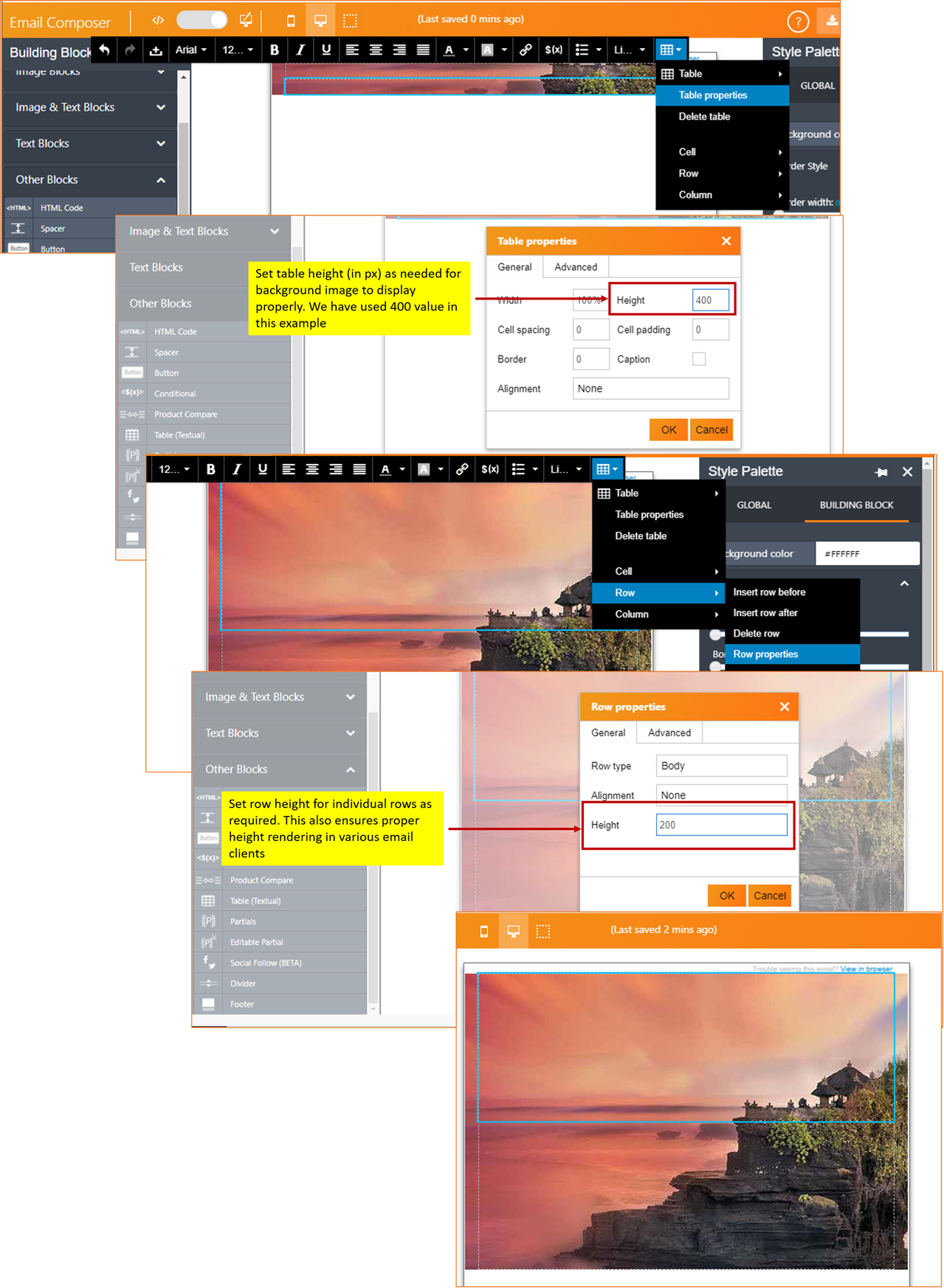
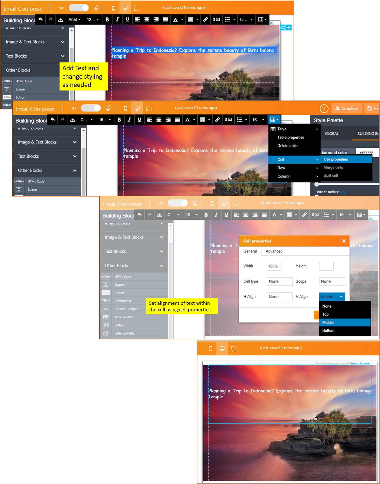
The following screenshots show the step-by-step instructions for an example scenario of how to add a background image to the ‘Table (Textual)’ Building Block.
STEP A : Select a background image and choose various rendering options for it.
STEP B: Adjust the height of Table and rows to fit the background image
STEP C: Add text, styles, alignment of text within the table cells.
Following are the style settings available for background images:
Image Size:
Options are :
- Auto: Display the background image in its original size.
- Cover: Resize the background image to cover the entire container. Narrow images will be stretched and wider images will be cropped. This works best for larger images with centered content (image will be cropped on left & right when viewed on mobile devices).
- Contain: Resize the background image to make sure the image is fully visible. This option enables full image to be viewed in all the devices. However, this may introduce blank strips above / below / to the sides of the image on mobile devices.
- Custom: The width and height of the background image can be set as % width and % height respectively of the container.
Vertical align.: Options are : Top / Center / Bottom
Horizontal align.: Options are : Left / Center / Right
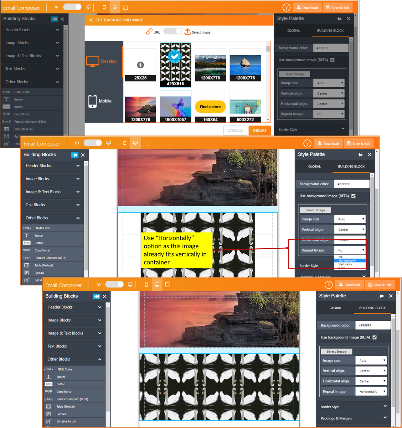
Repeat Image : This setting is useful when the background image is small and can be used to create a pattern in the background.
Options are:
- No: Background image is not repeated
- Horizontally : Background image is repeated from left-to-right or right-to-left (based on the option selected in ‘Horizontal align.’ setting).
- Vertically : Background image is repeated from top-to-bottom or bottom-to-top (based on the option selected in ‘Vertical align.’ Setting)
- Both: Background image is repeated both vertically and horizontally (based on the options selected in ‘Horizontal align.’ and ‘Vertical align.’)
The following table shows whether background image feature is supported various popular email clients:
| Rendering Client | Supports Background Image |
|---|---|
| Android | |
| Android6 | x |
| Android Gmail App | ☑ |
| Android Gmail IMAP | x |
| Android Outlook App | ☑ |
| Android Samsung 6 | ☑ |
| iOS | |
| iOS Gmail App | ☑ |
| iPad | ☑ |
| iPad mini | ☑ |
| iPad Pro 13in | ☑ |
| iPhone native app (all iOS versions) | ☑ |
| iOS Outlook | ☑ |
| Desktop | |
| Outlook desktop (Multiple versions) | Partially Supported (Background image will render covering the full height and width of the container - irrespective of the option used in "Size" setting. |
| Outlook desktop (Multiple versions) | ☑ |
| Apple Mail (versions 9, 10 & 11) | ☑ |
| Gmail on browser | ☑ |
| Yahoo on browser | ☑ |
| Outlook .com | ☑ |
| Office 365 | ☑ |
2. ‘Social Follow’ Building Block (BETA):
We have re-introduced this Building Block, however it remains in ‘BETA’ at present. This Building Block can be used to provide links to your social media channels.
We will be making some additional changes/minor bug fixes in upcoming releases to make this block more robust. Your feedback is welcome with any observations about this Building Block; however, please do not raise an incident with Operations for this; instead please send me an email directly.
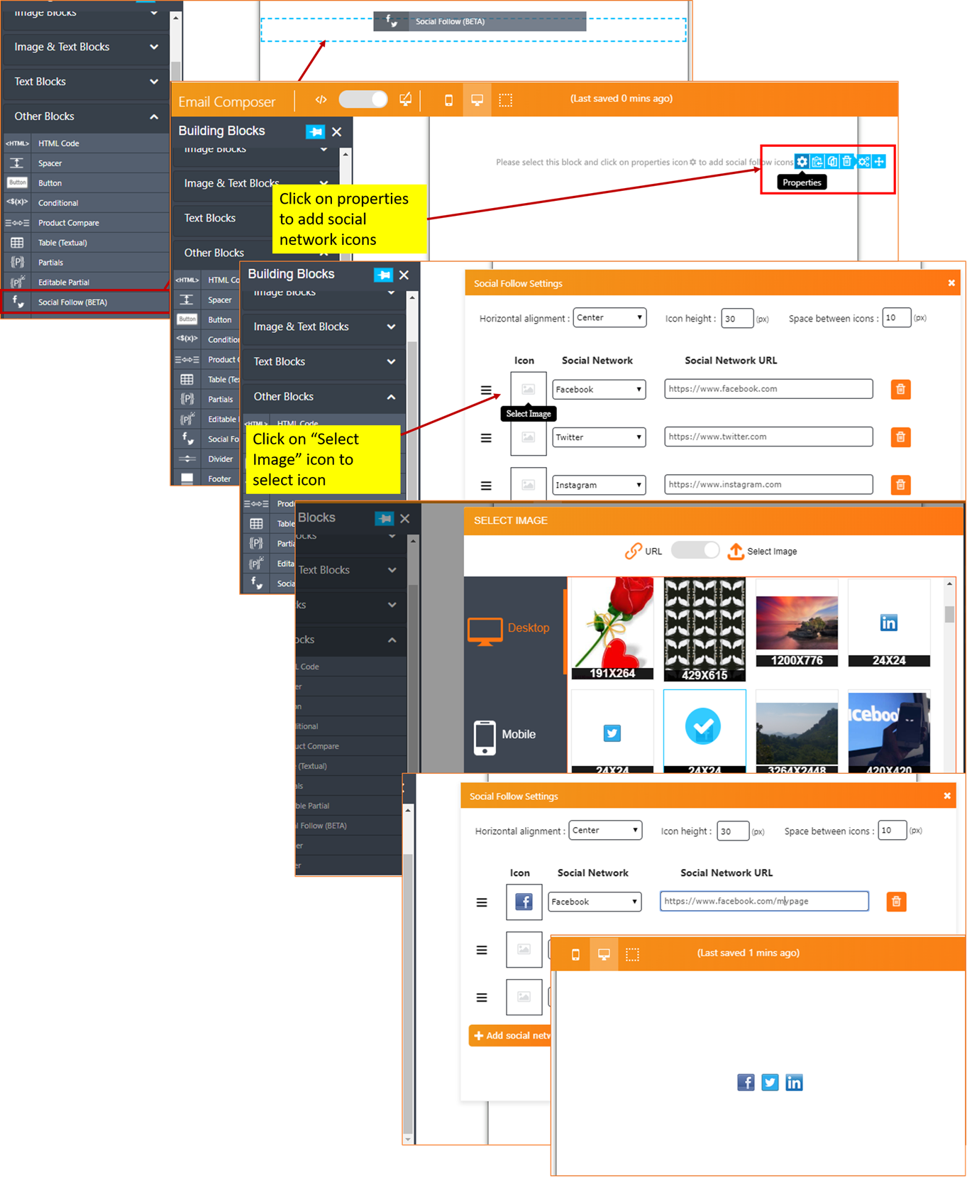
Following are the settings / options for the ‘Social Follow’ Building Block:
- Horizontal alignment : Options are : Left / Center / Right
- Icon height: Sets the height of the container for social media icons (1 to 50px for both Desktop and Mobile device rendering). If the icons’ height is larger than this value, then Email Composer will resize the icons to fit into this height and width will be adjusted maintaining the image aspect ratio.
- Space between icons: Sets the space between icons. (0 to 10px for both Desktop and Mobile device rendering).
- ‘Add social network’ button: You can add up to 5 social network icons
- ‘Move’ button: Change the order of the icons.
- ‘Delete’ button: Delete an icon that you no longer want.
- Social Network URL: You can select a social network from the drop-down and its corresponding home URL will be populated, which you can edit to point to your own specific social media URL.
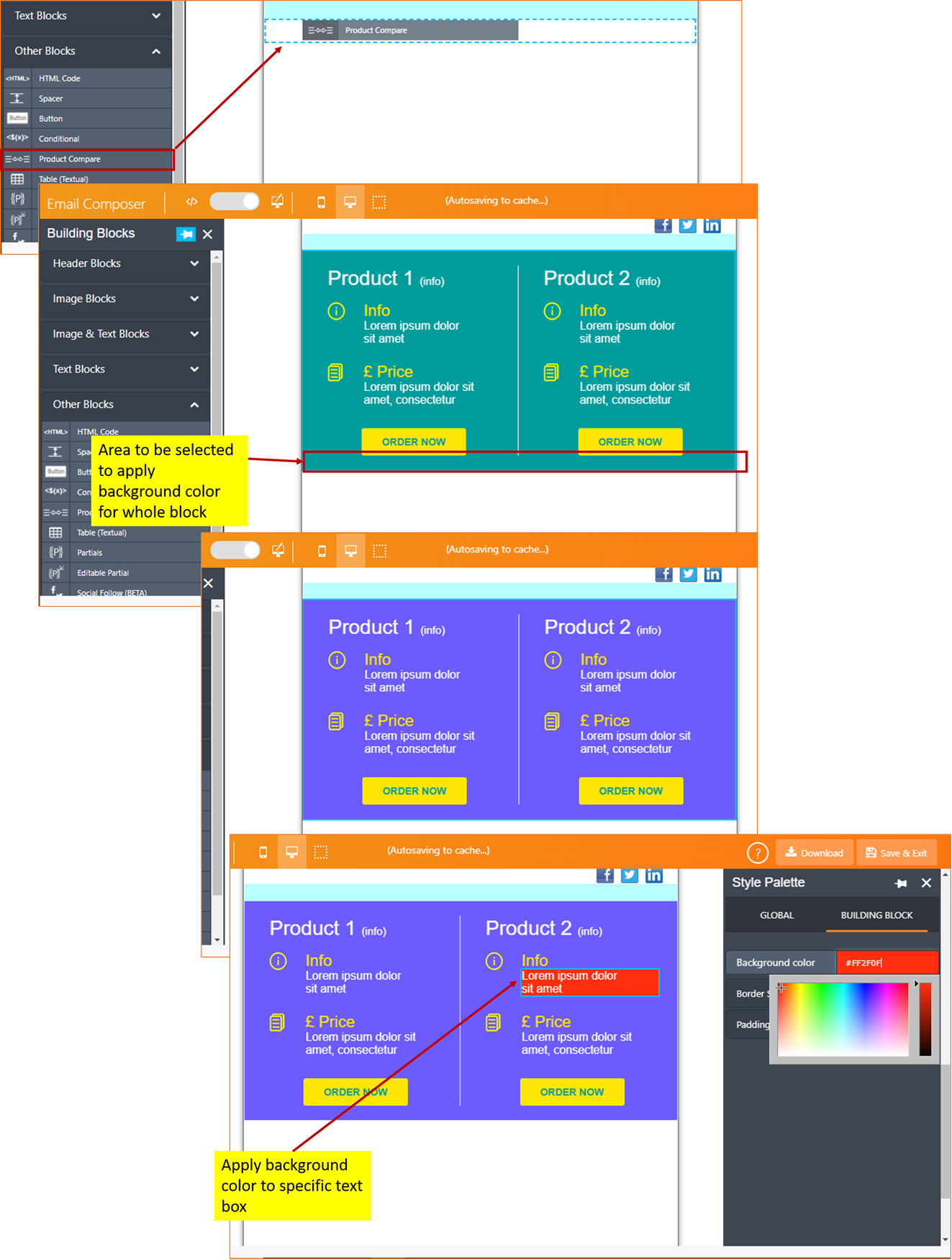
3. ‘Product Compare’ Building Block enhancements
- We have now provided the ability to customise the background colour for the Building Block as a whole as well for individual text elements within it.
- We have now provided the ability to select different images for desktop and mobile device rendering.
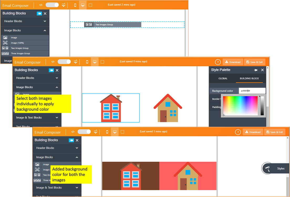
4. ‘Two Images Group’ and ‘Three Images Group’ Building Blocks:
We have now provided the ability to add a background colour for these 2 Building Blocks in cases when small images are being used (which do not occupy the full width of the container).
5. Render small images as 94% container width in mobile devices :
Even if the user uploads small images (i.e. image width is less than the width of the container for a mobile device), the Email Composer will now stretch the image to fit the width of the container on that device and the height will be adjusted maintaining the aspect ratio. This enhancement is applicable to the following Building Blocks (all the blocks under “Image blocks”):
- Image
- Image (100%)
- Two Images Group
- Three Images Group
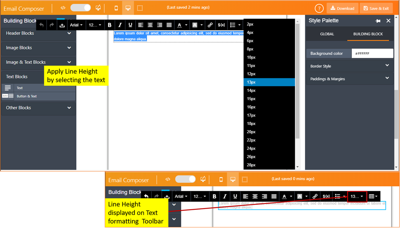
6. Text formatting toolbar fixes:
- Fixed the issue where the floating black text-toolbar was retaining value from previous text blocks under certain conditions.
- Fixed the issue where ‘Line Height’ was not being displayed in the toolbar under certain conditions.
7. Enhancements in how a link is added to a piece of text:
- The pop-up alert is now not shown when the user enters ‘MAILTO:’ and ‘TEL:’ links (which do not require https/https prefix):
- The wording of the pop-up has been clarified (when the link is not one of the above 2 types)

8. Bug fix for IMI-INC9557149 :
Fixed the bug where a gap was observed when the email is viewed online in a browser (when the email recipient clicks on “View in browser”) and ELSE condition was left blank while designing the email template (IMI-INC9557149 / Gap when viewed in Browser - using Conditional in the Composer )
Of course, in addition to the above enhancements and new features, we have delivered a number of minor bug fixes / validations to make the Email Composer more robust overall.